Bridging the Recycling Gap in Nigeria: A User-Centered Approach to Promoting Sustainable Waste Management
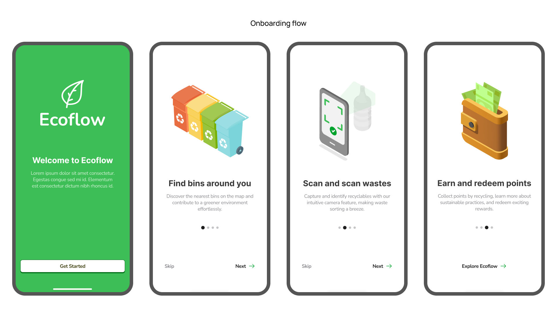
Ecoflow is a mobile recycling experience that encourages users to practice sustainable waste management, share their recycling journey with others and earn rewards for their efforts.
UX Research
UI/UX Design
Ideation Methods
Prototyping
User Testing
Overview
The goal of this project was to design and evaluate and mobile application addressing waste management challenges using a collaborative Ideation method. The app aims to promote recycling and waste reduction by providing users with an intuitive and engaging experience, empowering them to adopt sustainable recycling practices. This case study showcases the design process and evaluation of the mobile app.
Process
This project was carried out for my Master's dissertation. I was responsible for the entire process from research, ideation, creating user personas, user stories, information architecture, UI design, and prototyping. The project duration was from October 2023 - January 2024 (12 Weeks)
Background
Due to rapid urbanization and inadequate infrastructure, urban residents in Nigeria face severe waste management challges, leading to issues such as open burning, dumping, environmental degradation, and associated health risks.
Despite their willingness to recycle, residents are burdened by the inconvenience of current waste disposal methods, limited access to facilities, and lack of incentives. They need a solution that simplifies recycling, making it engaging and rewarding, to turn their good intentions into action for a cleaner environment.
The Challenge
How might we bridge the awareness gap and motivate users to actively participate in sustainable recycling practices?
1. Research Process
During the iniitial research where I reviewed research papers, articles, and journals to gain insights into current best practices in waste management, I identified recycling as a key element in sustainable waste management to efficiently minimise waste, as recommended by the UN's 3R initiative.
After the initial research, I also interviewed potential users (students, young professionals, and environmentally conscious citizens) to understand their needs and frustrations regarding waste management and recycling.
"I would love to recycle, but I don't know where to start. I wish there was a way to make recycling fun and rewarding." - Survey Participant
Key Insights
The research process provided valuable insights offering a deeper understanding of the challenges users were facing and their motivations for practicing sustainable waste management.
Awareness Gap: Despite a favourable attitude toward recycling, many participants were not actively recycling because they were unaware of local recycling initiatives.
Motivations for Recycling: Participants cited health, environmental concerns, and social responsibility as their primary motivations for recycling.
Desire for Organised Waste Management: Comparisons with developed countries revealed a strong desire among participants for organised waste management systems.
The Solution
Ecoflow aims to bridge the awareness gap and motivate users to actively participate in sustainable recycling practices.
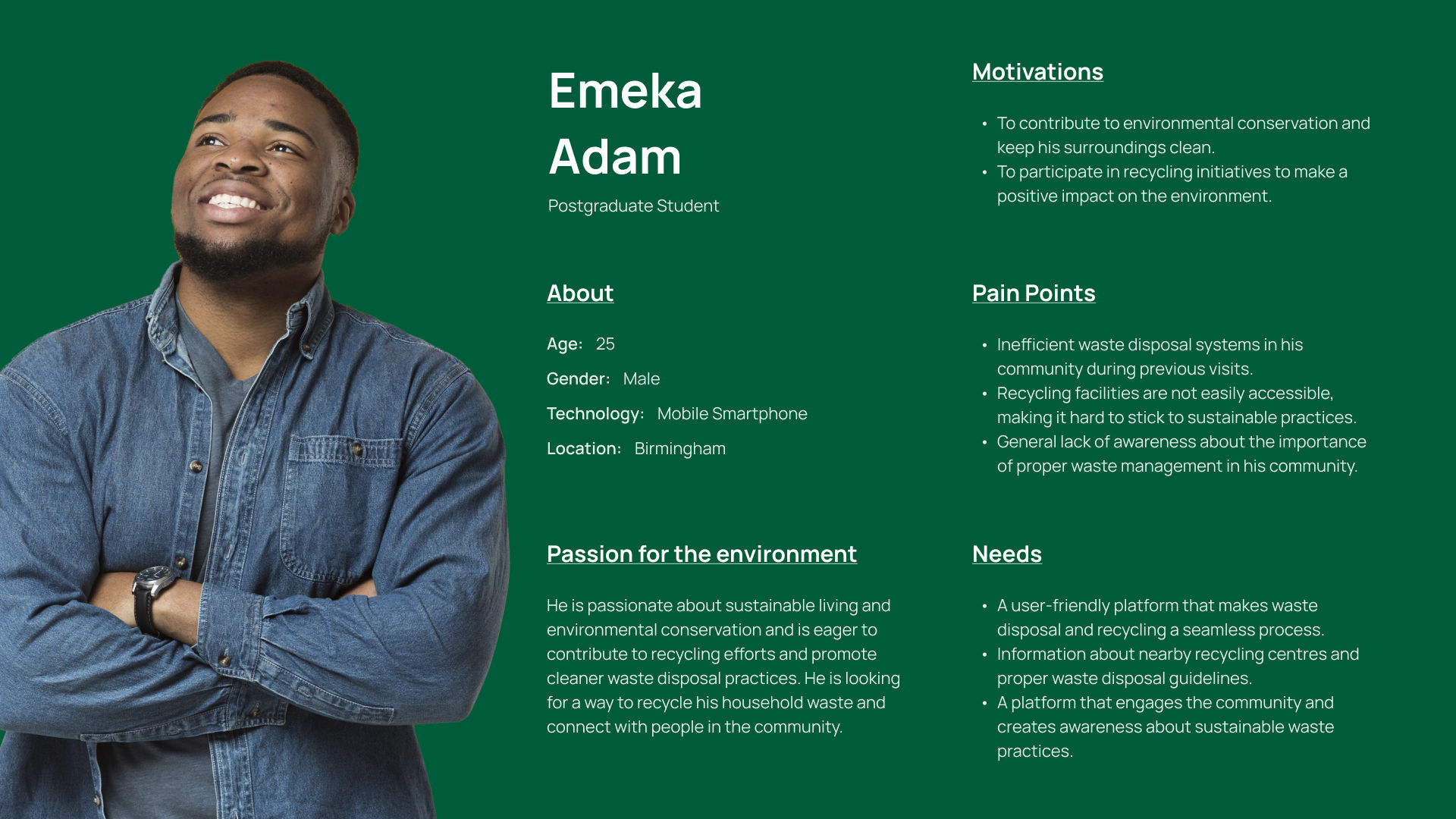
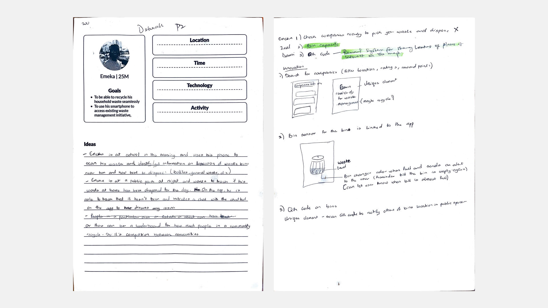
2. Defining the User Requirements
Using the insights I got from the user research, I created the persona to capture the user's needs and motivations. The insights also guided the creation of the card system used in the ideation workshop.
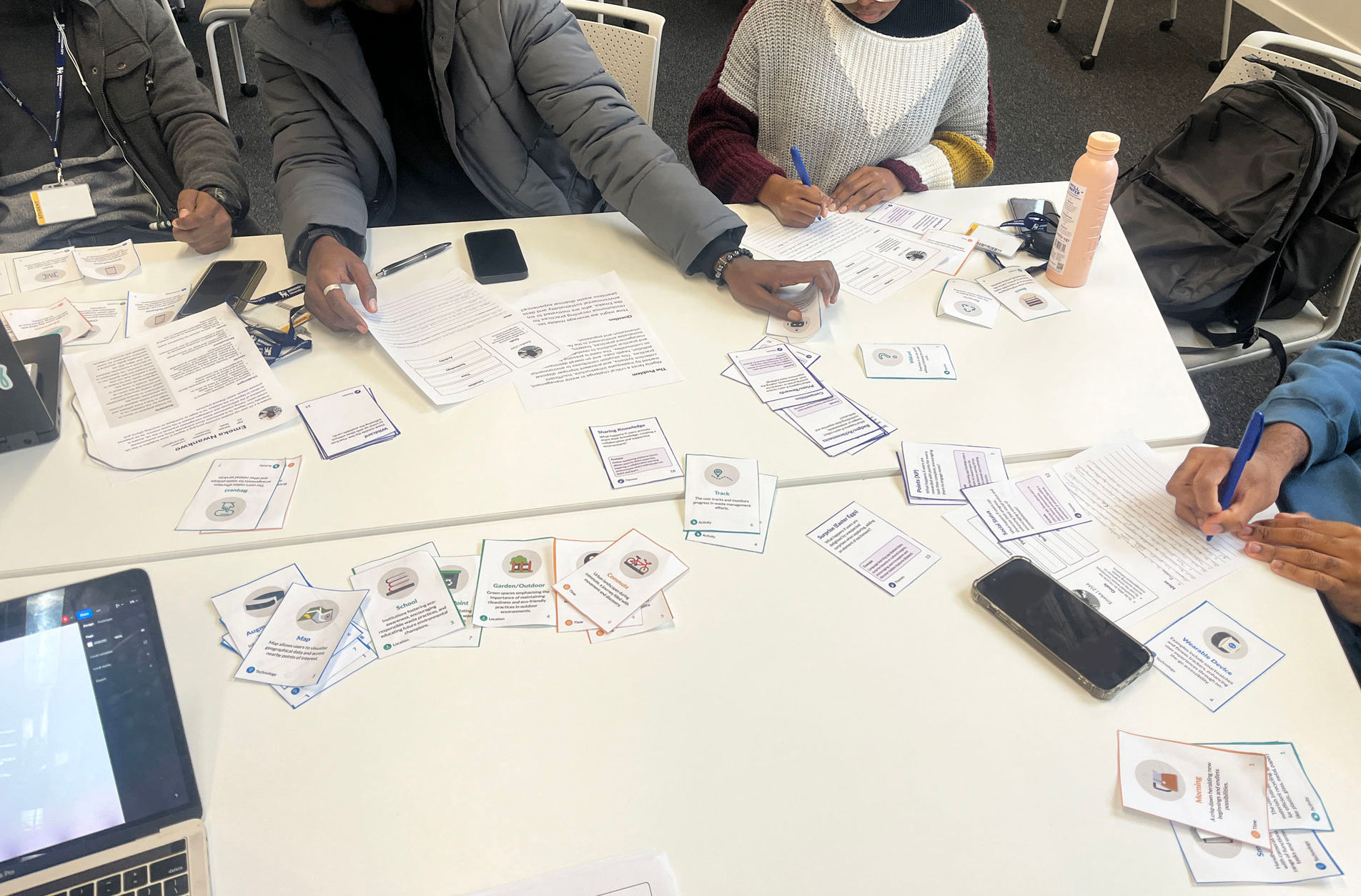
3. Ideation
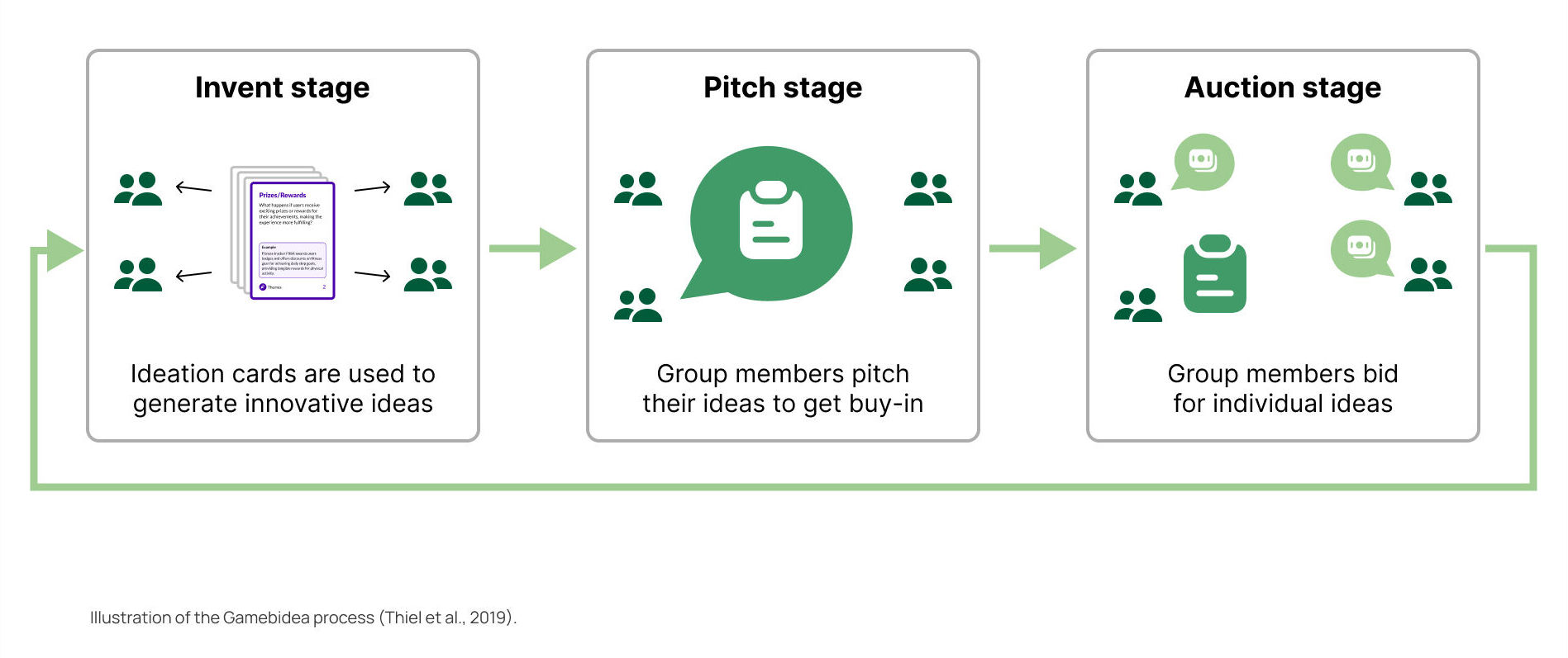
The ideation stage was a collaborative process involving participants using a gamified ideation process called “Gamebidea” to generate ideas. A custom ideation card system was used to guide the participants, helping them to create scenarios and see the user's problem from different lenses.
The ideation card system was designed to help with scenario development focusing on key elements like time, location, technology, and activity (Taking inspiration from Instant Cards). The theme cards used game mechanics to help develop innovative ideas, while the criteria cards helped the assessment of the ideas. The card system was designed to be easily understandable using colours, symbols, and typography. The size of the cards was also considered to be easily handled by the participants.
After generating the ideas, the participants all pitched their ideas before moving to the next stage which was the auction stage. In this stage, the participants were allotted game money and had to bid for the ideas they preferred. The bought ideas at the end of the workshop were selected for further evaluation.
The ideation process was found to improve engagement with the use of constraints and game elements. The ideation cards were found to be effective in developing contextual scenarios and also in generating and evaluating ideas.
Providing structure
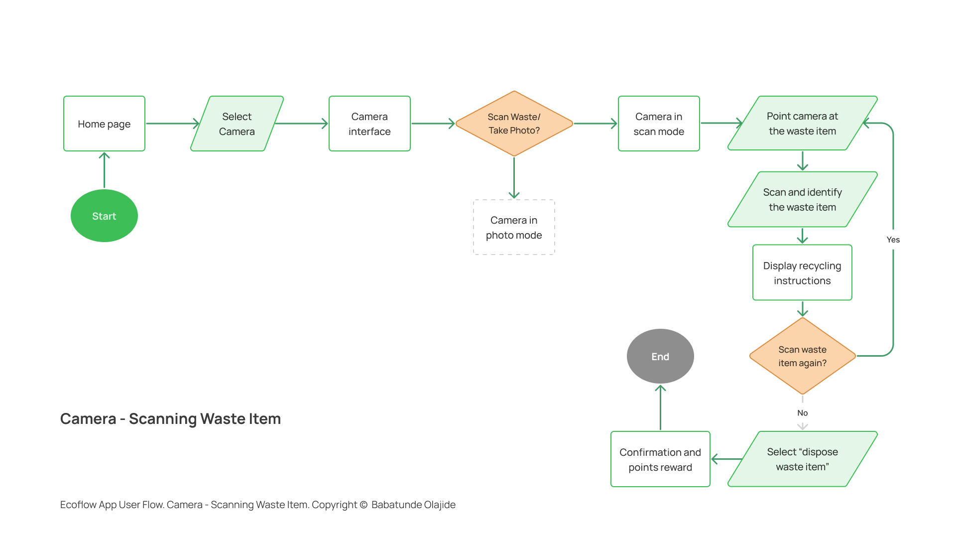
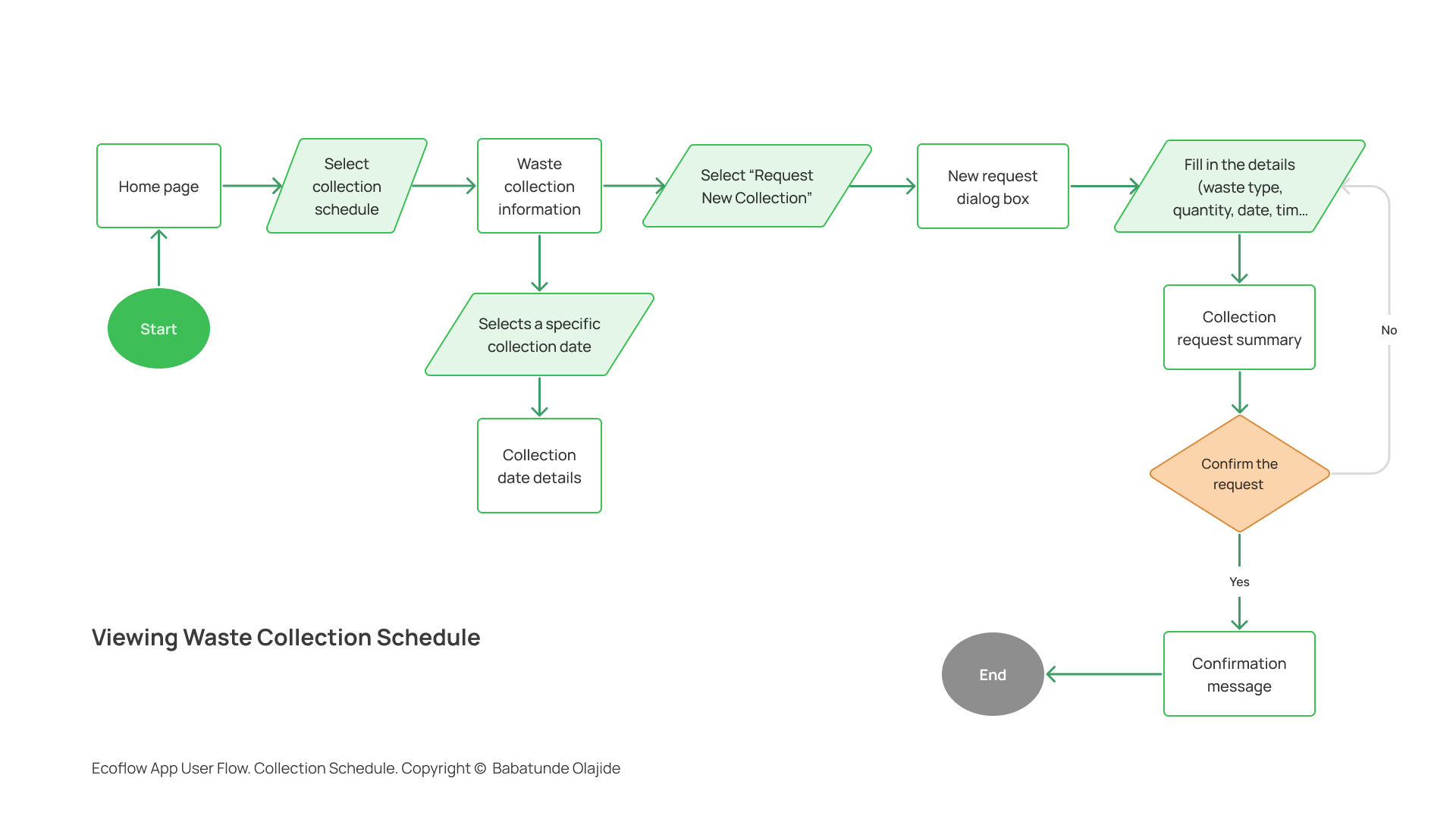
I designed the application structure to be intuitive and user-friendly, using User Flows and Hierarchical Task Analyses (HTAs) to break down user journeys and mitigate potential challenges.
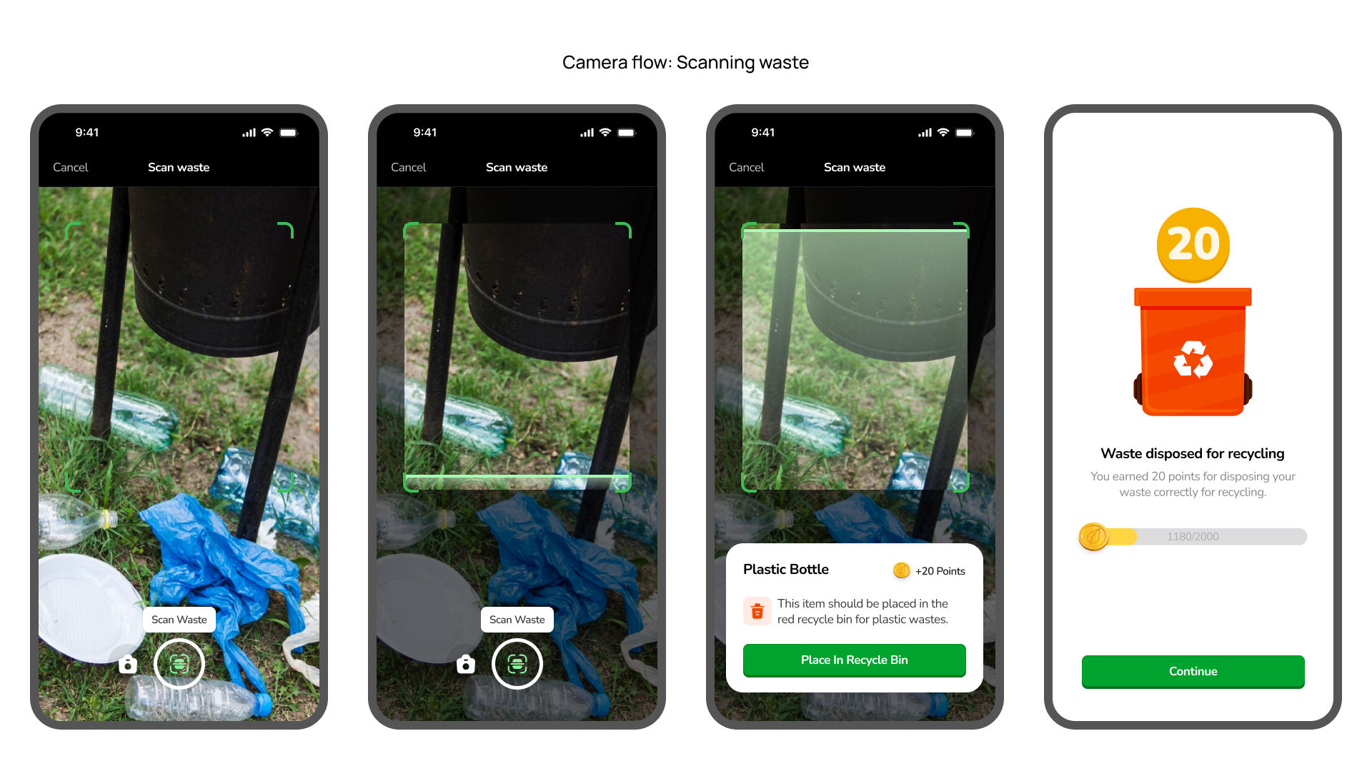
Mapping out the detailed steps for critical tasks like checking waste pickup schedules and using camera features provided valuable insights. By visualising each decision point and action, I could better understand the user's thought process, pinpointing potential stumbling blocks and areas of confusion. Streamlining the camera workflow simplified the user experience, enabling effortless scanning and photo capture while minimising user effort and cognitive load.
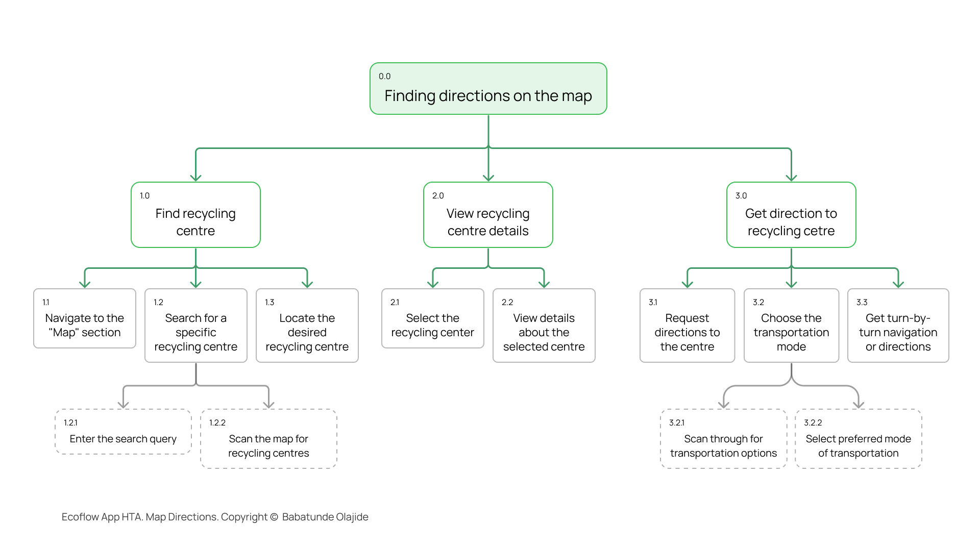
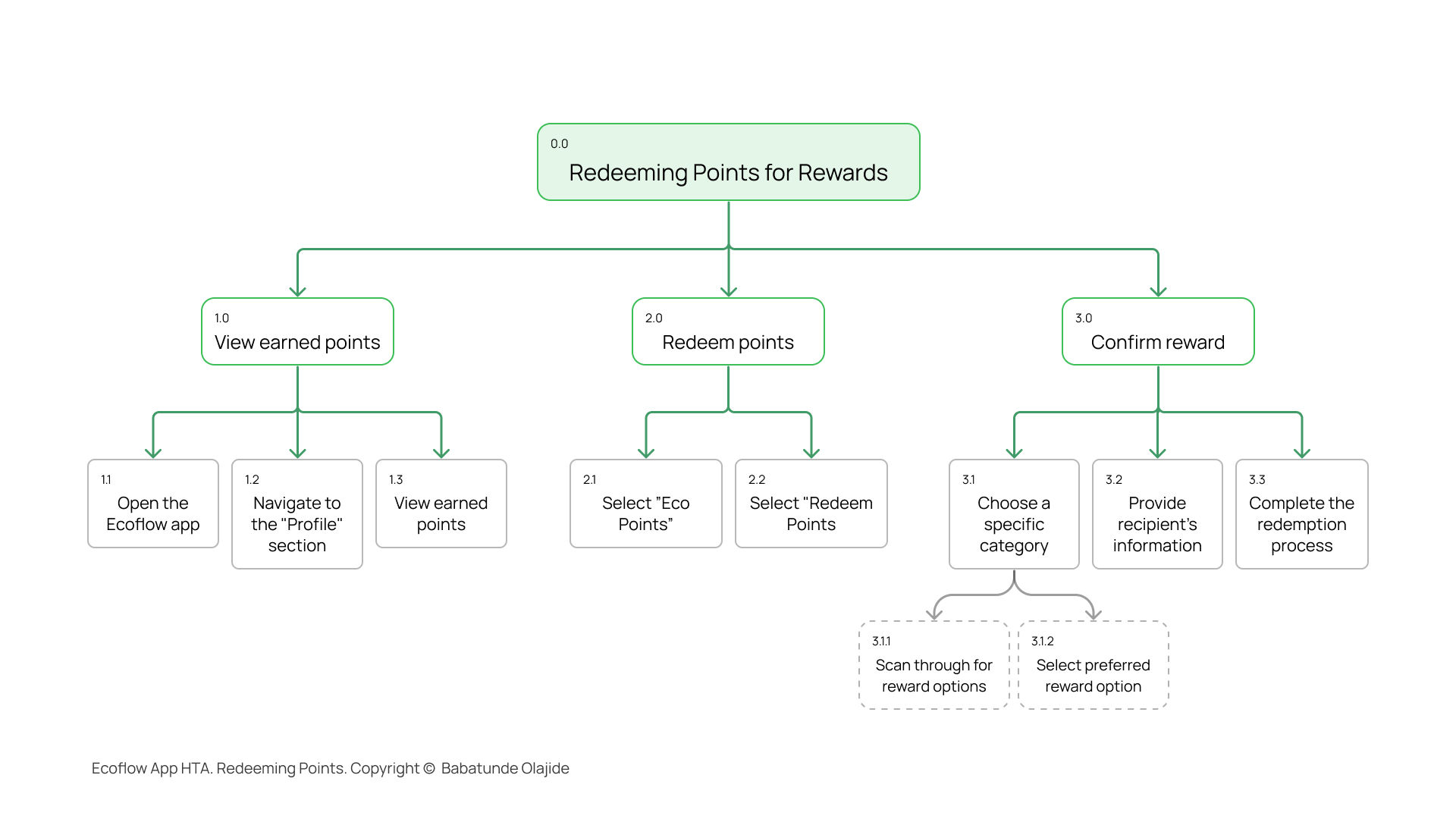
Creating HTAs for complex actions like redeeming points and finding directions allowed me to identify opportunities for simplification by breaking tasks into smaller subtasks. The HTA for finding map directions highlighted potential friction points like selecting recycling centres or transportation modes, allowing me to address usability concerns easily.
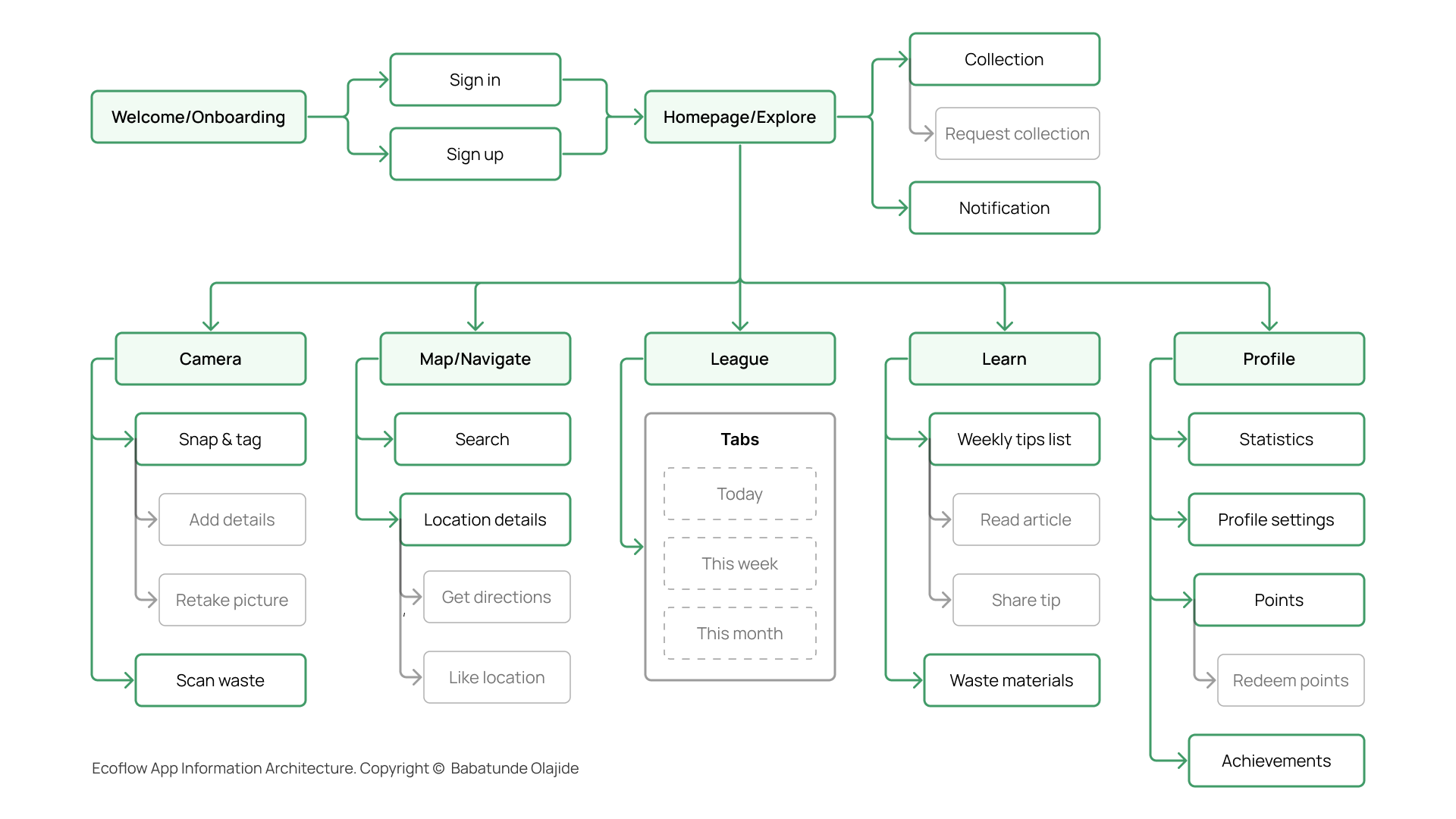
Based on user requirements and insights from the ideation workshop, I developed an information architecture to logically structure content and ensure an intuitive flow of information within the application.
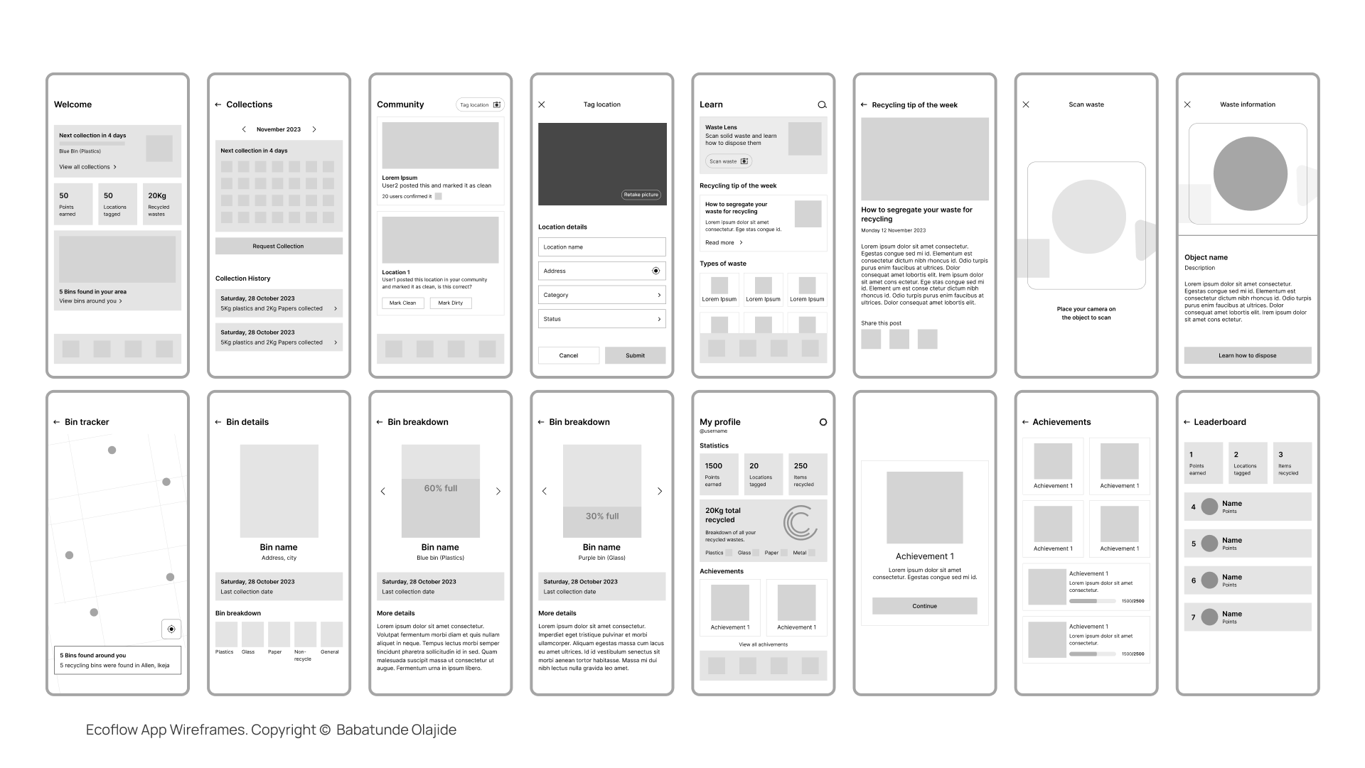
Wireframes were created to visualise the layout and structure of the app, focusing on the placement of key elements and interactions. The wireframes were iterated based on feedback and user testing to ensure a seamless user experience.
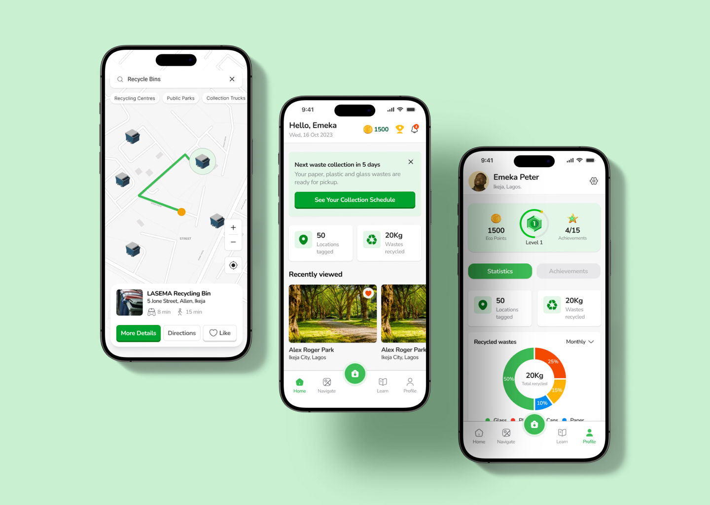
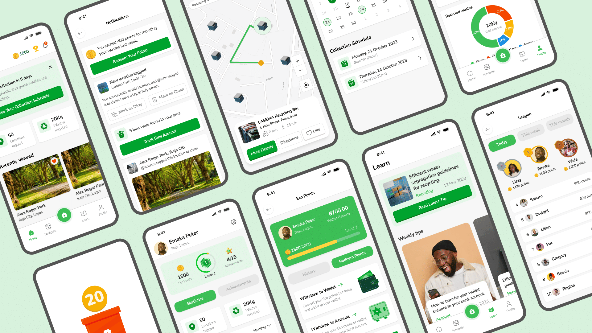
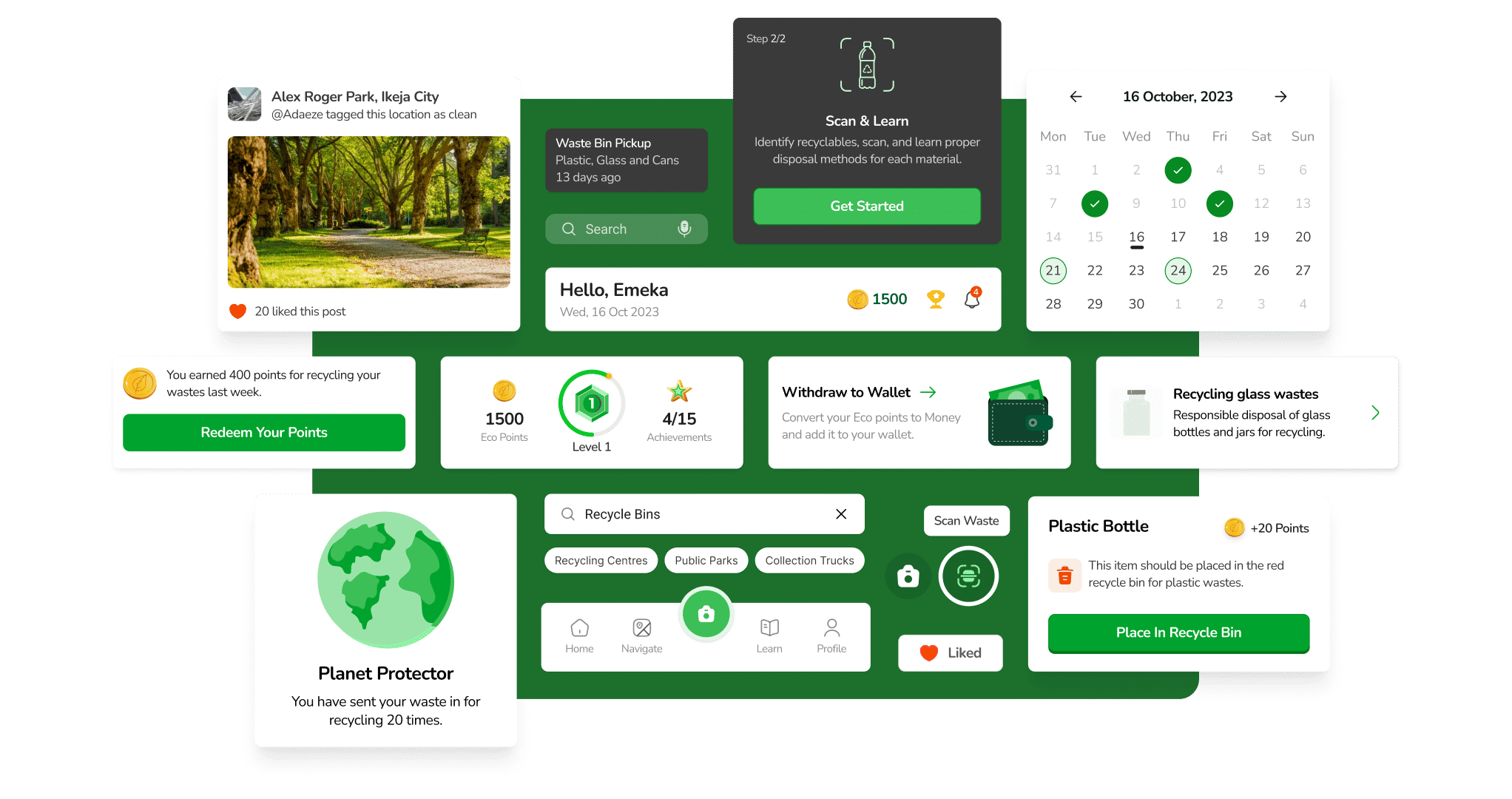
4. Design
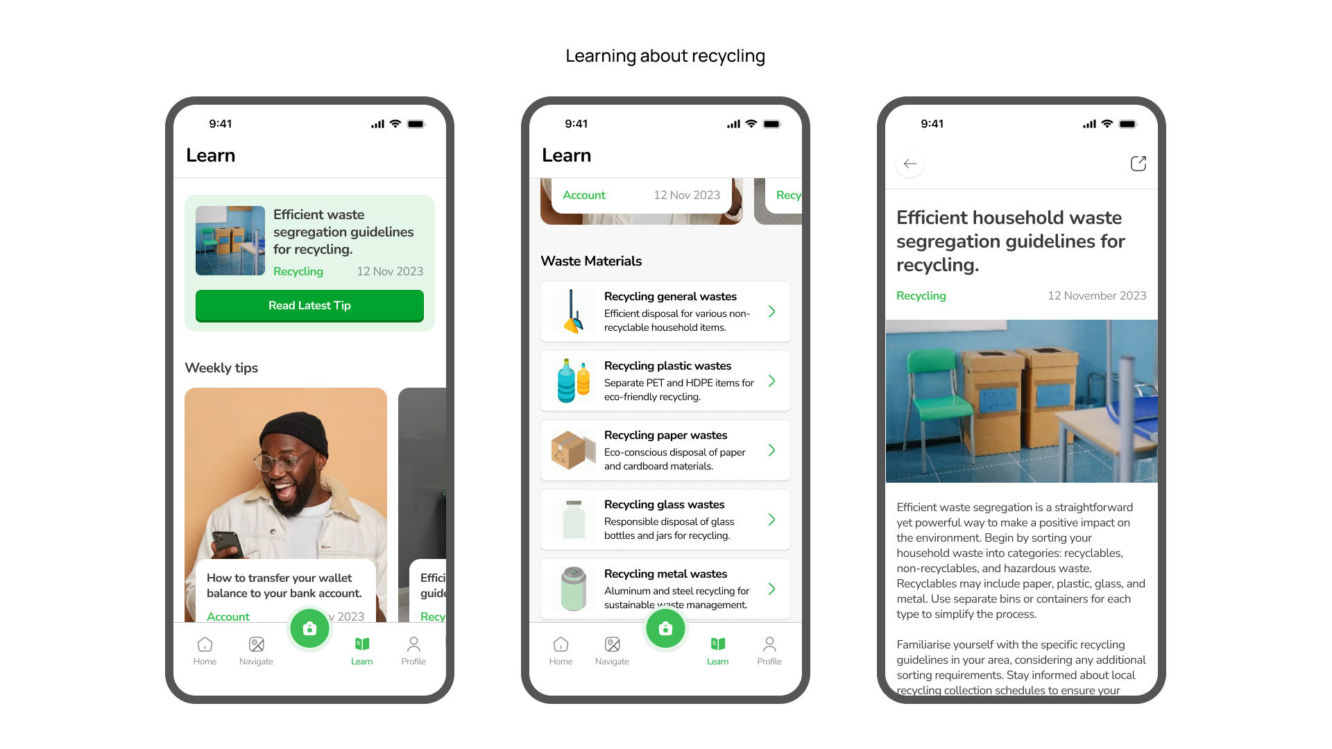
The visual design was inspired by the theme of sustainability and recycling, using a green colour palette and eco-friendly imagery. The UI elements were designed to be clean and minimalistic, ensuring a modern and engaging look. The typography and iconography were chosen to be easily readable and recognisable, enhancing the user experience.
The high-fidelity prototype was developed using Figma, allowing for interactive testing and feedback. The prototype was iterated based on user testing and stakeholder feedback to ensure that it meets users' expectations.
5. User Testing
A user testing study was conducted with the primary goal of evaluating the usability and effectiveness of the designed prototype. The study involved two rounds of testing, with the first round involving 10 participants and the second round involving an additional 10 new participants. The key insights are outlined below.
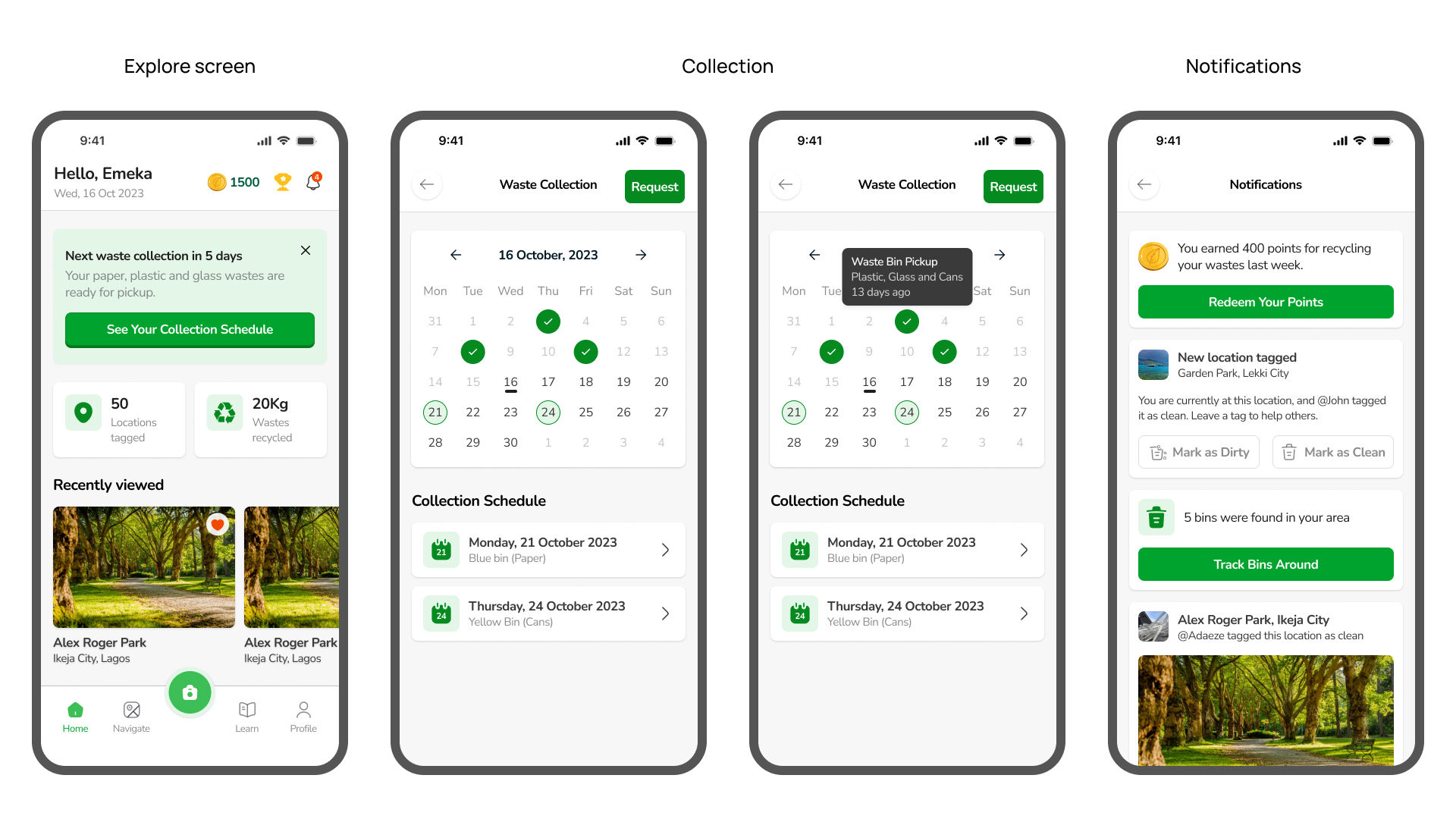
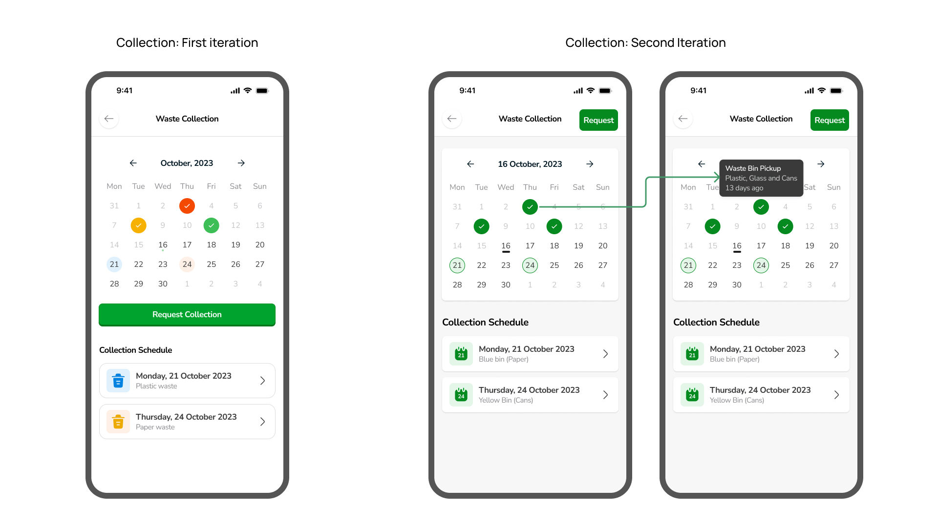
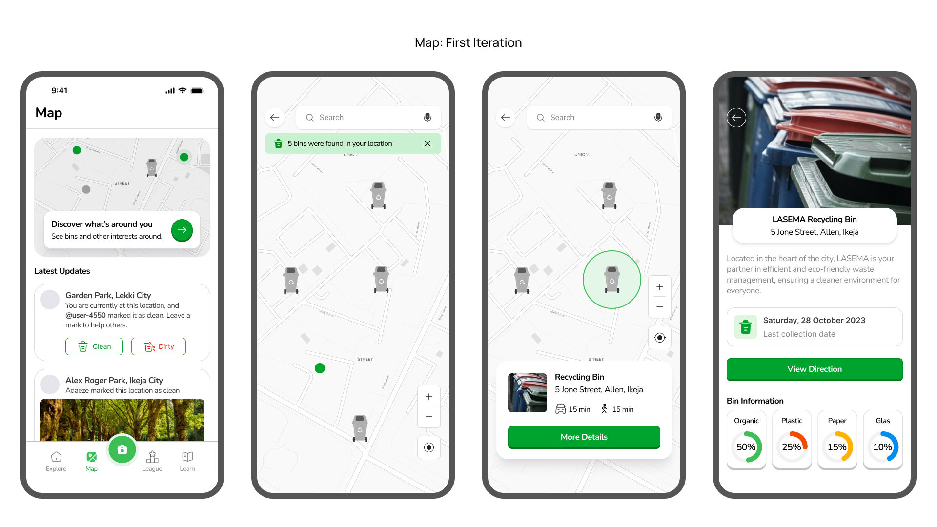
5.1 Streamlining Waste Collection Schedules:
During the initial round of testing, 7 out of 10 participants expressed confusion regarding the colour coding and categorisation of materials for waste collection schedules. They found it challenging to understand which specific recyclables were accepted on each day. To address this, a clear and detailed breakdown of accepted materials was implemented for each collection day, eliminating ambiguity.
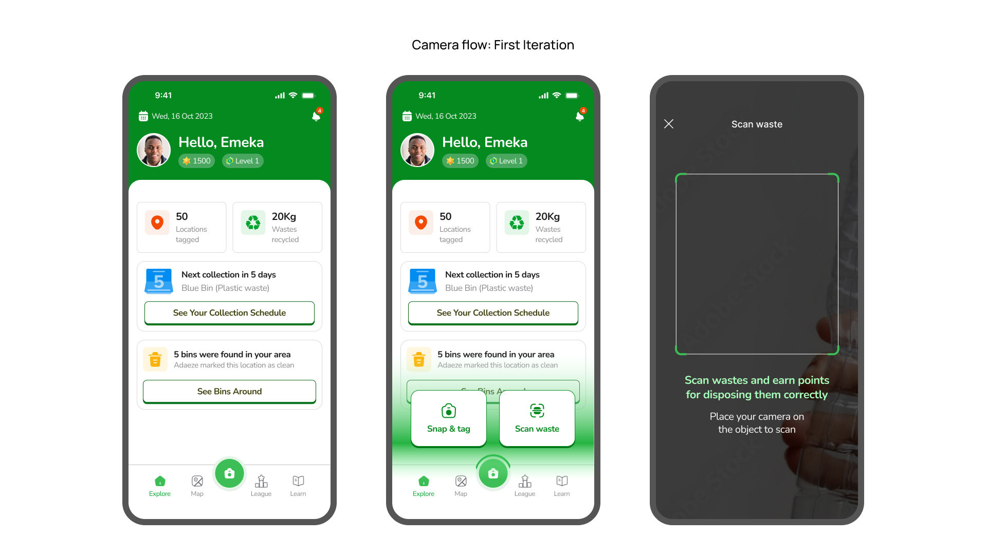
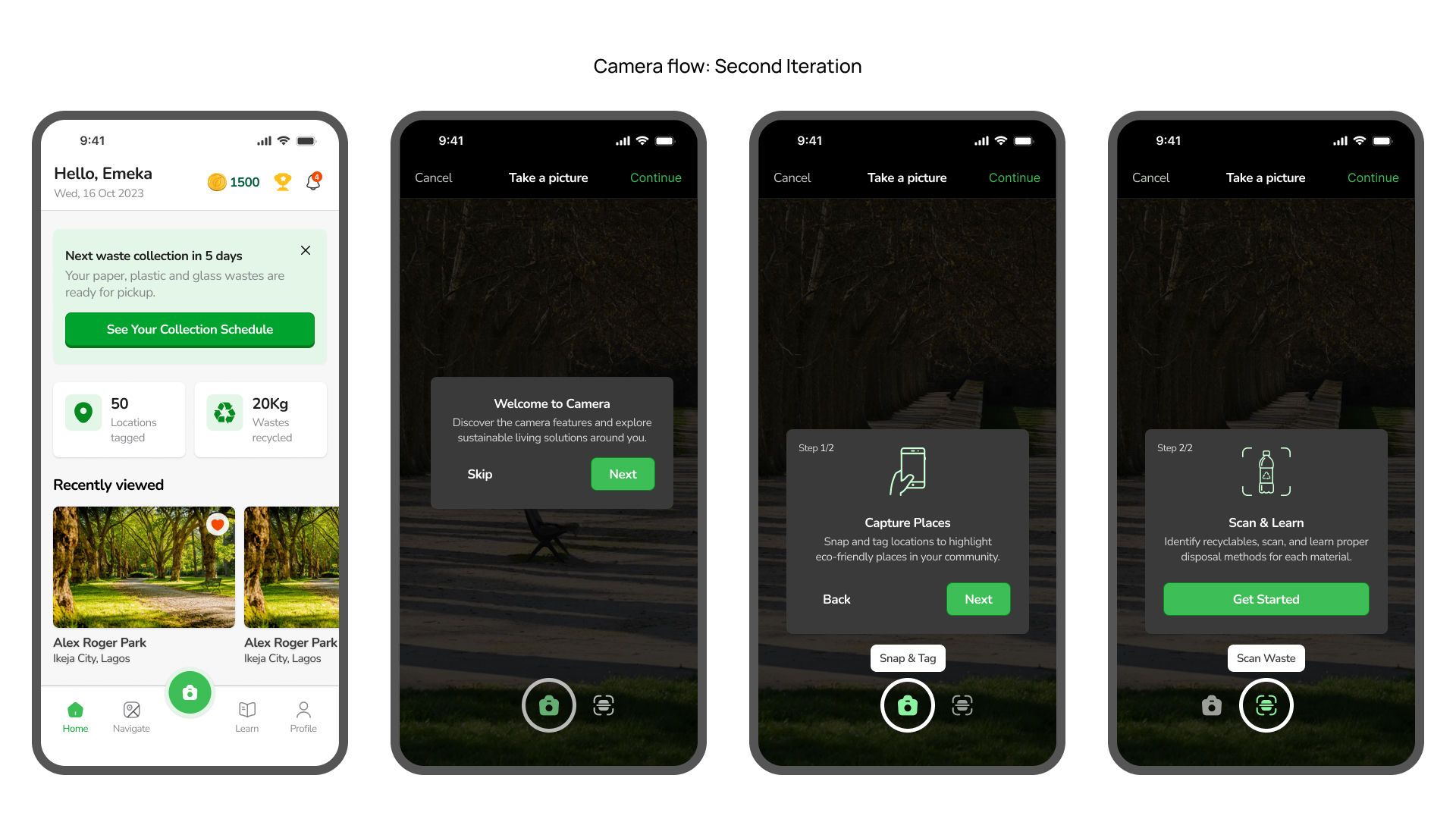
5.2 The Camera Experience:
In the first round, 8/10 participants found the initial camera flow confusing when attempting to switch between photo and scanning modes. They desired a more seamless transition without having to exit the camera screen. The camera screen was redesigned including contextual popups and an improved onboarding process. These changes provided users with better guidance and a more intuitive experience.
After implementing these changes, the second round of testing revealed a significant improvement, with 9/10 participants expressing satisfaction with the updated camera flow.
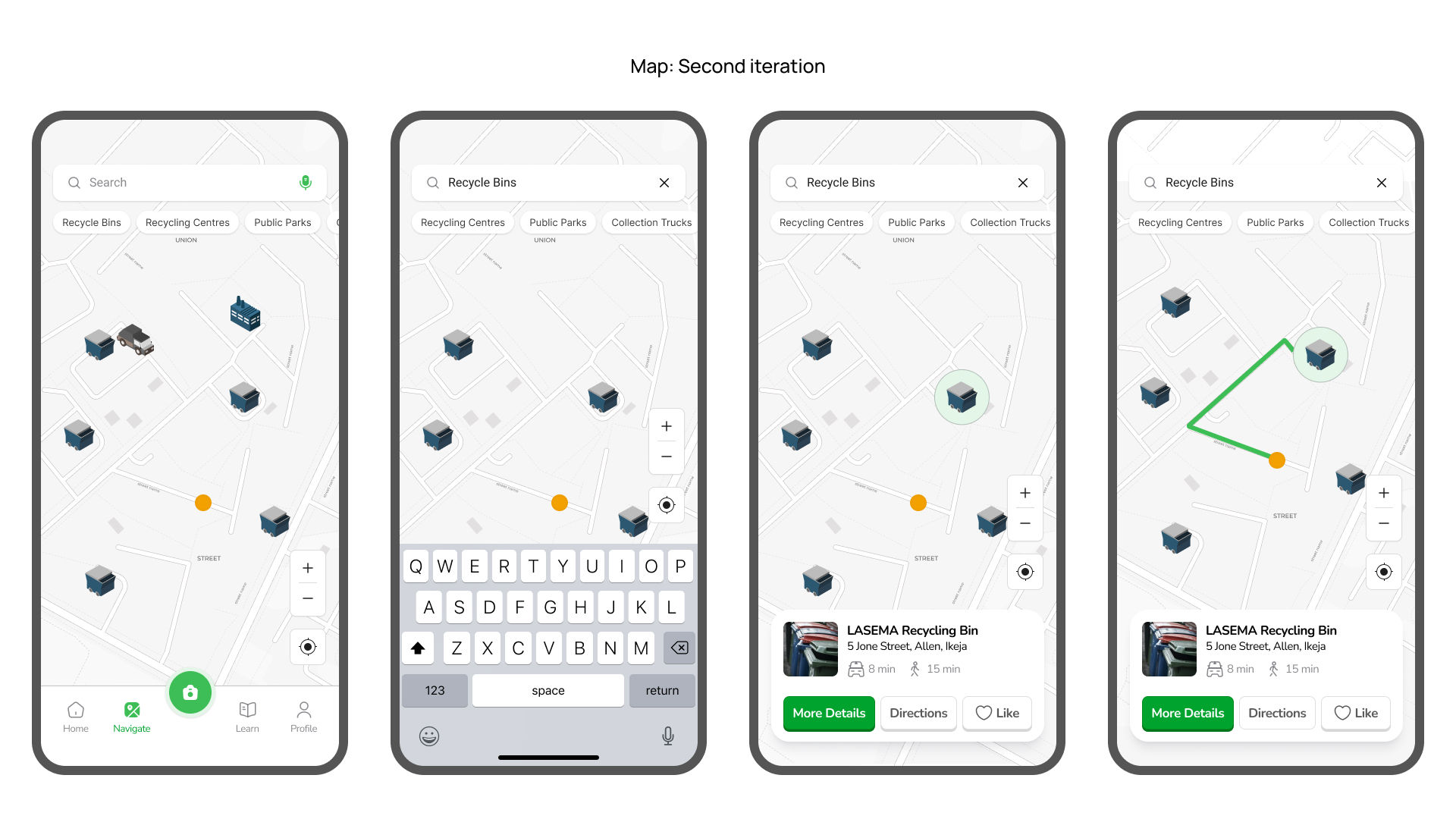
5.3 Accessible Visual Guides:
During the initial testing, 6/10 participants expressed a need for visual guides and turn-by-turn directions to locate nearby recycling bins. This feedback was addressed by implementing animations and clear directions to recycling bins, significantly improving accessibility. One participant mentioned
"I love the map feature! It's so easy to find recycling bins now. I can't wait to start recycling more!" - User Testing Participant
In the second round of testing, 9/10 participants found the new design to be more accessible and user-friendly. Another participant expressed their satisfaction with the map animations, stating:
"I like the new animation and how easy it is to get directions to the recycling bins." - User Testing Participant
5.4 Incentivising Sustainable Behaviour:
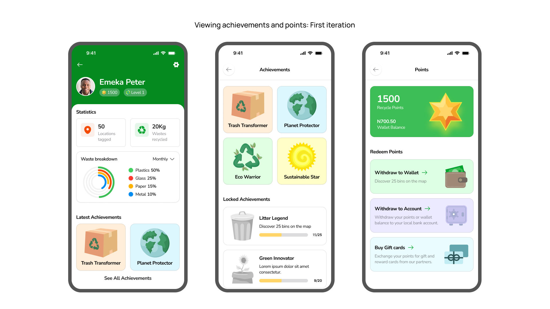
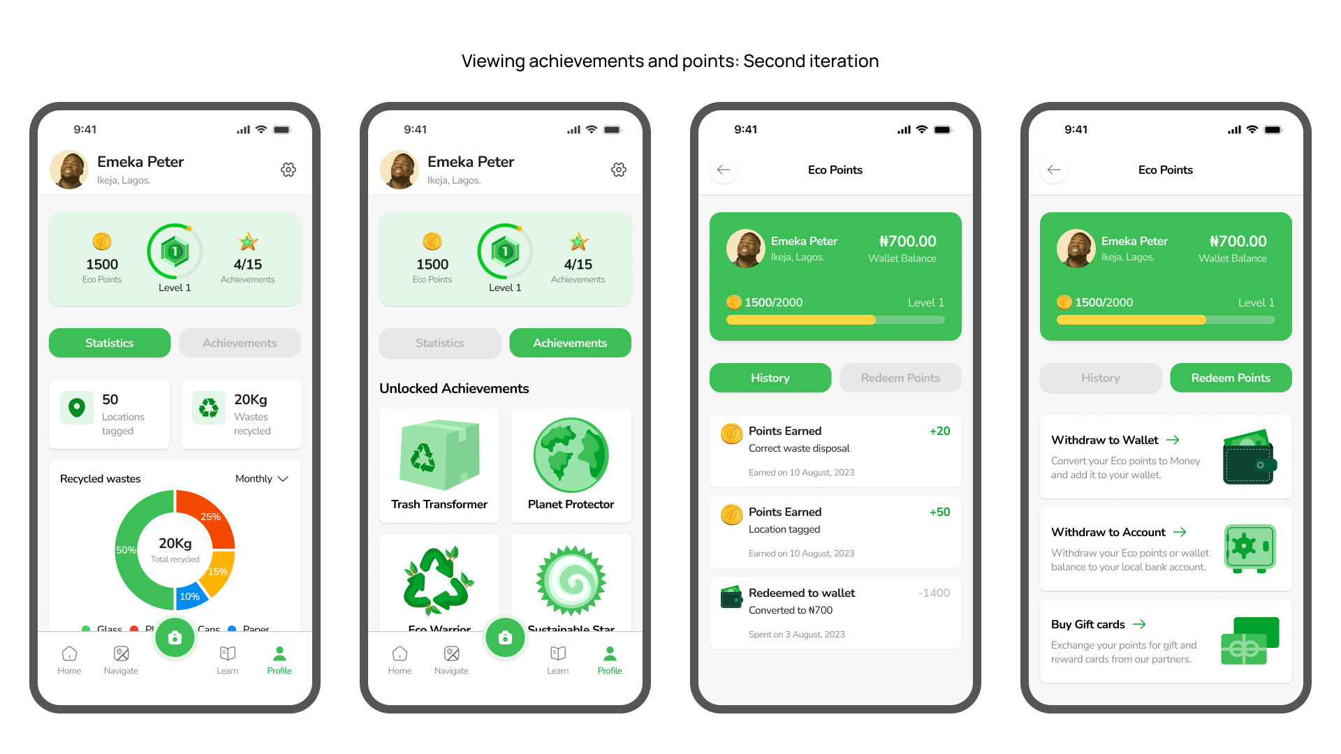
The first round of testing revealed that 8/10 participants had difficulty discovering and accessing achievement badges, as they were initially hidden on the profile page. This hindered user engagement and motivation. To address this, the profile page was redesigned to prominently display points and achievement badges, increasing visibility and incentivising sustainable behaviour.
5.5 Prioritising Accessibility
Accessibility was a key priority in designing Ecoflow. User feedback led to the implemention of visual guides, turn-by-turn directions, and real-time updates on recycling bin capacity using smart bin technology. This empowered users with accessible information for locating bins and planning trips. The app's design also adhered to Web Content Accessibility Guidelines (WCAG) to ensure inclusivity for users with diverse abilities. By prioritising accessibility, Ecoflow aims to create an inclusive experience, enabling broader participation in sustainable waste management practices.
Next Steps
This case study explored the design process of Ecoflow, a mobile application aimed at bridging the awareness gap and motivating users to actively participate in sustainable recycling practices. Through research, collaborative ideation, design, and user testing, I uncovered valuable insights that helped me to create an engaging and user-centric solution that makes recycling fun and rewarding. To further enhance the app's effectiveness and broaden its impact going forward, the following recommendations are proposed:
Refine the prototype based on user feedback and conduct further user testing to validate its effectiveness in promoting sustainable waste management practices and motivating long-term behavioural change.
Involve a larger and more diverse group of participants in future ideation workshops, opening up a broader range of perspectives and increasing the quantity of ideas generated.
Extend the duration of future workshops, allowing for multiple rounds of ideation and providing participants with adequate time to explore and refine their ideas.
Include younger participants, as their unique perspectives could contribute valuable insights into recycling practices tailored to their demographics.