Hirefoster Testing Platform
Refining the Candidate Experience for Better Matches and Faster Hires.
Refining the Candidate Experience for Better Matches and Faster Hires.

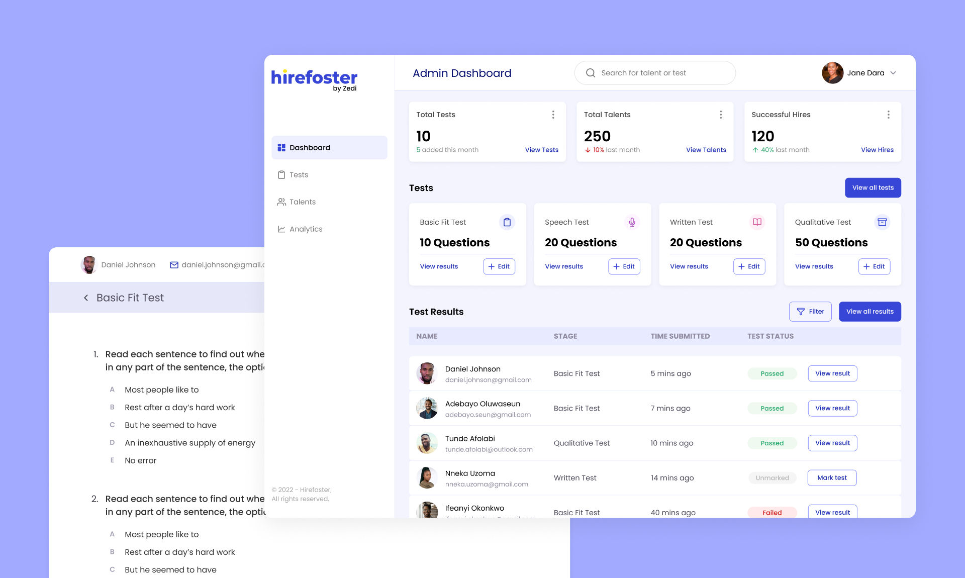
HireFoster is a recruitment solution connecting businesses with top marketing and growth professionals across Africa. Its Talent Testing Platform streamlines the hiring process by providing a comprehensive assessment system to accurately evaluate candidate skills, enhancing hiring efficiency and accuracy.
I was responsible for creating user personas, wireframes, UI designs, and prototypes, working closely with developers to build and deploy the platform. I also developed a design system to ensure consistent, scalable design, enabling seamless integration of new features.
HireFoster's recruitment process lacked a streamlined and centralised system for assessing marketing professionals' skills. Recruiters struggled to efficiently monitor and manage the various stages of talent selection. Similarly, marketing professionals struggle to demonstrate their competencies, find suitable job opportunities, and secure positions aligned with their skills and aspirations.
Existing job platforms in the region did not cater specifically to the marketing industry, leading to inefficiencies and mismatches in the hiring process. HireFoster needed a centralised solution to streamline recruitment, enhance decision-making, and enable candidates to better showcase their skills.
How might we create a user-centred platform that facilitates efficient, reliable connections between pre-tested marketing professionals and employers looking to fill marketing roles?
The platform was designed to serve two main user groups:
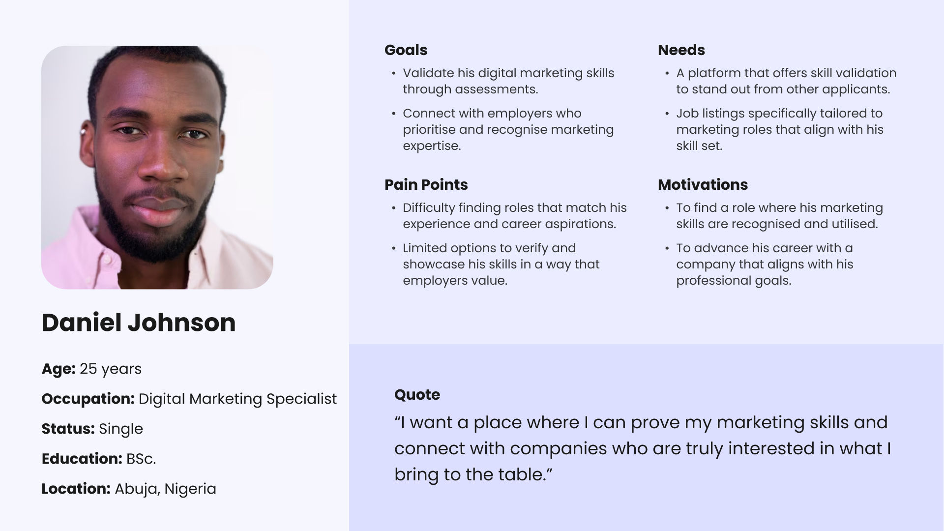
To better understand our users and their needs, we developed detailed personas for both employers and job seekers. These personas, based on our research findings, helped guide our design decisions throughout the project.
Jane urgently needs to fill a digital marketing role but has limited time for screening numerous applications. Using Hirefoster, she focuses on pre-screened candidates with verified skills, allowing her to shortlist candidates quickly based on experience, portfolio quality, and test scores—saving hours she’d otherwise spend sorting through CVs.

Daniel is eager to advance his career but has found it challenging to secure roles that fully utilise his digital marketing skills. By joining Hirefoster, he completes assessments in key areas, earning validated scores that help him stand out to employers. The platform’s focus on marketing roles further streamlines his job search, connecting him directly with companies prioritising candidates with his skill set.
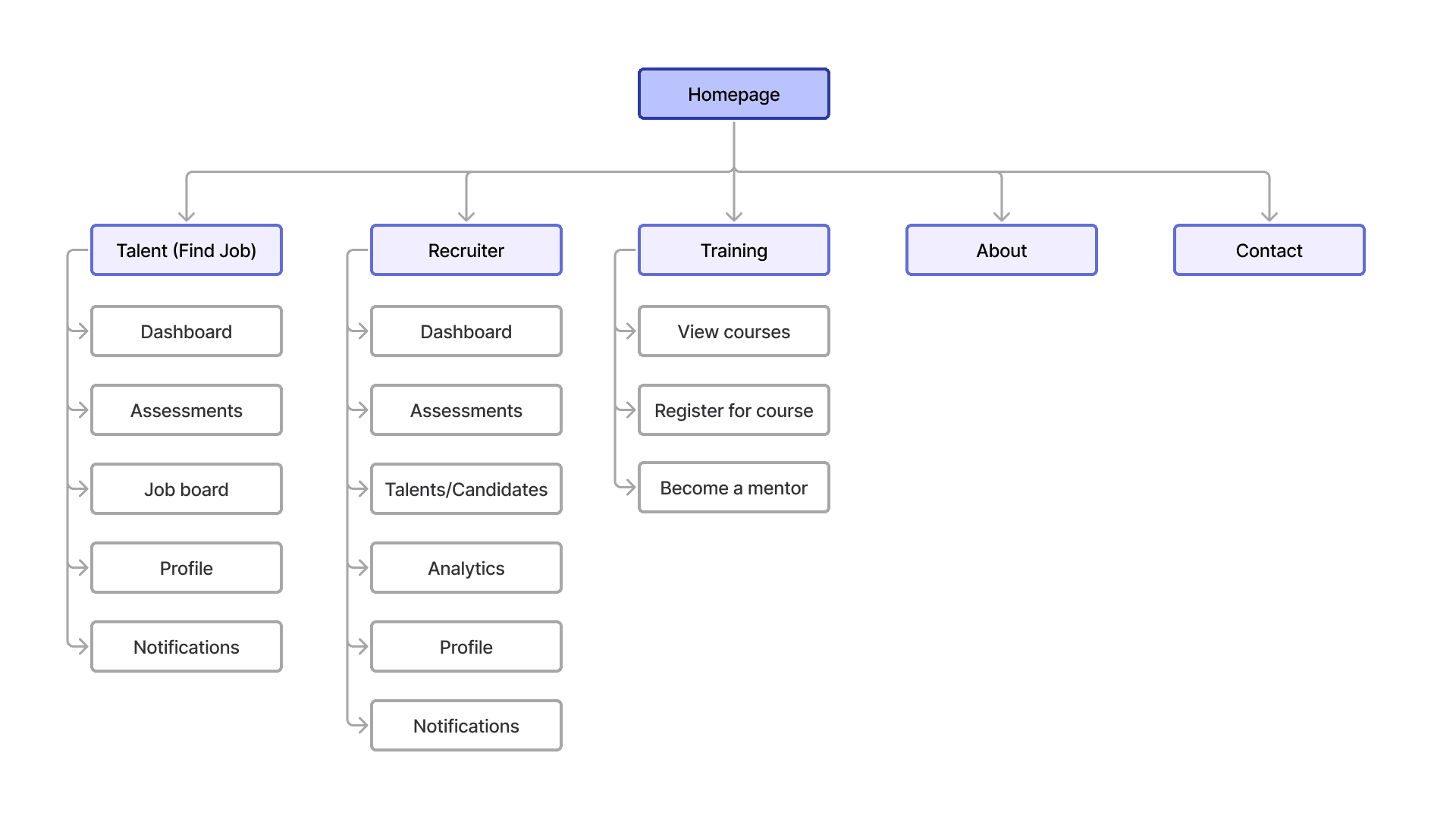
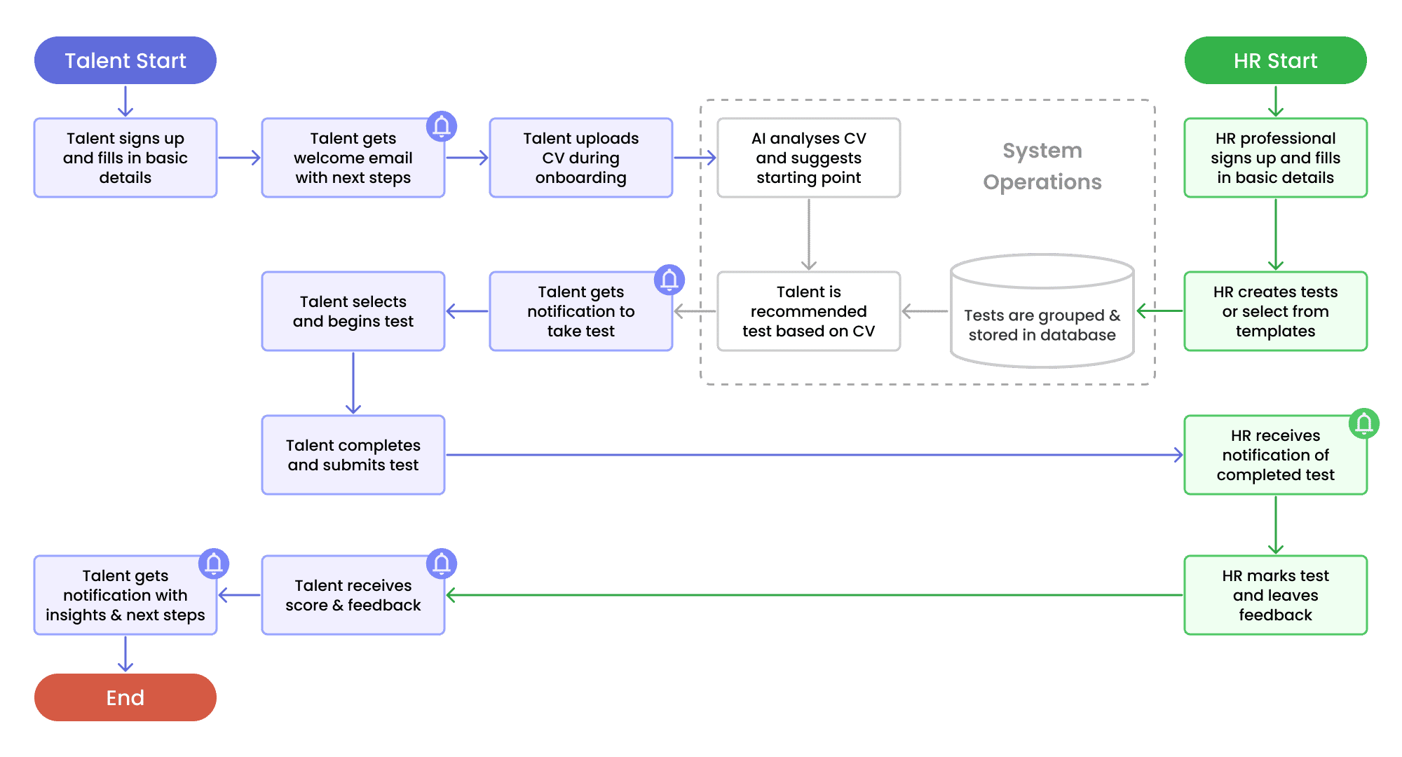
During the initial design phase, we noticed user misunderstandings with key onboarding and test-taking flows after interactions with users. These insights highlighted the need for a streamlined information architecture and user flow to optimise usability.
There were misunderstandings regarding:
This led us to create a well-detailed information architecture and refined flow to enhance clarity and efficiency throughout the user journey.
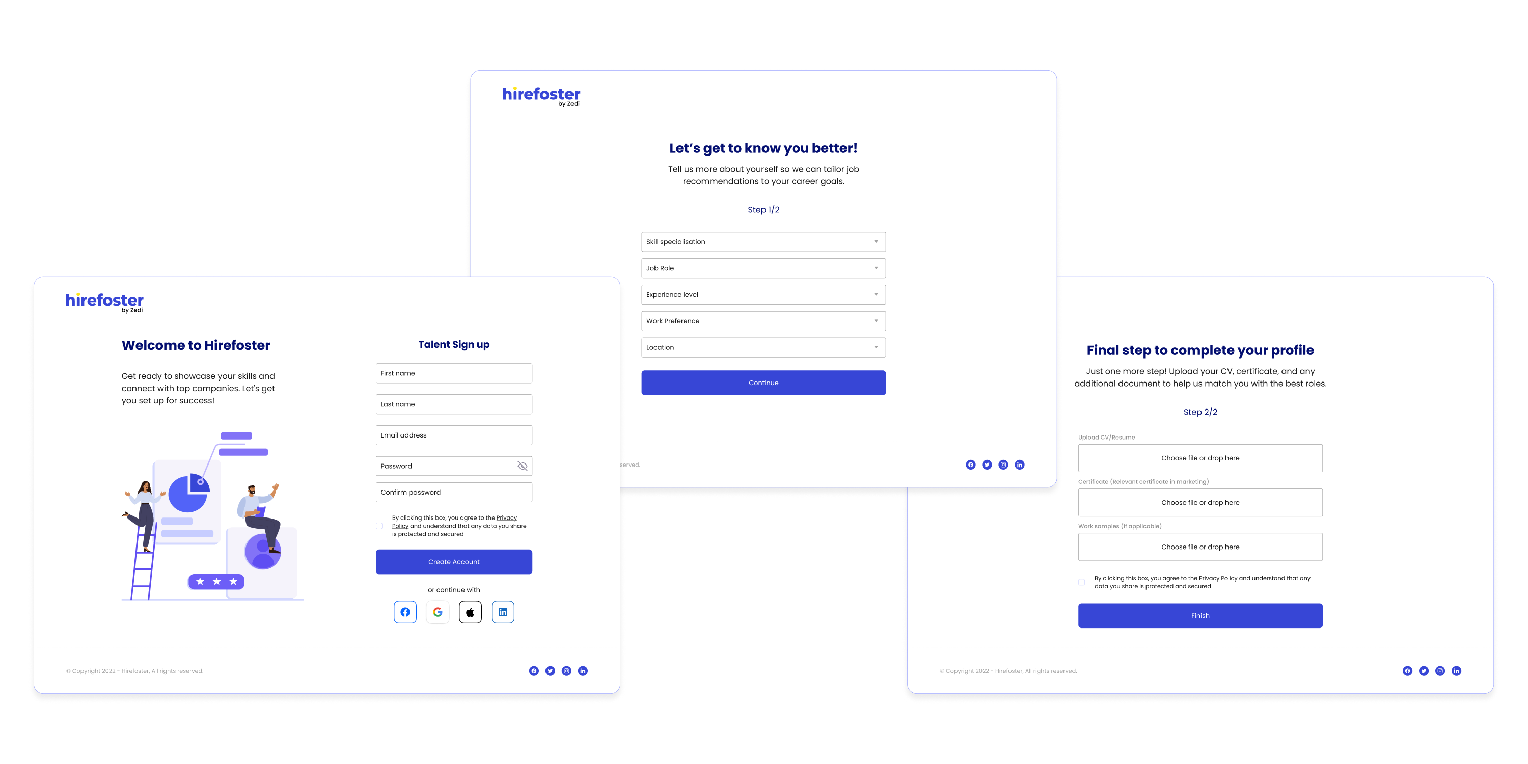
To enhance the onboarding experience for marketing talents, we streamlined the registration process by minimising unnecessary steps and required fields. A progress indicator was introduced to inform users of their status, along with a welcoming message.
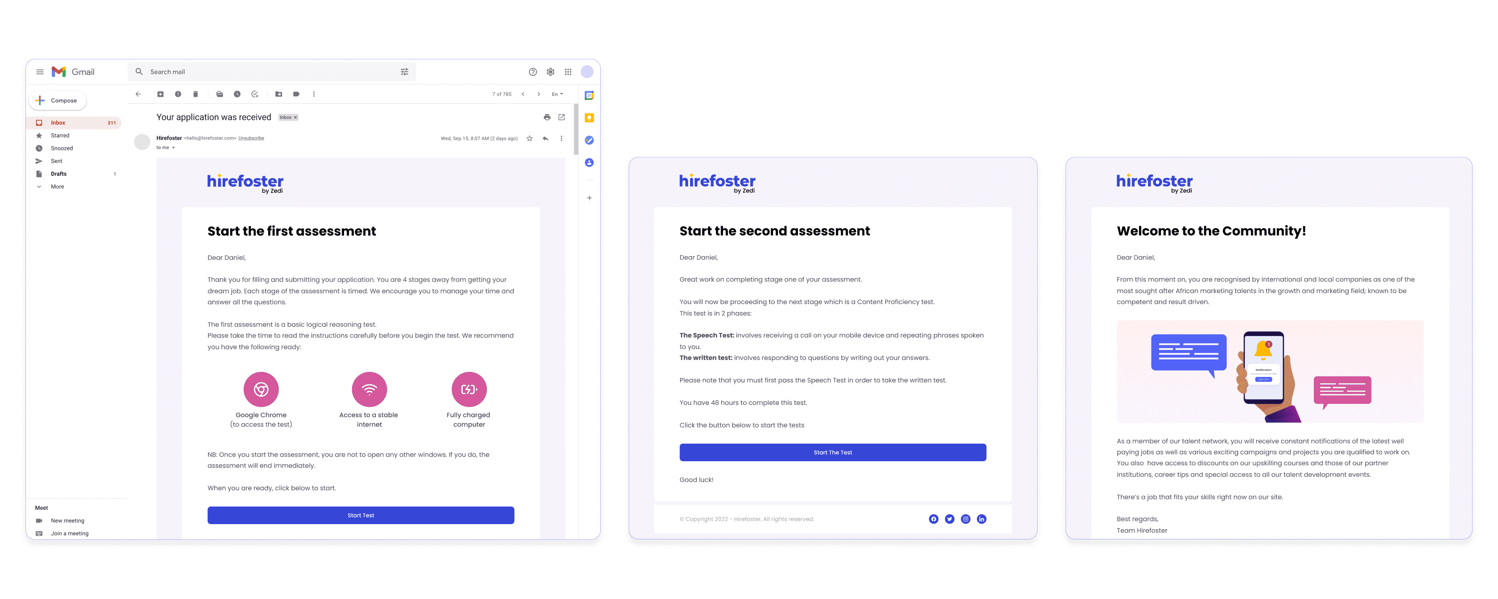
After user testing, we decided to deliver notifications via email for timely communication and included helpful tips post-onboarding to further guide users. The onboarding was also made mobile-responsive, allowing users to complete it on any device.
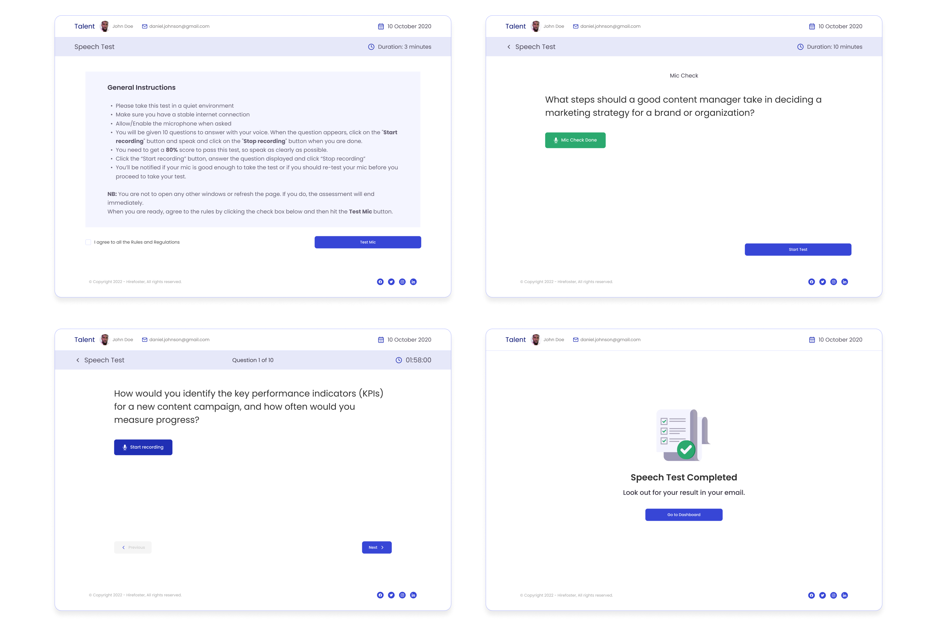
We created a user-friendly test interface that guides candidates through each assessment step. We added clear instructions and a progress tracker help users understand their current status in the test. Results are displayed post-completion, allowing users to view their performance immediately. To enhance accessibility, a mobile version of the platform was designed, enabling users to complete tests from any device.
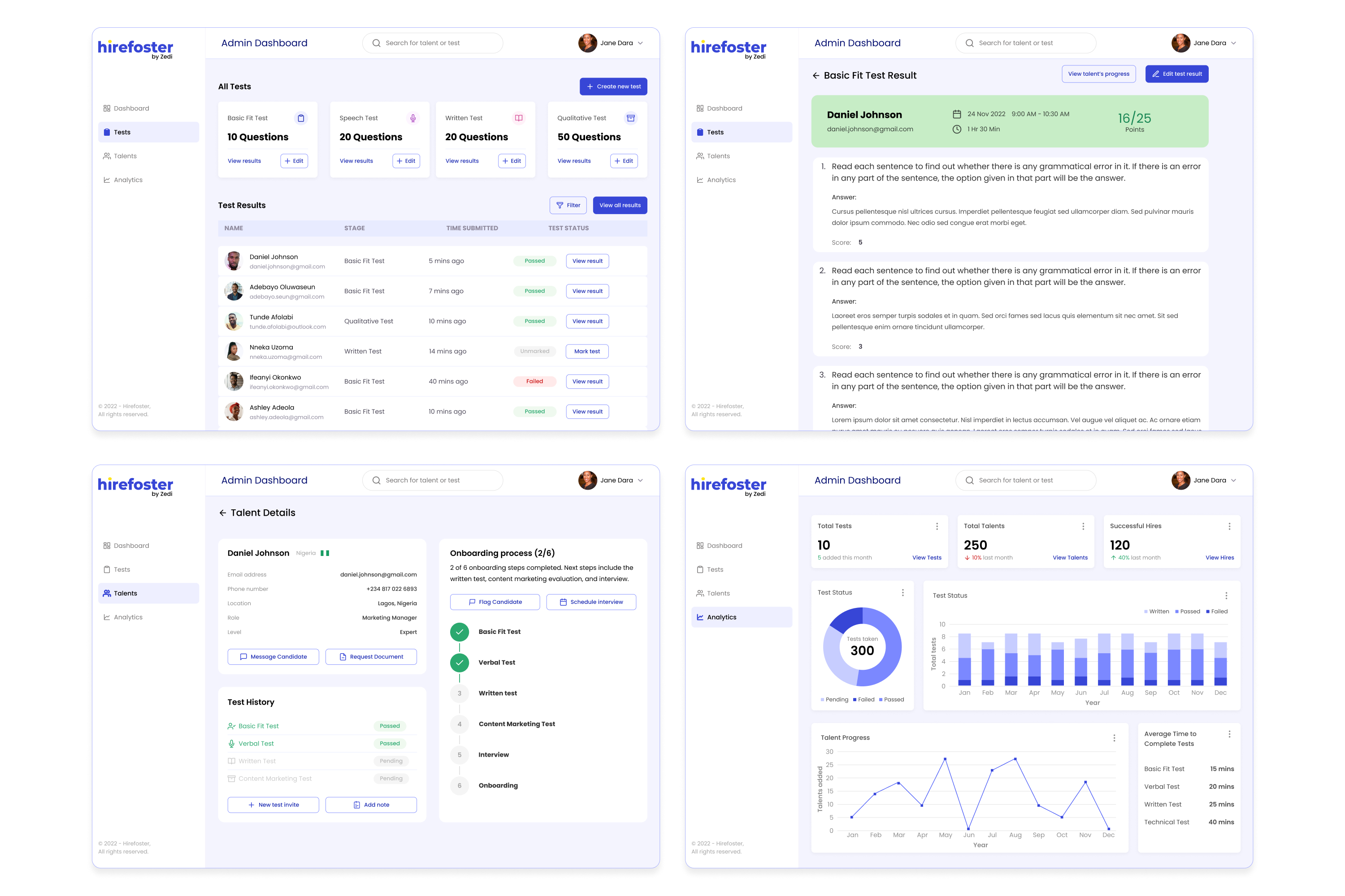
A dedicated section was developed for HR professionals to easily design and manage assessments. This feature allows them to customise test parameters, such as question types and scoring criteria, ensuring that each test aligns with the specific skills required for the role.
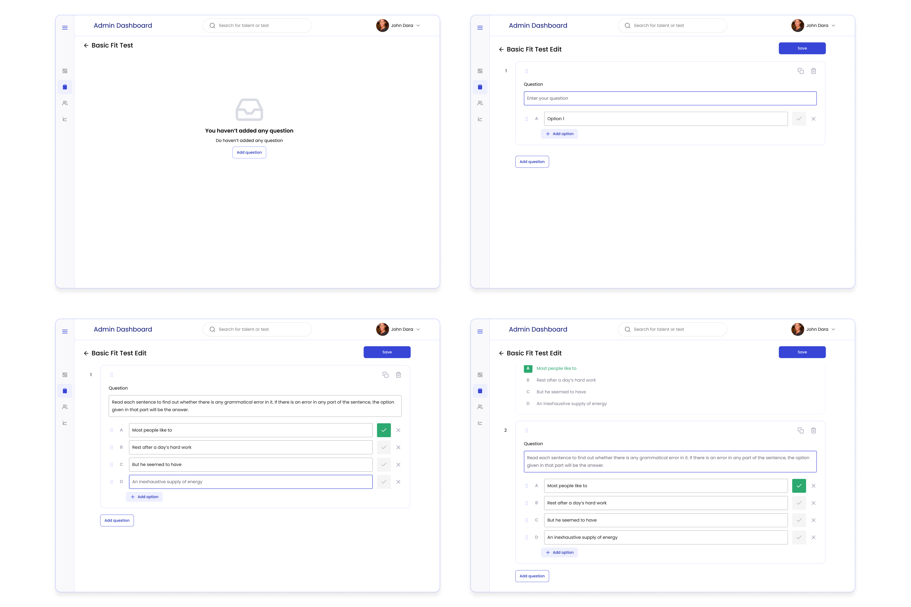
To streamline the marking process, we implemented an automated grading system that delivers instant results and feedback. This allows HR professionals to concentrate on qualitative assessments rather than spending excessive time on manual grading.
