Railtime
An accessible and inclusive train travel experience for people with disabilities, following WCAG standards.
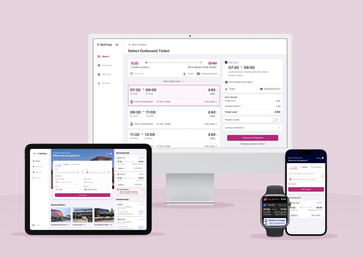
An accessible and inclusive train travel experience for people with disabilities, following WCAG standards.

Railtime is a mobile app designed to improve the accessibility and inclusivity of train travel for people with disabilities.It complies with WCAG 2.0 guidelines and is accessible to people with visual, auditory, physical and cognitive impairments. This case study highlights the design process and prototype development,
This project focused on addressing the specific needs of passengers with disabilities. I utilised tools like WCAG, ARIA, and user testing to ensure accessibility and usability. The project spanned 12 weeks, from May to September 2023.
The UK rail industry has experienced a substantial 44% decline in ridership in 2022, attributable to factors like the COVID-19 pandemic, and shifting consumer preferences.Compounding this issue is the significant accessibility barriers within the rail system.
Many people with disabilities face significant challenges when traveling by train. These challenges include difficulties with booking tickets, navigating stations, and accessing real-time travel information, which limits their independence and mobility. This makes train travel a daunting experience for them.
The goal of the Railtime app is to tackle the challenges faced by passengers with disabilities by providing an inclusive and seamless travel experience, empowering them to travel with confidence and independence. It offers a range of features tailored to address the passengers' diverse needs.
For the research, I conducted an online survey to understand the experiences of adults with disabilities when travelling by train. The survey focused on ticket booking, information provision, accessibility features, and support services. The survey received responses from 30 participants
In addition to the survey, I conducted semi-structured interviews with 10 adults with disabilities to gain insights into their experiences when travelling by train. The interviews focused on personal experiences and their motivations for commuting using the train. The research suggests that users with disabilities want to feel independent and empowered when using rail services.
Four key insights focusing on the four different types of impairments were identified during the research process:
I developed four personas representing users with visual, auditory, cognitive, and physical impairments. For each persona, I created scenarios capturing their unique challenges using rail services, assistive technologies used, and their preferred ways of engaging with technology. This persona-driven approach allowed me to deeply understand the diverse needs across the disability spectrum and design inclusive, tailored solutions addressing their specific requirements.
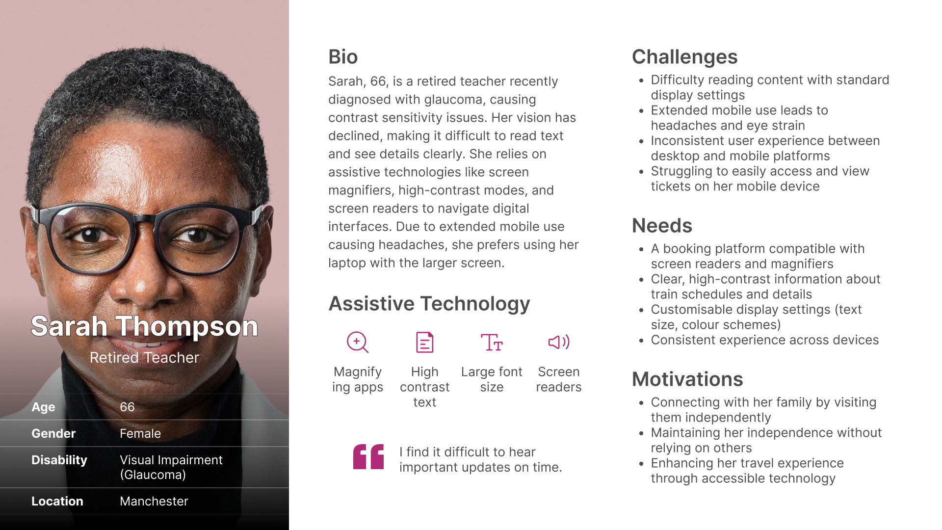
Sarah books a train ticket to visit her daughter on her laptop using the screen reader and keyboard controls. At the train station, she opens the mobile app but has trouble reading the small text. She navigates to the settings to switch to a high-contrast colour scheme and increase the font size. With the adjustments, she can comfortably view and scan her ticket before boarding.
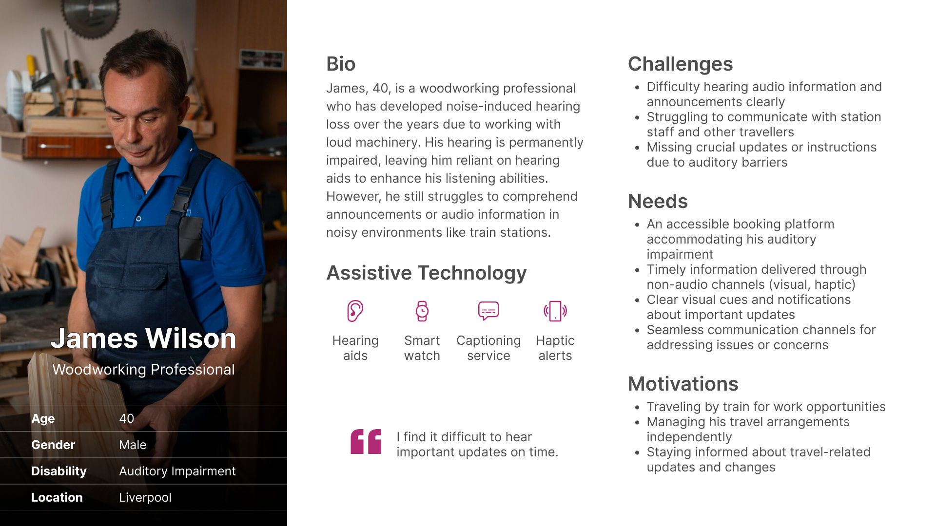
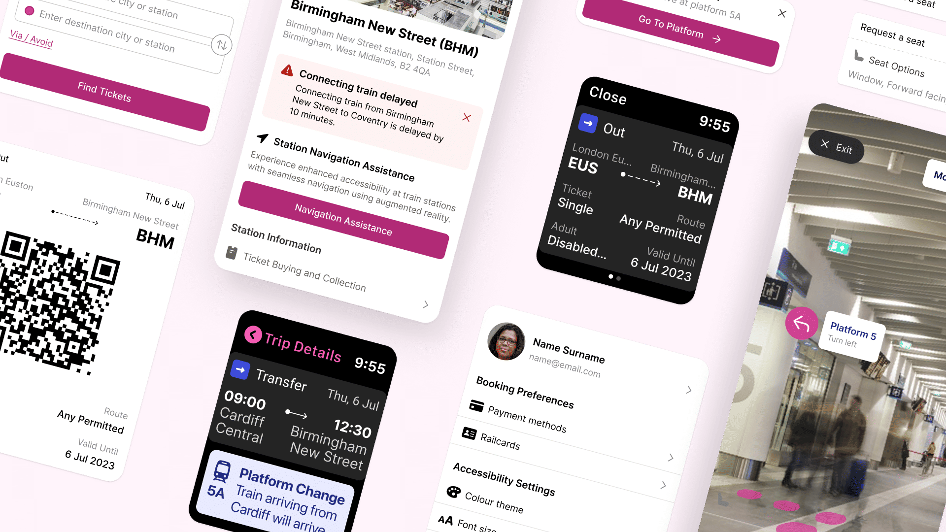
James books a train for a work opportunity, with a connection midway. While waiting at the busy connecting station, an announcement is made about a last-minute platform change, but he can't hear it. However, his smartwatch vibrates with a haptic alert, and he sees the notification with the new platform number and visual directions. Relieved to receive this crucial update, he confidently makes his way to the correct platform.
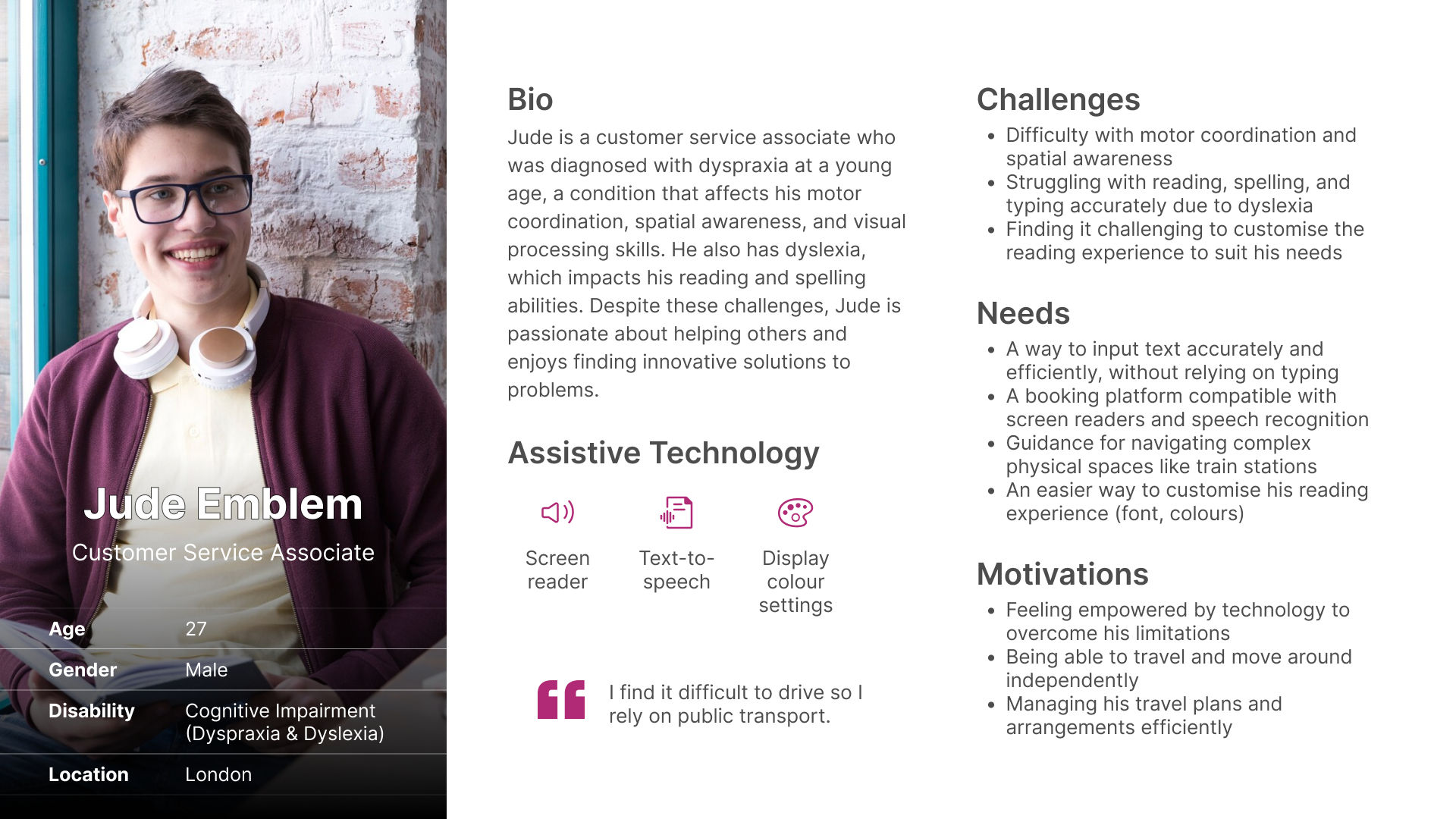
Scenario 1: Jude wants to attend a seminar and books a train ticket. When entering the station names, he uses the app's speech recognition due to spelling difficulties with his dyslexia. The app transcribes his voice input accurately.
Scenario 2: On the day of travel, Jude arrives early but struggles to navigate the complex station environment due to spatial awareness issues. He uses the app's camera-based navigation assistance, which overlays visual guides on his camera view, directing him seamlessly to the platform.
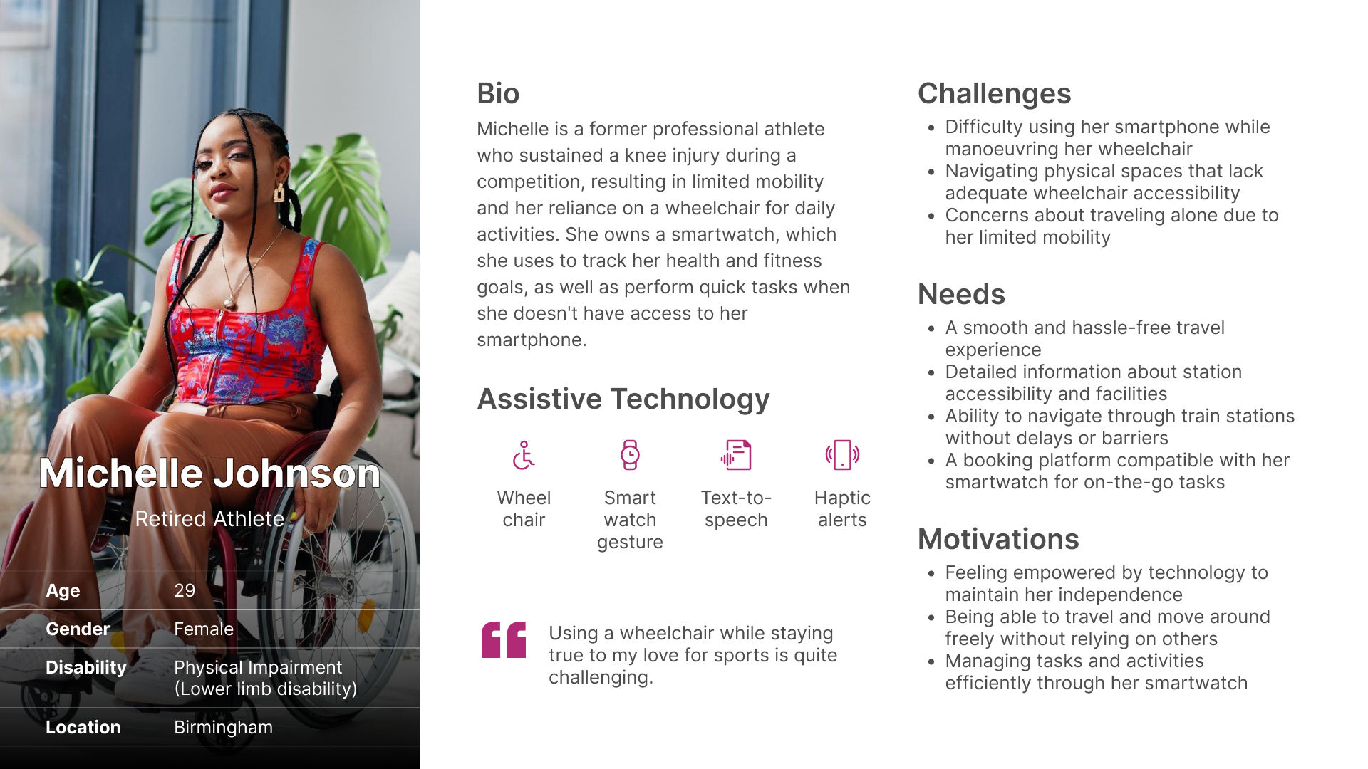
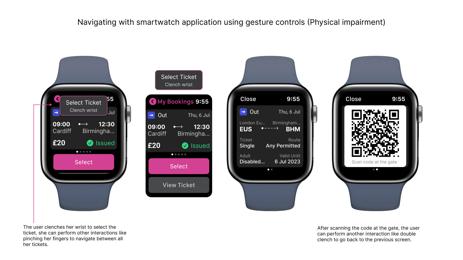
Michelle books a train ticket to attend a football game. Before her trip, she checks the station accessibility information on the app to ensure a smooth experience. At the station, she navigates using her wheelchair but needs to select her ticket for scanning. With one hand controlling the wheelchair, she uses her smartwatch's gesture controls to pull up and scan her ticket hands-free. The app then guides her to the accessible platform entrance.
To make the final solution inclusive for all users and empower users with disabilities, some requirements were considered which include:
The ideation stage was exciting and insightful as I got to create accessible solutions that address real user needs across the disability community. I used several techniques like empathy mapping, sketching, and worst experience ideation to develop ideas. These creative approaches helped me in ensuring that I explored all options for improving accessibility and promoting independence. I also gained new perspectives, which influenced the final designs.
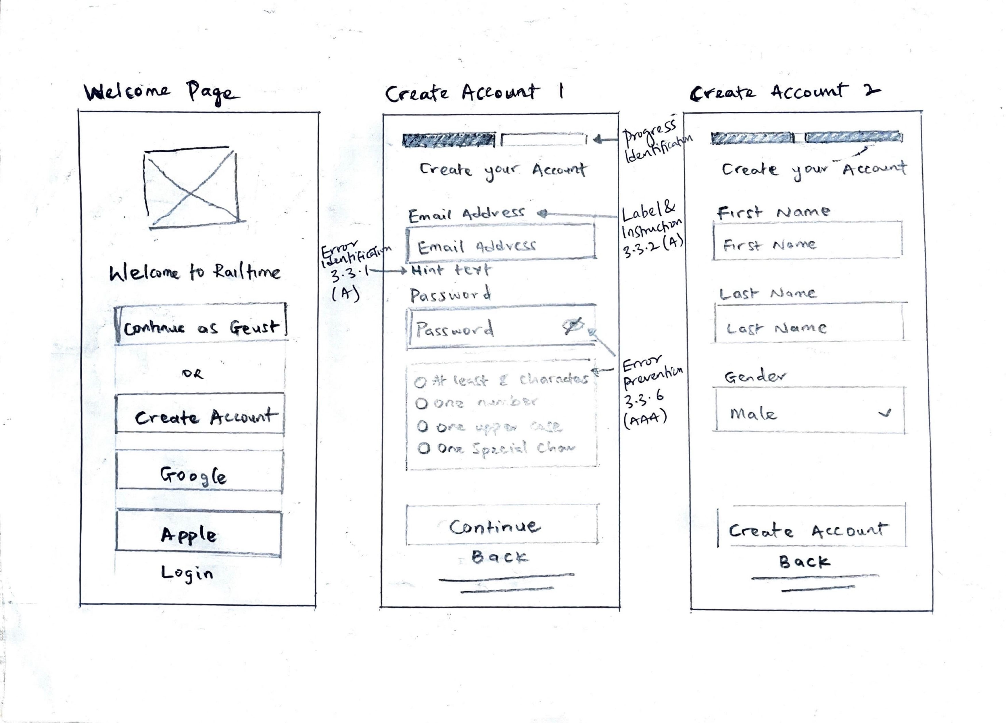
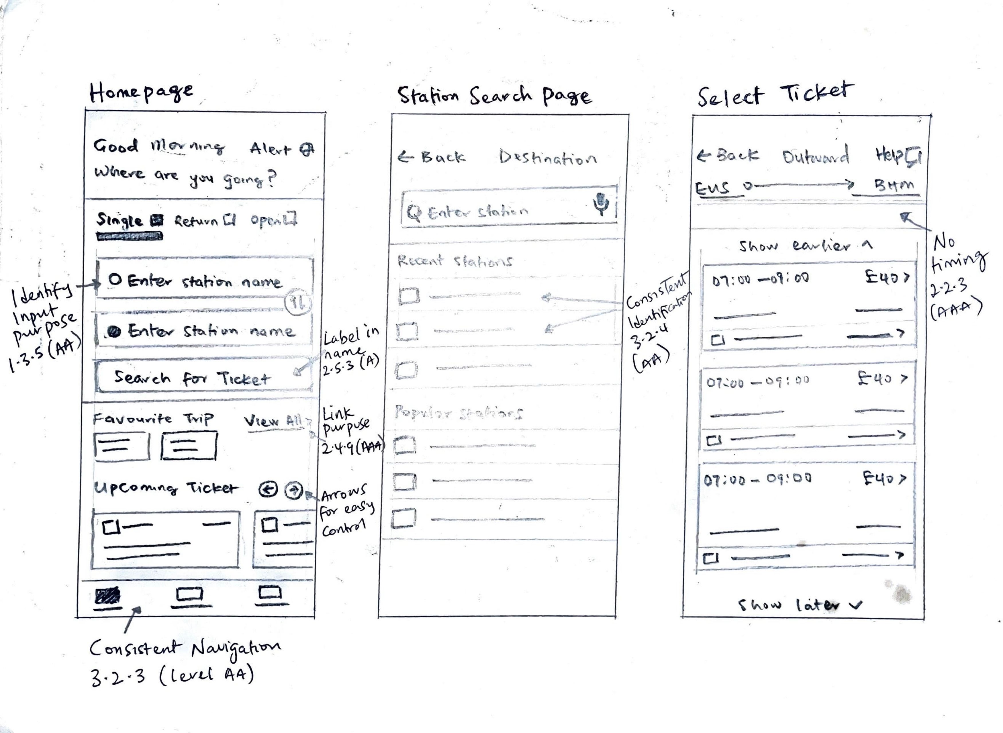
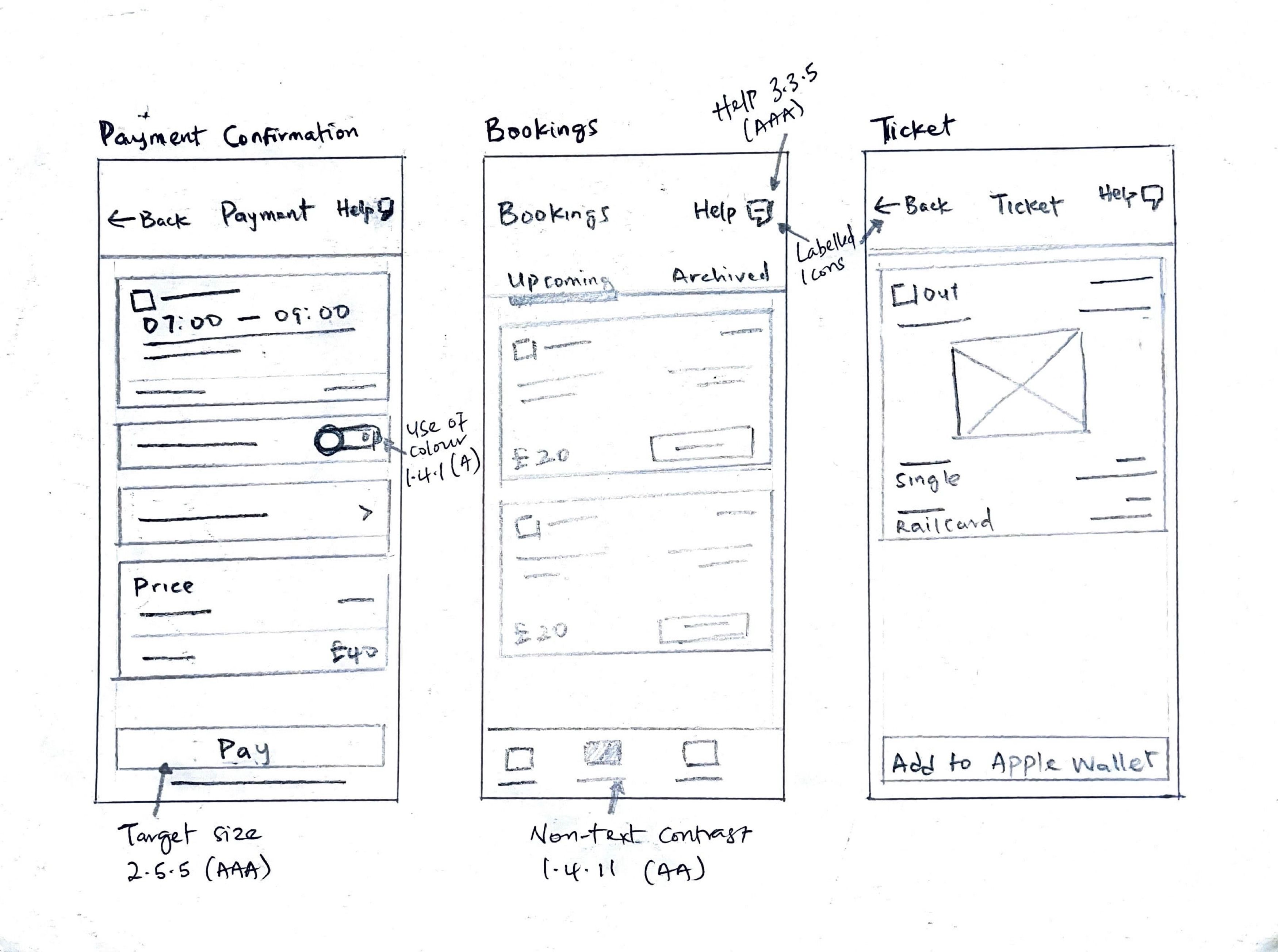
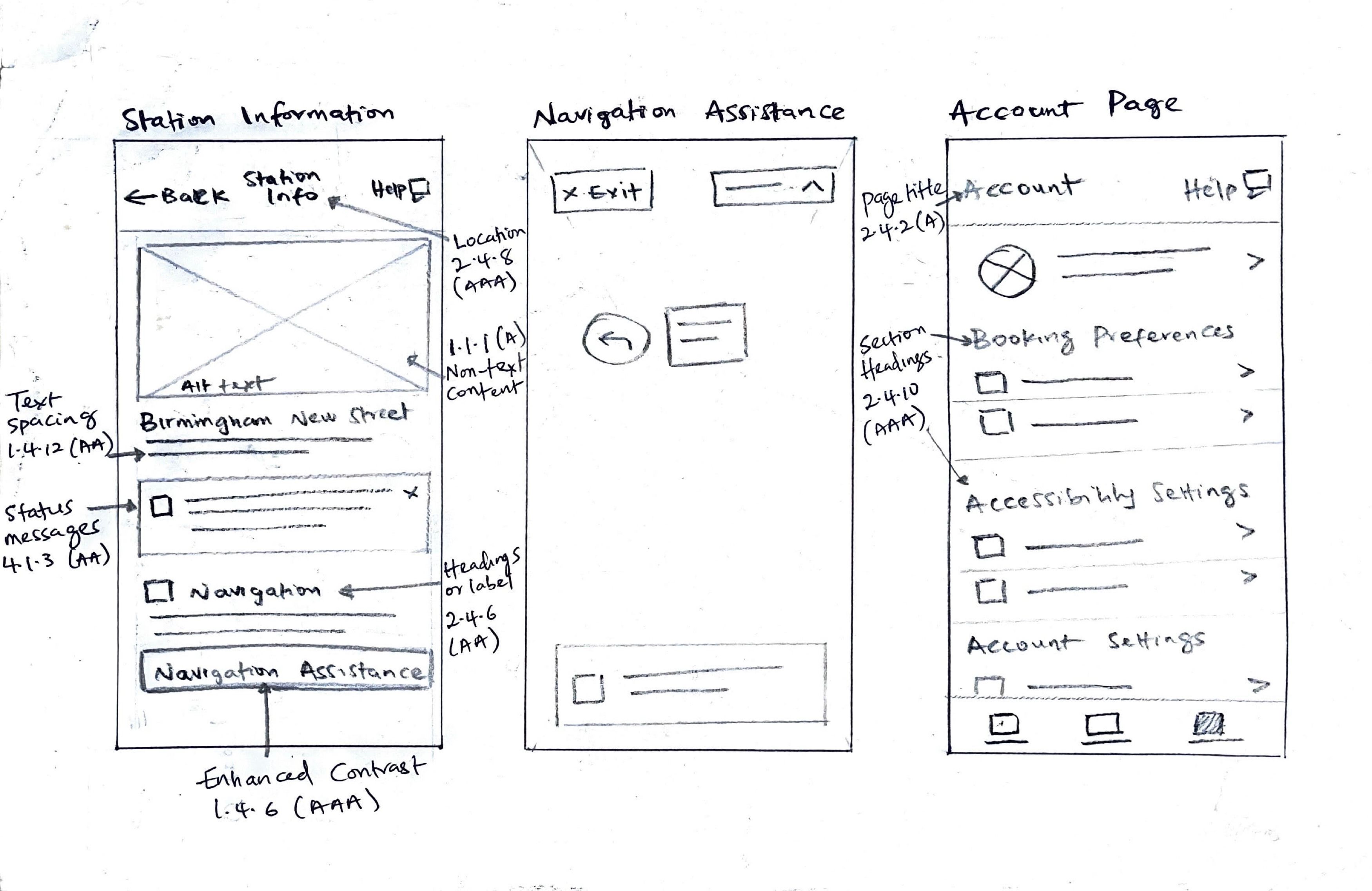
The paper sketches highlight my design ideas and layout concepts aimed at fulfilling the needs of all the users. I ensured I applied various WCAG guidelines to make the platform Perceivable, Operable, Understandable and Robust. The layouts feature a clean and organised structure with sufficient white space separating different sections of the interface, focusing on easy navigation and intuitive information presentation. Through these paper sketches, I demonstrate how I applied various WCAG guidelines to make the application inclusive and accessible for people with disabilities.
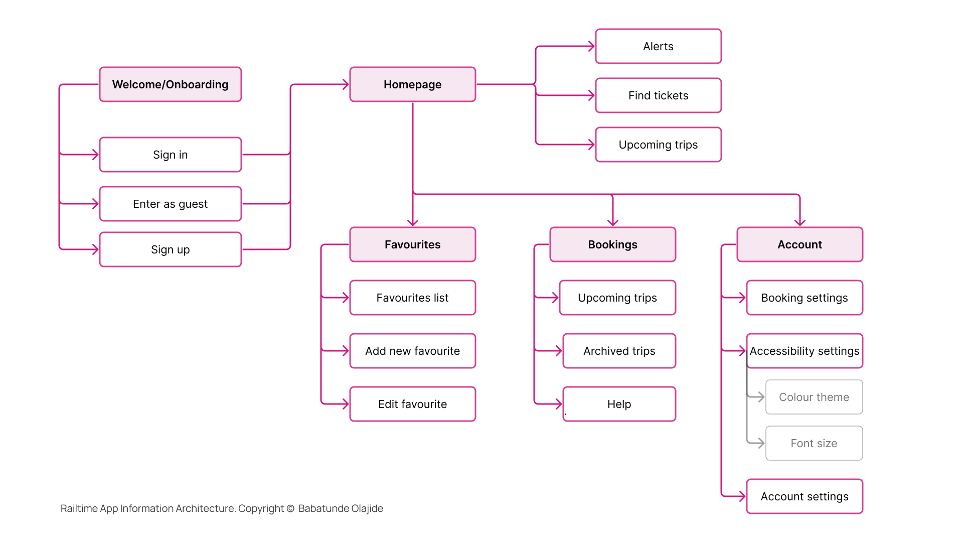
I developed the Information Architecture for the Railtime app to ensure a logical and intuitive structure that aligns with the needs of users with disabilities. The IA was designed to facilitate easy navigation and clear information hierarchy.
I designed the Railtime app's visual interface to adhere to WCAG principles, ensuring optimal usability for all users, including those with visual or cognitive impairments. I picked a colour palette with a minimum contrast ratio of 4.5:1 to enable clear legibility. I used an 8pt grid system with consistent spacing and margins, providing a structured layout. To enhance text readability across platforms, I chose the Inter typeface, designed specifically for digital interfaces with a tall x-height and line spacing of 1.5px. I opted for solid icon styles, offering increased contrast and stronger visual cues to benefit users with conditions like glaucoma.
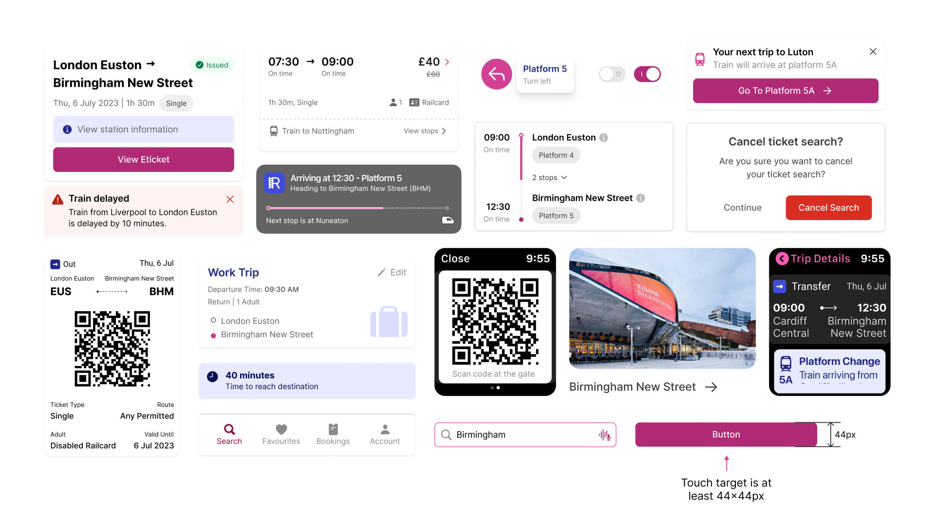
The app's design features a clean and intuitive interface with accessible components like buttons, input fields, and navigation elements. I added assistive technology compatibility, such as screen reader support and voice input, to enhance accessibility for users with disabilities. The inclusive design considerations that were implemented in the designed solution are highlighted below.
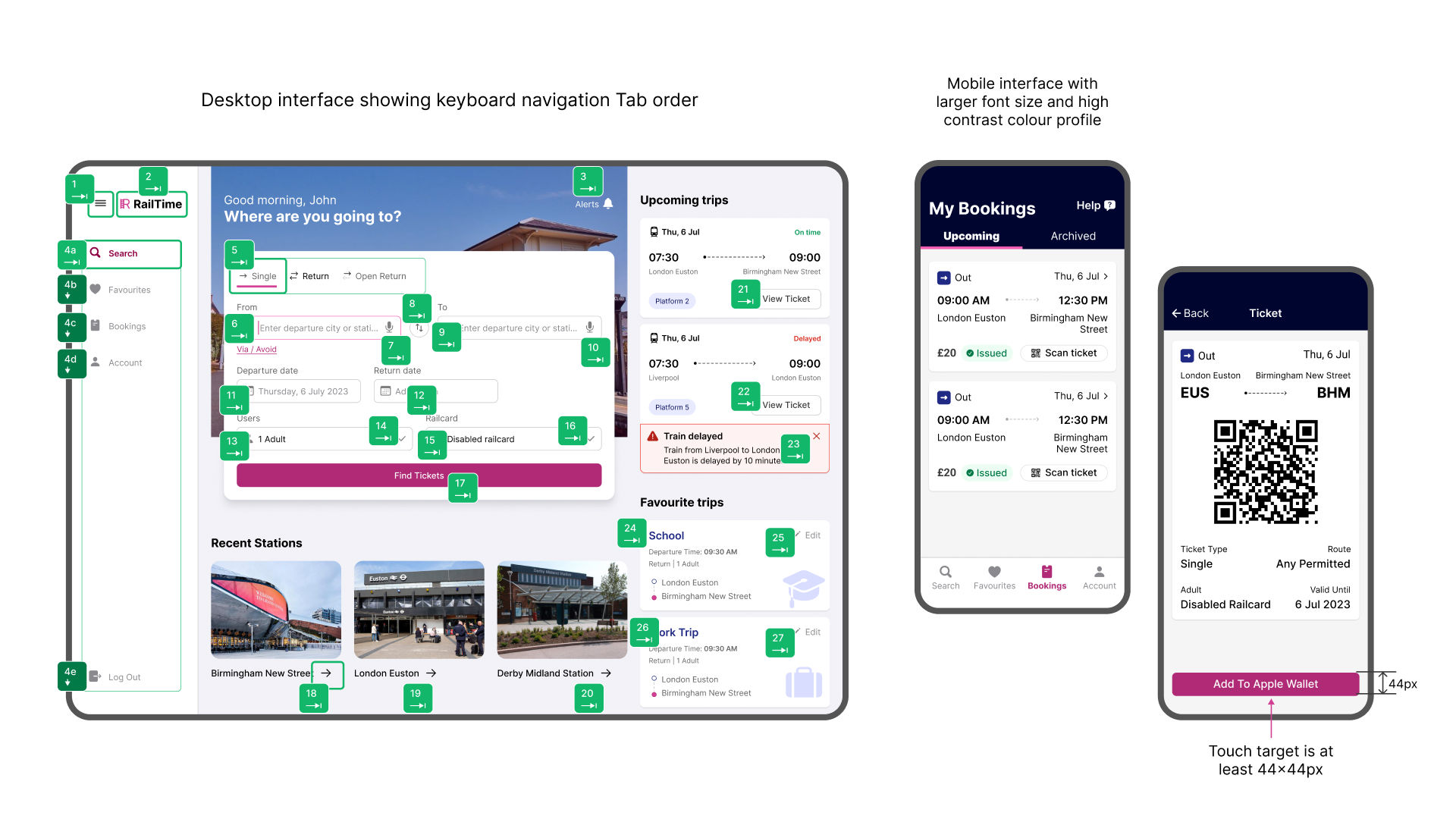
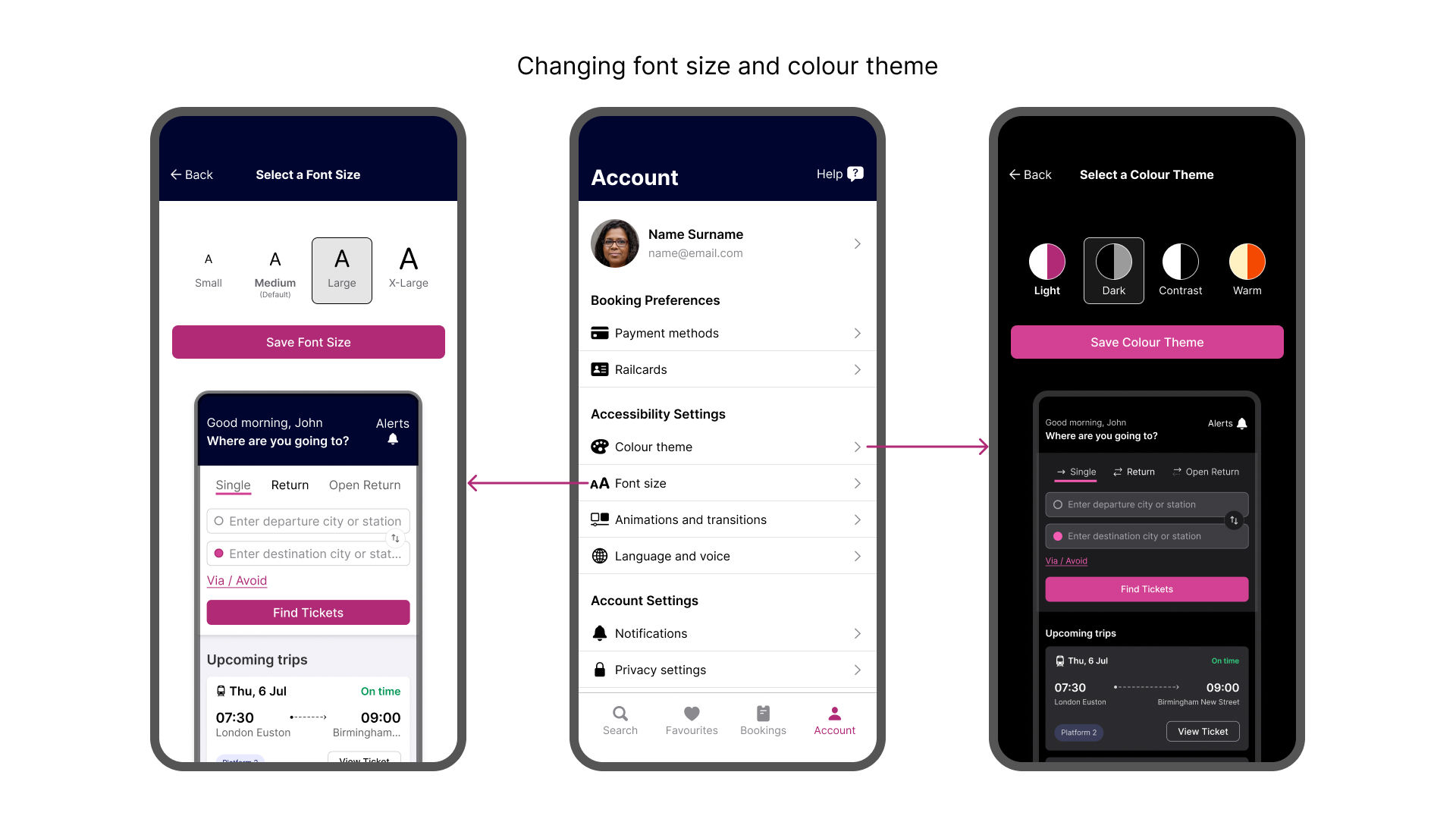
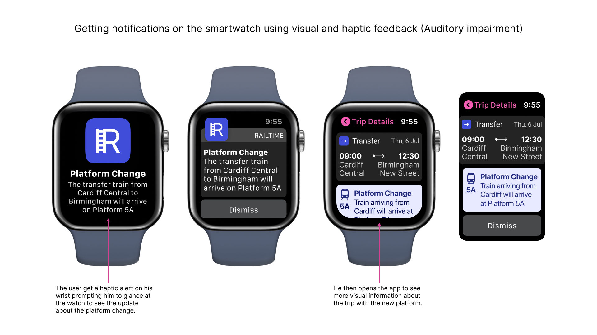

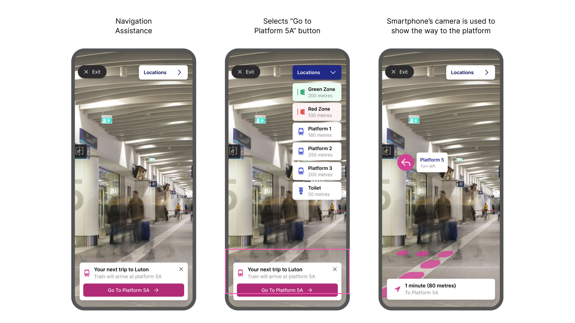
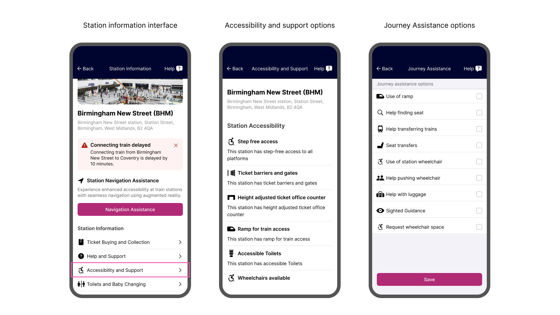
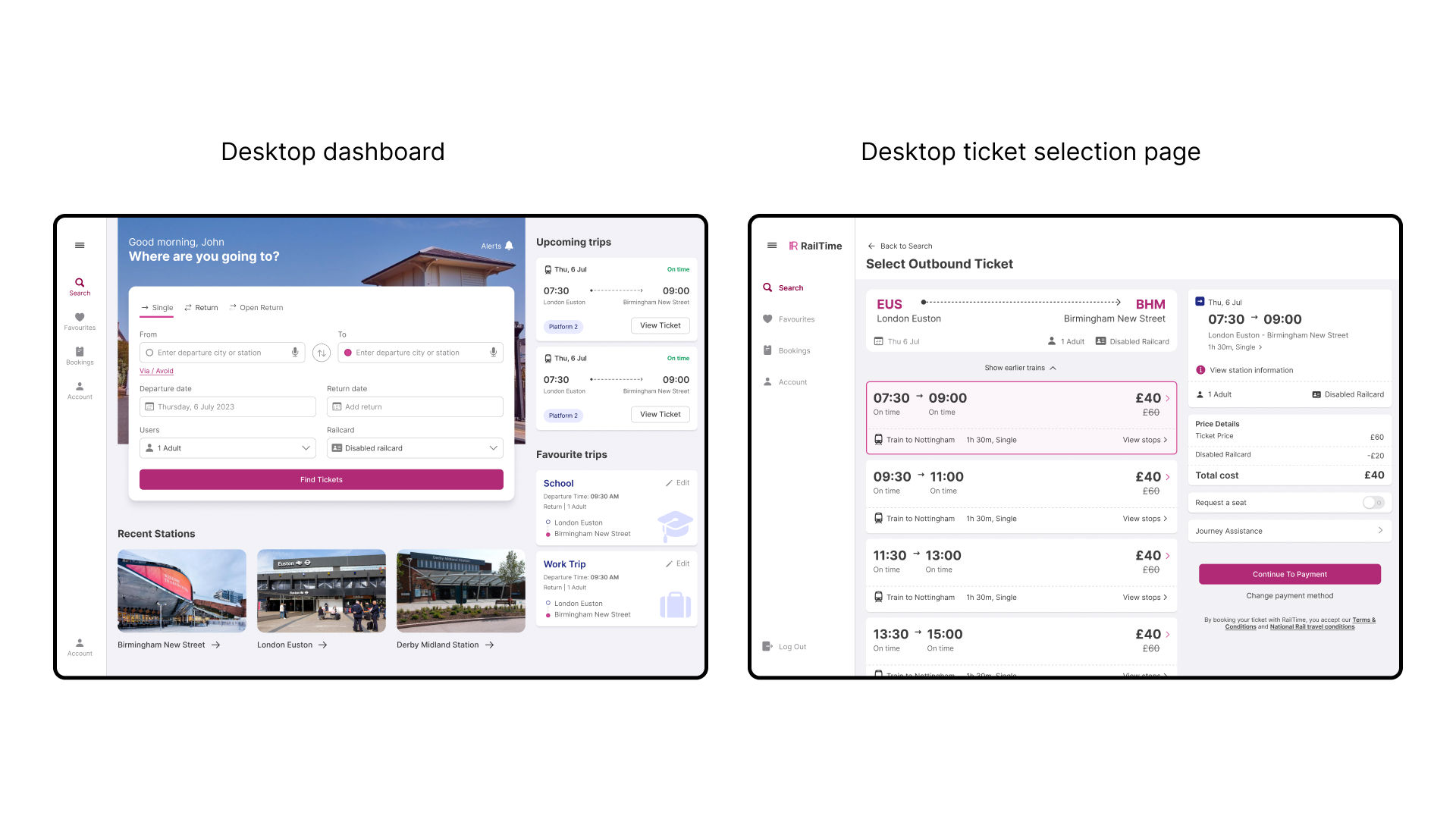
I designed the Railtime app with a multi-platform approach to ensure accessibility across different touch-points in users' daily lives, catering to their varying technology preferences and needs.
For desktop users, the larger screen real estate allowed for a comprehensive interface that displays important information like upcoming trips, favourite stations, and booking options on a single page. Keyboard accessibility (WCAG 2.1.3 Level AAA) was implemented, enabling users with physical impairments or those who prefer keyboard navigation to operate the app confidently. I considered the visual presentation by following principles like focus highlighting (WCAG 2.4.7 Level AA) and responsive reflow (WCAG 1.4.10 Level AA) to further enhanced the experience for users with visual impairments.
I designed the smartwatch app to provide quick and accessible updates. Leveraging haptic feedback and visual notifications, the app alerts users about important announcements at train stations, particularly benefiting those with hearing impairments. For users with physical impairments, the smartwatch app supports gesture interactions and voice controls, allowing them to select tickets and navigate the interface hands-free while on the move.
I conducted a user testing study with users between the ages of 18-60 who have recently used the train and are familiar with train booking apps. The testing's primary goal was to evaluate the usability and effectiveness of the proposed solution.
The study involved two rounds of testing involving 10 participants each. The user testing sessions were conducted remotely using video conferencing tools, allowing participants to interact with the prototype in a controlled environment. The sessions were moderated to guide participants through specific tasks which include: creating an account, booking a train ticket, viewing favourite trips, selecting a booked ticket, accessing station information, and using the navigation assistance feature.
Participants were encouraged to think aloud during the sessions to provide insights into their thought processes and interactions with the app. The key insights are outlined below.
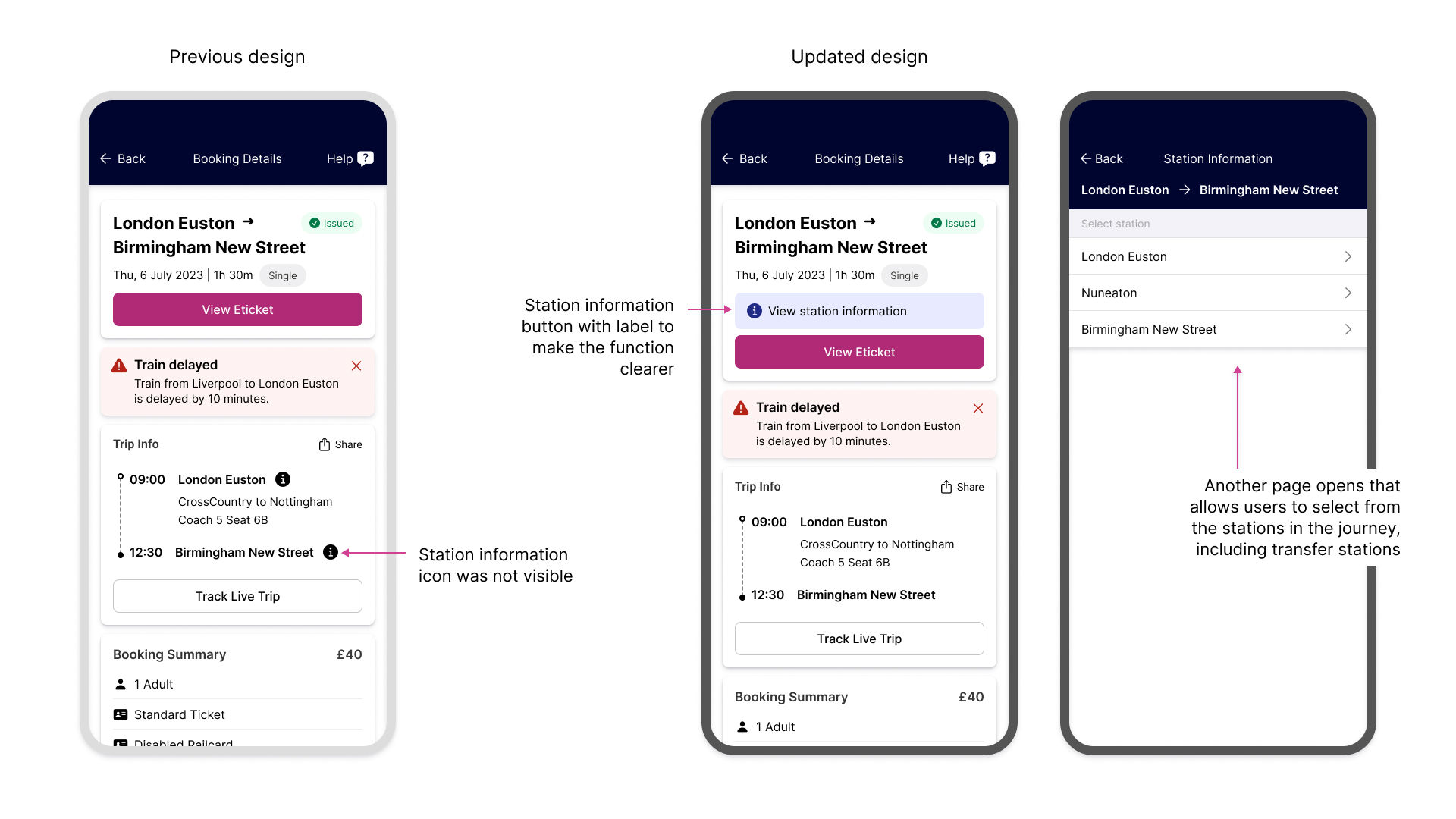
During the initial round of testing, I discovered that 7 out of 8 participants found it difficult to locate and understand the station information icon. One participant observed that the icon indicated a pop-up, but its function was not immediately obvious. To address this, I added a larger station information button with a text label to make the function clearer for users.
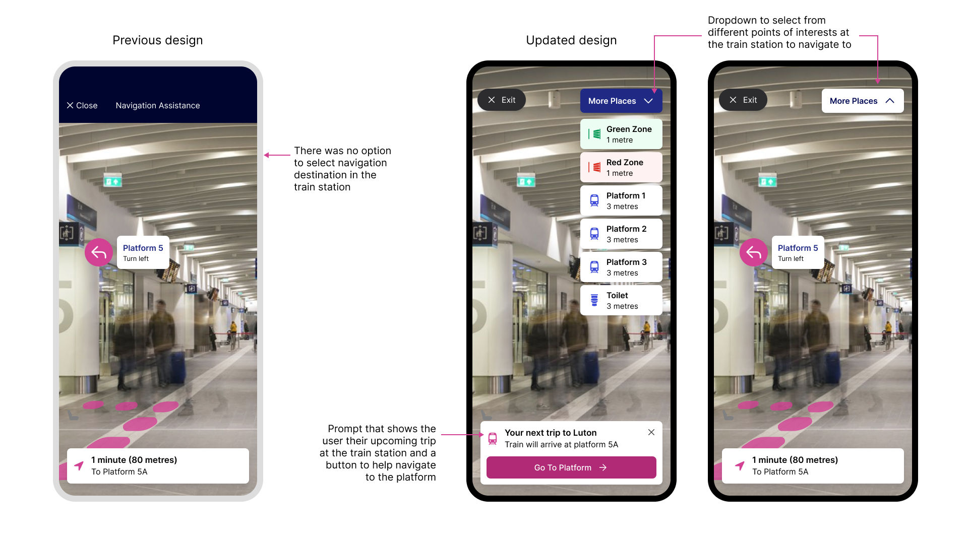
In the first round, a participant commented that the Navigation Assist feature lacked the ability to select a specific destination within the train station. To address this, I introduced an option to allow users to select their destination from different locations within the train station on the Navigation Assistance screen.
The System Usability Scale (SUS) data I collected during the first round showed that the app's usability was generally satisfactory, with an average score of 92.8, which is considered excellent.
After implementing the design updates based on the initial round of testing, the second round of testing revealed a significant improvement in the user experience. 7 out of 8 participants expressed satisfaction with the updated station information access and the ability to select their destination within the station navigation interface. One participant mentioned:
"I love the new navigation feature! It's so easy to find my way around the station now. I can't wait to use it on my next trip!"
This case study explored the process of designing a mobile application aimed at enhancing accessibility and inclusivity for passengers with disabilities in the rail travel experience. The user testing provided me with valuable insights into the usability and effectiveness of the Railtime app's prototype, leading to design improvements that enhanced the overall user experience, particularly for individuals with disabilities.
To further refine and expand the impact of Railtime, the following recommendations are proposed: