Student-Zen
A mobile self-care app for university students to manage their mental health and build healthy habits.
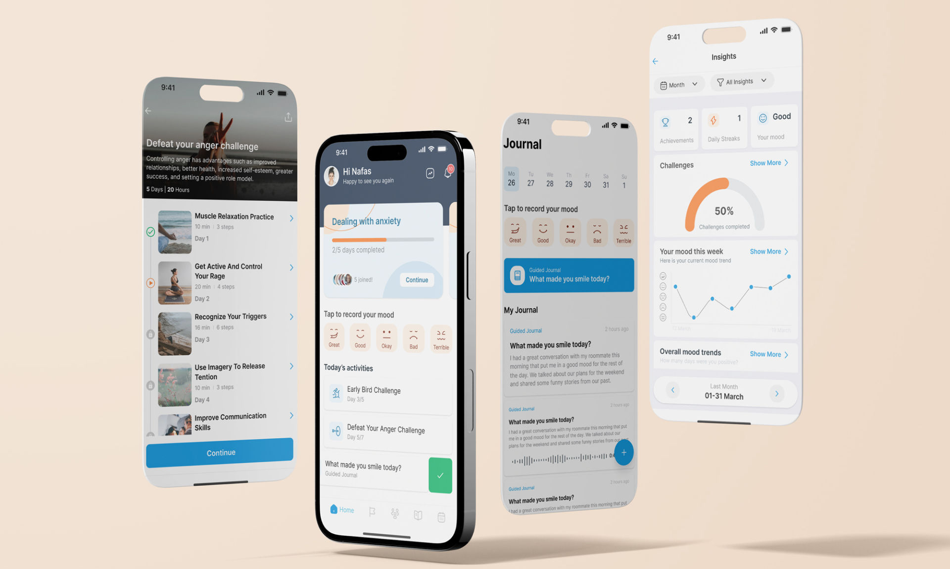
A mobile self-care app for university students to manage their mental health and build healthy habits.

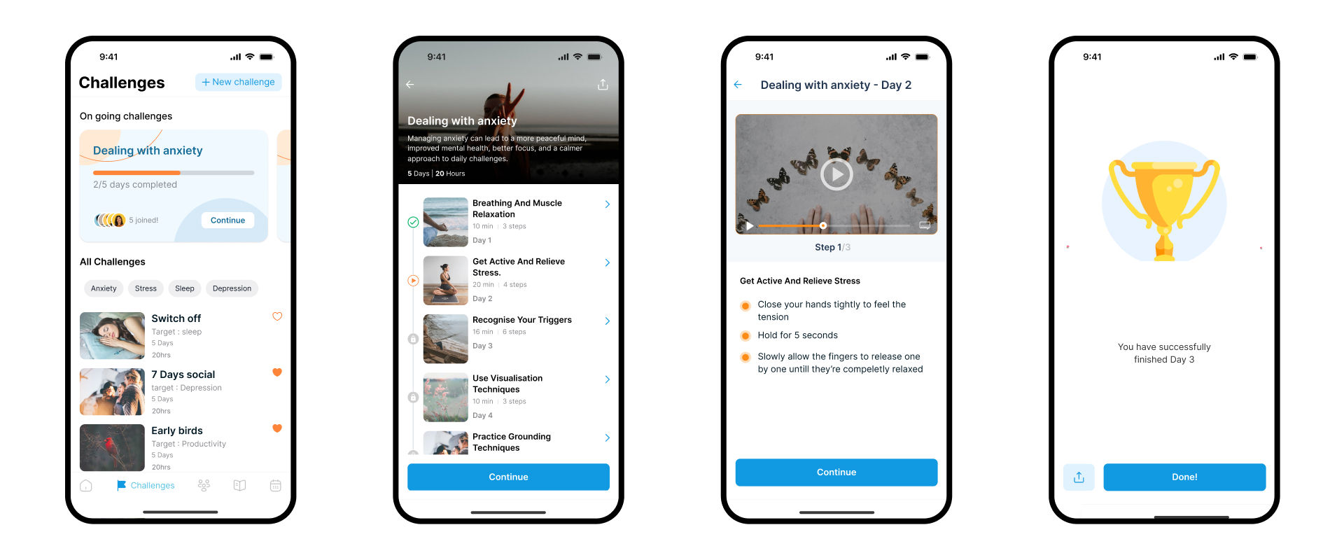
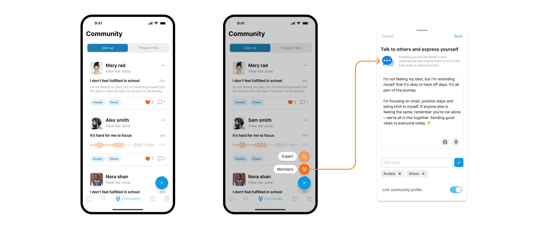
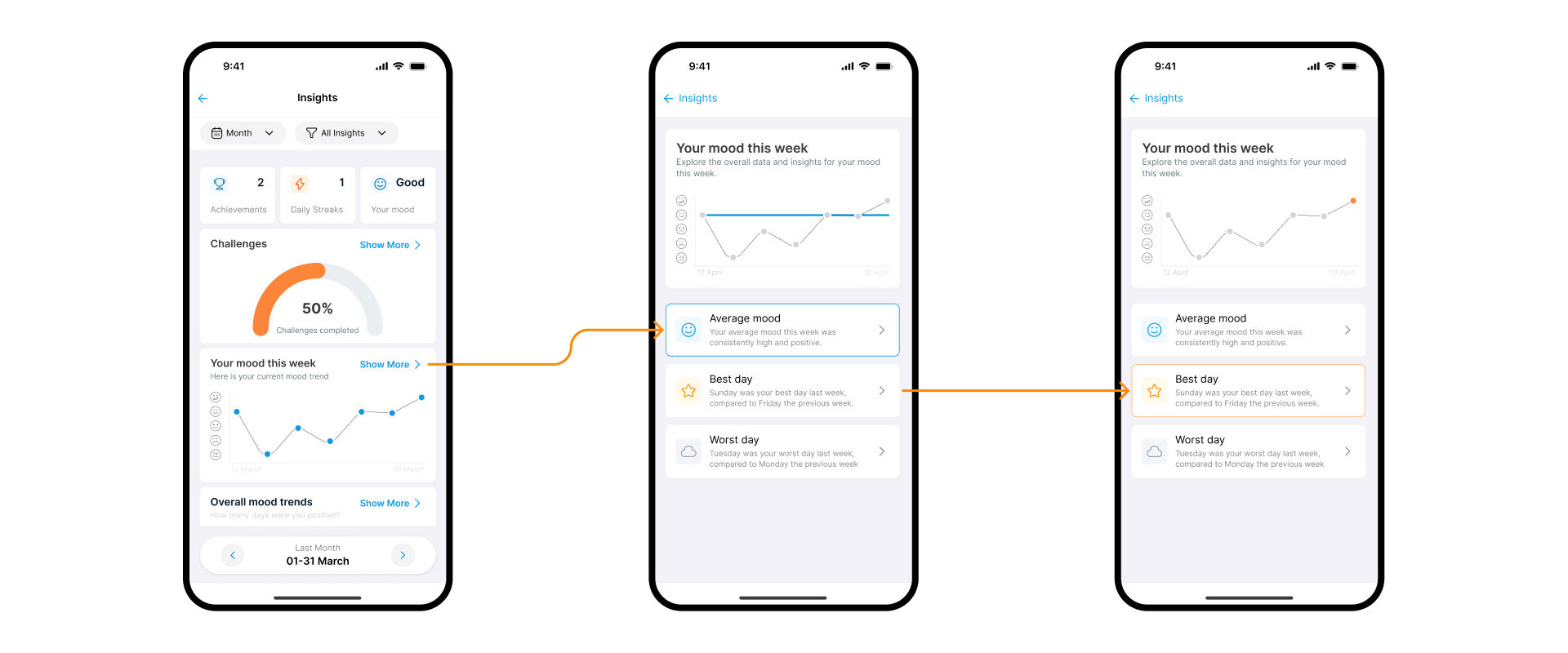
StudentZen is a mobile self-care app that addresses the unique mental health challenges of university students. The features include journaling, mood tracking, self-assessment, professional support, and community interaction to help students build healthy habits and stay productive in their academic lives.
My team designed the app using a human-centered design approach from user research, ideation workshops, prototyping, and user testing to refining the app based oon feedback. We focused on creating a functional, intuitive, visually appealing, and accessible app.
Young people are facing increasing pressures in their lives, with academic stress, social media, and the impact of the COVID-19 pandemic contributing to a rise in mental health issues.
University students are particularly vulnerable to mental health issues due to the pressures of academic performance, financial stress, and social isolation. The transition to university life can be challenging, with students often feeling overwhelmed and struggling to cope with the demands of their studies.

We took on the challenge to design an app that would provide students with the support they need to manage their mental well-being and build healthy habits that would help them succeed in their academic lives.
We also wanted to create a system that would encourage students to use the app regularly and engage with its features while building a sense of community and support among users.
We started the project with preliminary research to understand the current landscape of mental health support for students. Key findings from the preliminary research included:
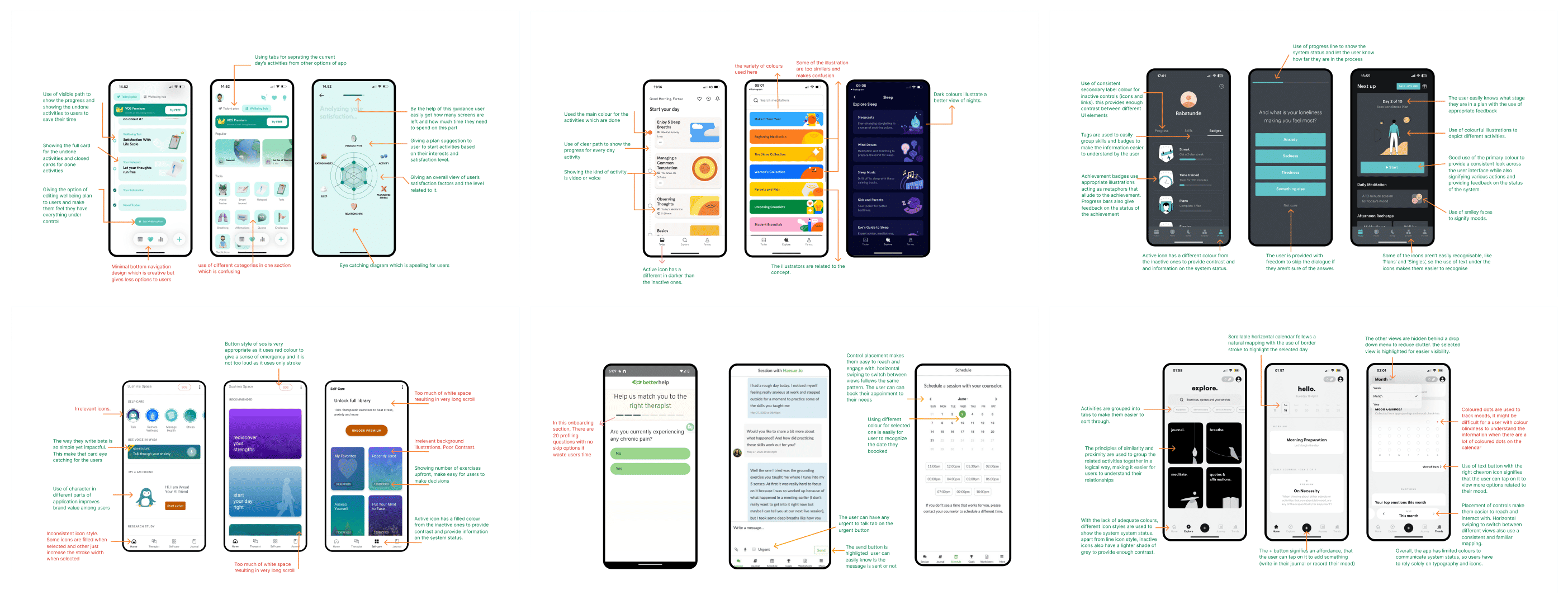
We reviewed popular self-care apps used by students to identify their strengths and weaknesses. The apps reviewed included Headspace, VOS, Balance, and BetterHelp. While these apps offered resources like meditation, journaling and therapy sessions, they lacked features that specifically addressed the needs of university students.
Using Microsoft Forms, I created an online questionnaire aimed at gathering quantitative data on students' preferences and habits related to mental health and self-care and how it affects their academic performance.
The questionnaire was distributed to 45 students at Birmingham City University through the university mailing list.
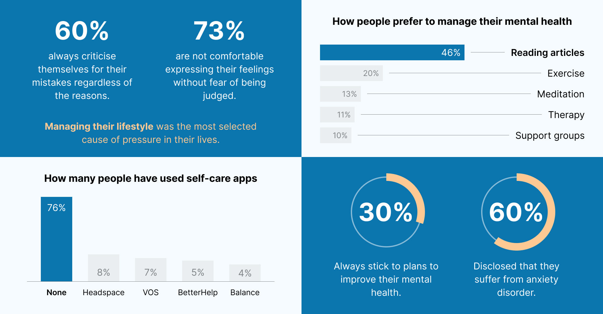
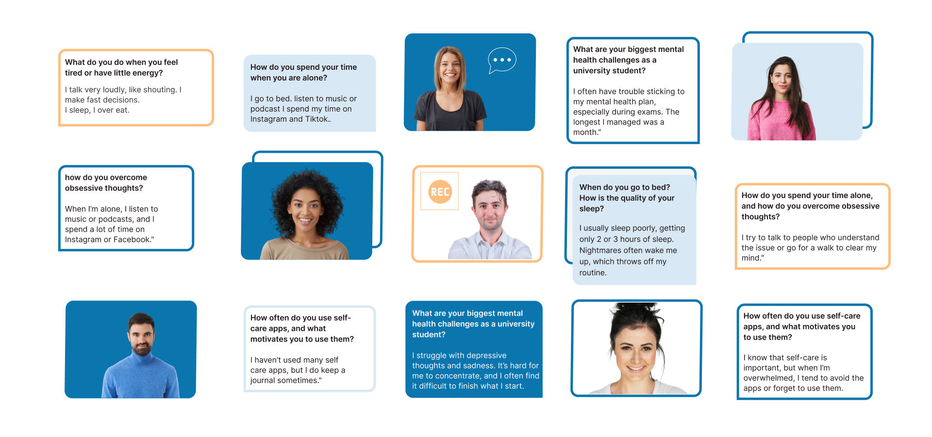
Following the questionnaire analysis, we conducted online semi-structured interviews with 20 students between the ages of 18 - 38 years old.
We asked questions around their mental health challenges, self-care habits, and their preferences for mental health support. Key interview questions included:
University students face significant mental health challenges, including anxiety, stress, and isolation, yet existing self-care resources are often inaccessible, lack professional support, and fail to foster community engagement.
How might we create a mobile health app that is easy to navigate, provides access to resources tailored to university students' needs, offers professional support, and encourages peer support to help students better manage their mental health.
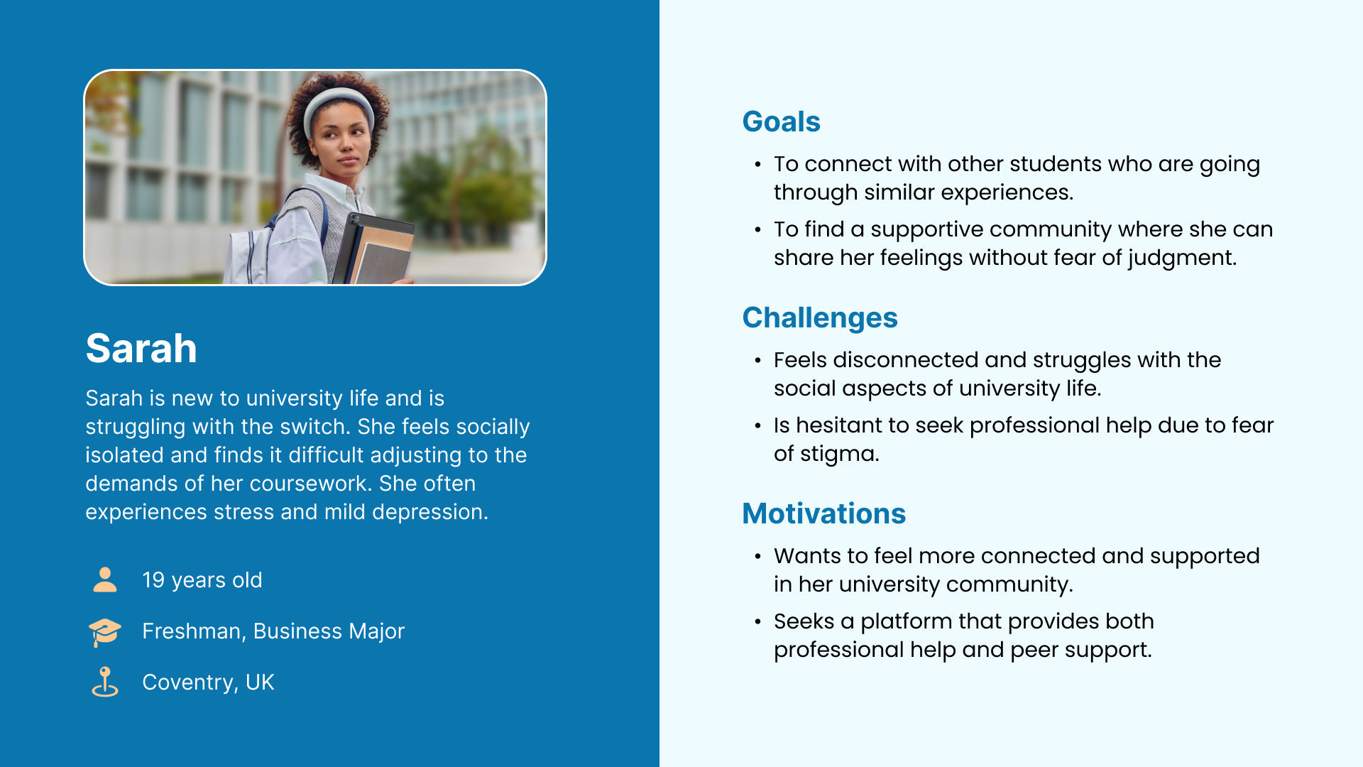
We developed user personas from the research findings to represent our primary users, enabling us to better understand and empathize with their needs, motivations, and pain points.


We conducted a competitive analysis of existing self-care apps to identify their strengths and weaknesses, which allowed us to uncover opportunities for differentiation and innovation in our solution.
StudentZen is a mental health app for students, offering accessible resources, professional support, and community features to help them manage their mental well-being and build healthier habits in a safe, judgment-free space.
We decided to focus on the following key features:
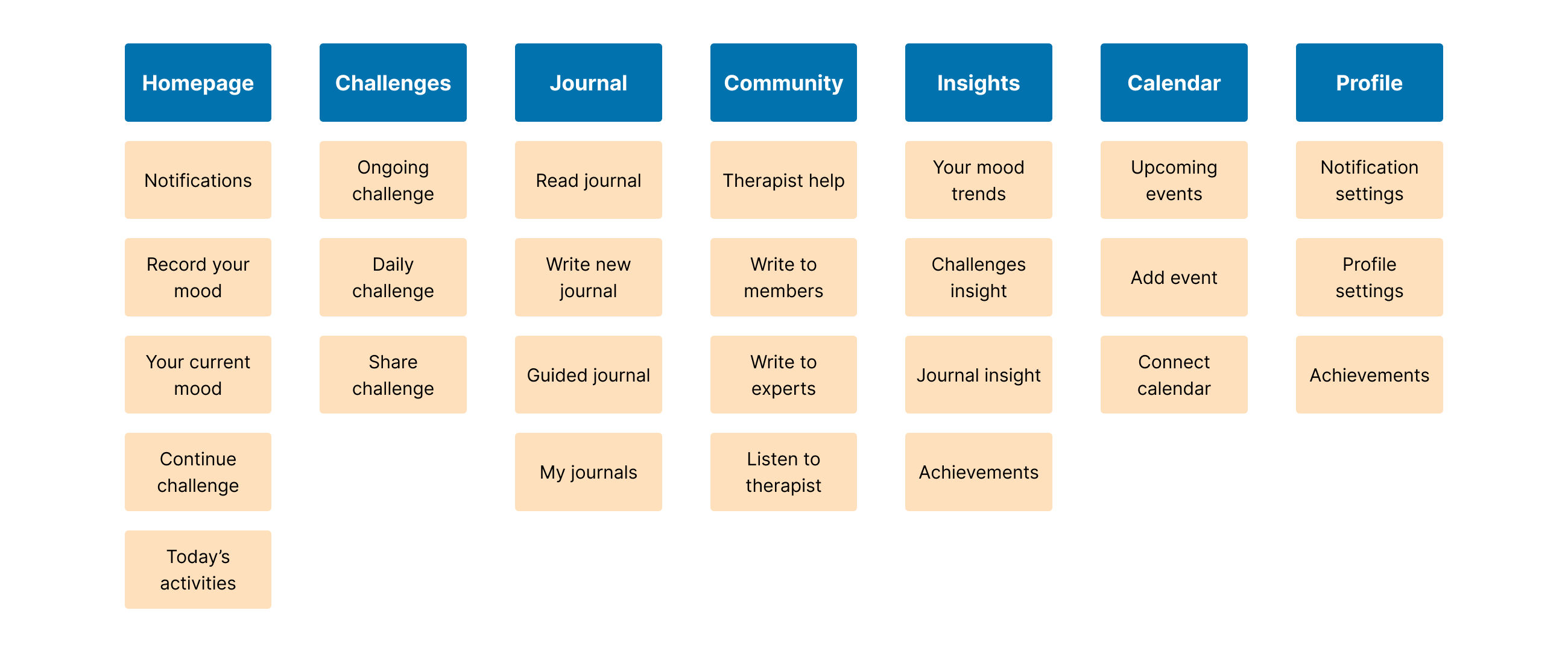
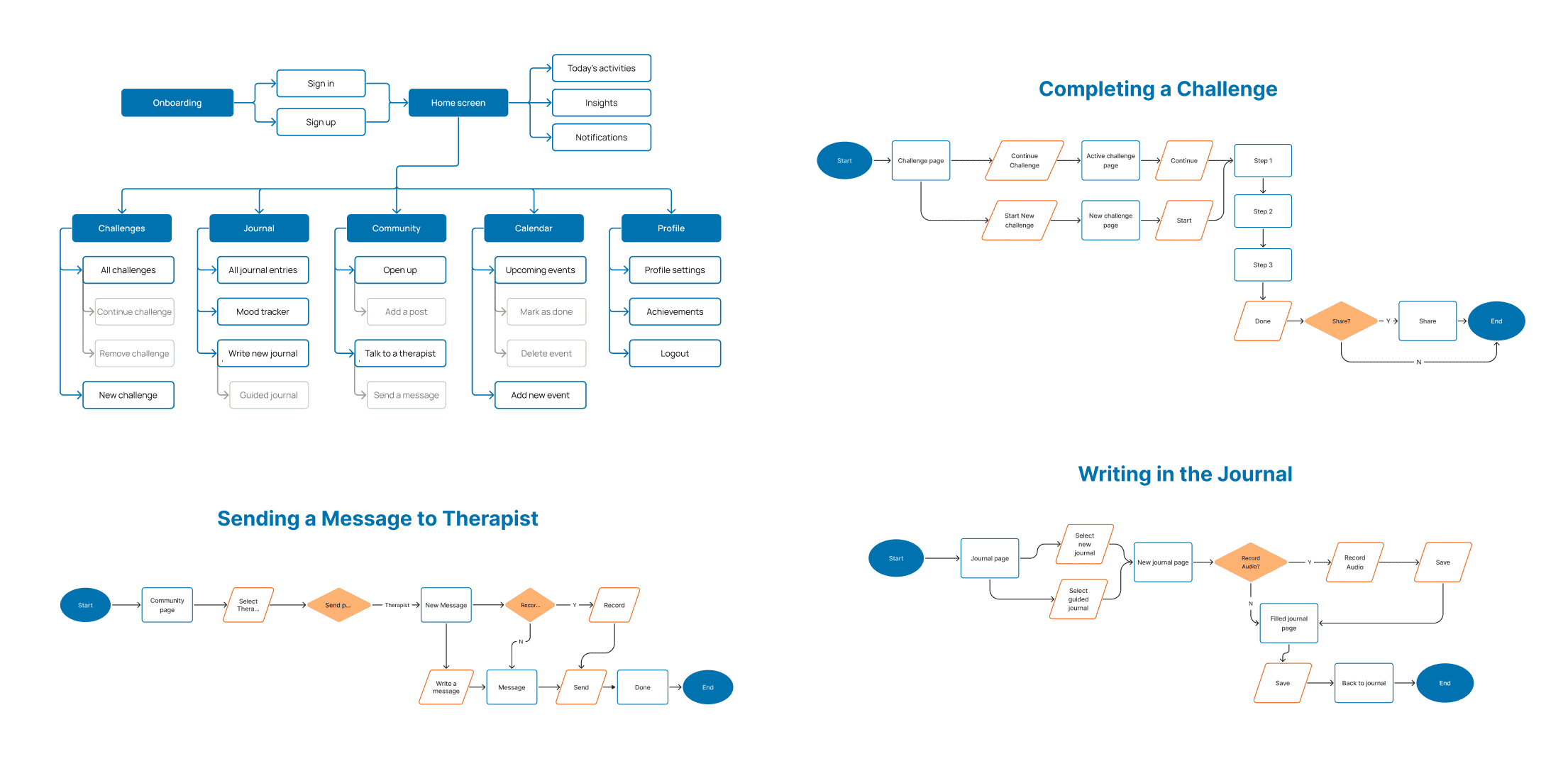
We conducted card sorting sessions with students to align the app's content structure with their expectations. By understanding how they categorize and prioritize mental health resources, we designed an intuitive information architecture that makes it easy for them to navigate and access the support they need.
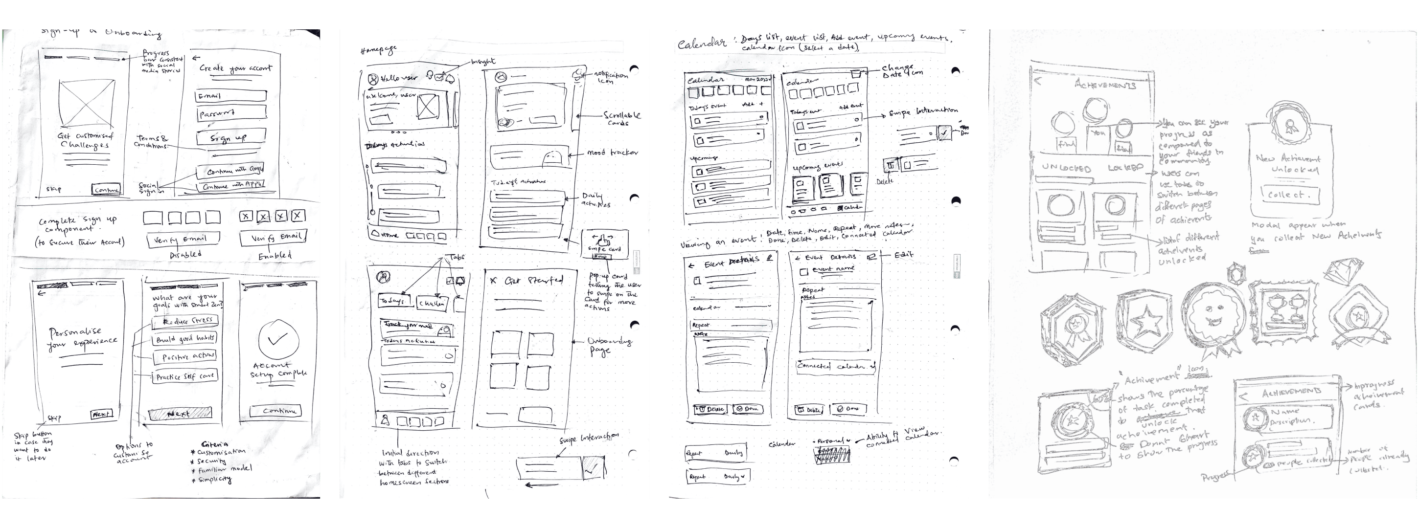
We started the design process with paper sketches to explore different layout options and features. This allowed us to quickly iterate on our ideas and gather feedback from our team members before moving on to digital wireframes.
We set some design criteria to ensure that final designn aligned with our goals and user needs. These criteria served as guiding principles throughout the design process, helping us create an app that is both functional and engaging.
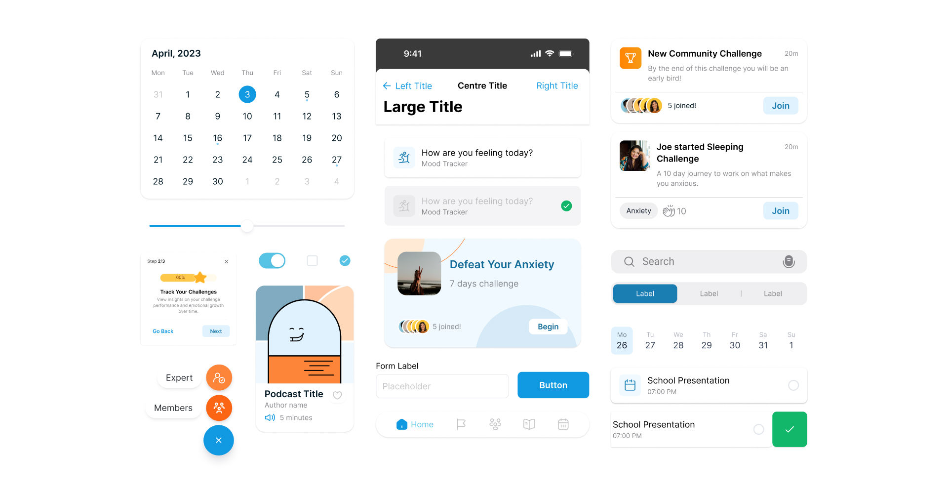
We focused on creating a visually appealing and intuitive design that enhances the user experience. We carefully selected a color palette that is calming and supportive for students. The text and typography were chosen to be clear and legible, promoting ease of reading across different devices. Icons were designed to be simple and easily recognisable, helping users navigate the app effortlessly.
Additionally, we created custom components, such as buttons, forms, and cards, that maintain consistency throughout the app while aligning with the overall aesthetic and functional goals.
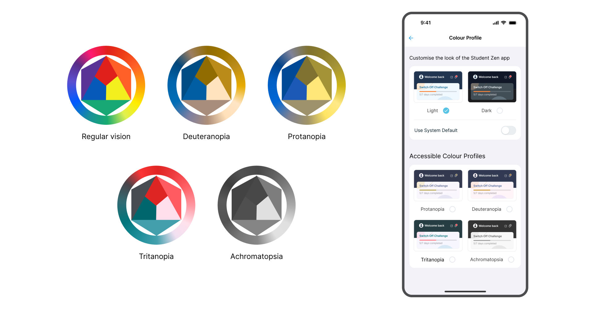
We prioritised accessibility by designing the app with features specifically for students with colour blindness. Users can adjust the colour profile to enhance readability, and they can also change the text size to fit their needs.
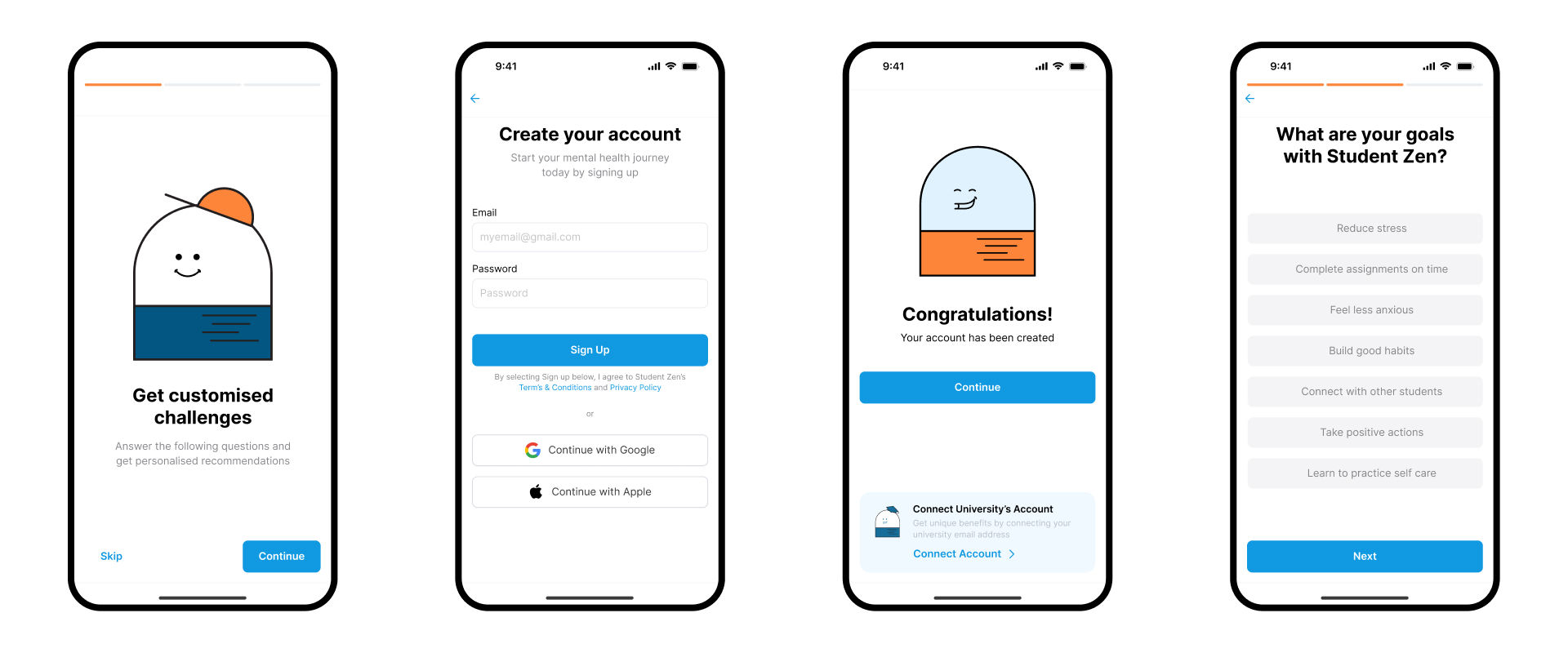
Additionally, we included a voice recording option for journaling, so users can easily record their thoughts without typing. This feature is especially helpful for users with motor disabilities or those who prefer not to type.
After connecting the screens to create a working prototype, we conducted a series of usability tests with a diverse group of students to evaluate the app's functionality, ease of use, and overall user experience. Participants were asked to complete six key tasks:
Based on the feedback, we made several adjustments to the app's design and functionality to improve the user experience and address the pain points identified during testing.
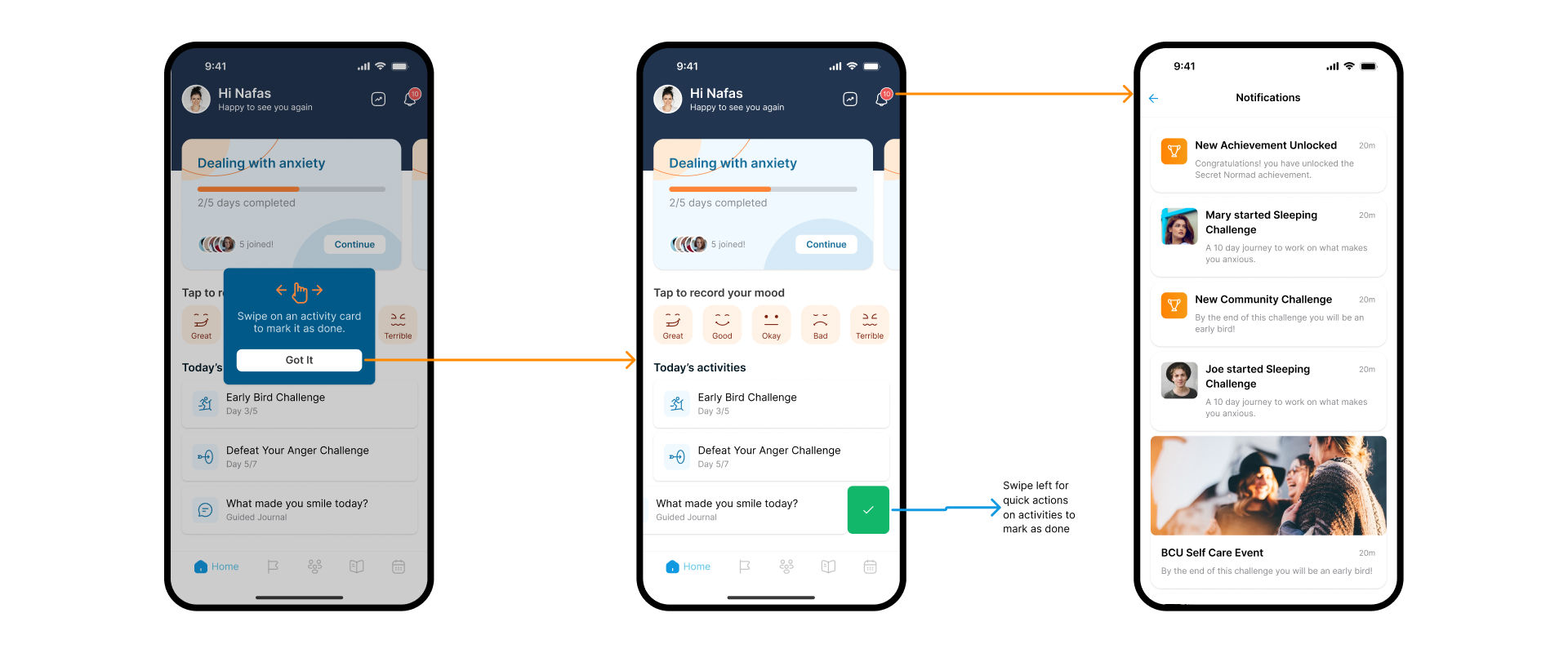


Working on the Student Zen app was a collaborative effort that was both rewarding and challenging. I gained valuable insights throughout the process, and I believe this app will make a meaningful difference in helping students manage their mental well-being.
I'm pleased with the final outcome, but I've identified areas for improvement in future projects: