VR Lingo
Immersive language learning platform leveraging VR technology to provide practical and engaging language experiences.

Immersive language learning platform leveraging VR technology to provide practical and engaging language experiences.

The VR Lingo project developed an immersive language learning solution ensuring engaging, practical, and effective learning experiences for language learners using proven language learnig techniques and realistic interactions.
The VR Lingo project was a collaborative effort and my roles included sketching ideas, UI design, prototyping, and motion design. The project duration was 12 weeks.
Many language learners struggle to gain confidence and proficiency due to the lack of real-world interaction in traditional learning methods. Research reveals that popular language learning methods lack real-world interactions and interactive structures, limiting learners' practical skills development (Bazzaza et al., 2016).
In our primary research, 87.5% of participants expressed the need for more practical applications in their language learning experience. This highlighted the necessity for an immersive approach to enhance language confidence and proficiency, leveraging the capabilities of immersive technologies.
The research process involved a combination of qualitative and quantitative methods to gather insights from new language learners and understand their challenges, preferences, and motivations. The process was an insightful journey that helped in identifying key insights on how people learn languages and the challenges they face.
The research findings highlighted the need for a more practical and engaging language learning solution that incorporates real-world interactions and immersive experiences.
Competitor analysis was conducted to identify the strengths and weaknesses of existing language learning platforms. The analysis focused on their user experience, features, and learning methodologies. The competitors included ImmerseMe, LanguageLab, and Duolingo.
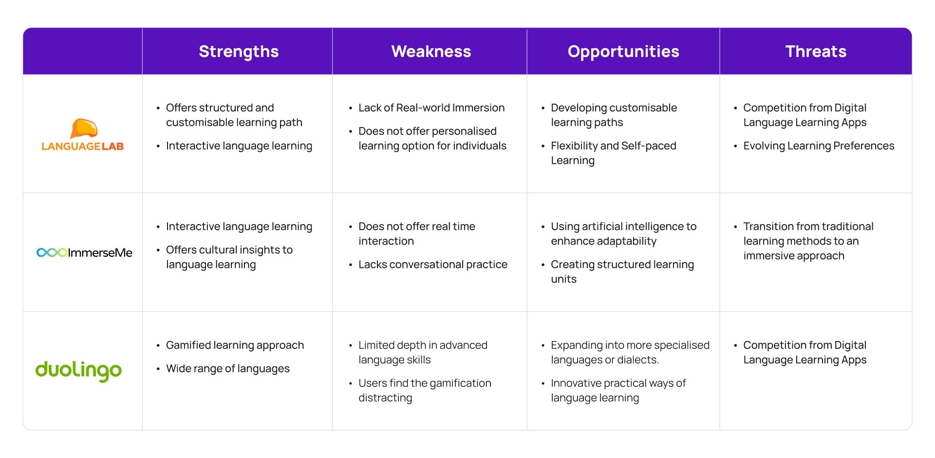
In order to set VR Lingo apart from the competition, we focused on creating a truly immersive learning experience. VR technology allows users to practice their language skills in an engaging environment where they can talk to virtual characters and interact with objects.
The insights gathered from the research process informed the design and development of the VR Lingo app to address the identified challenges and provide a more effective language learning experience for users.
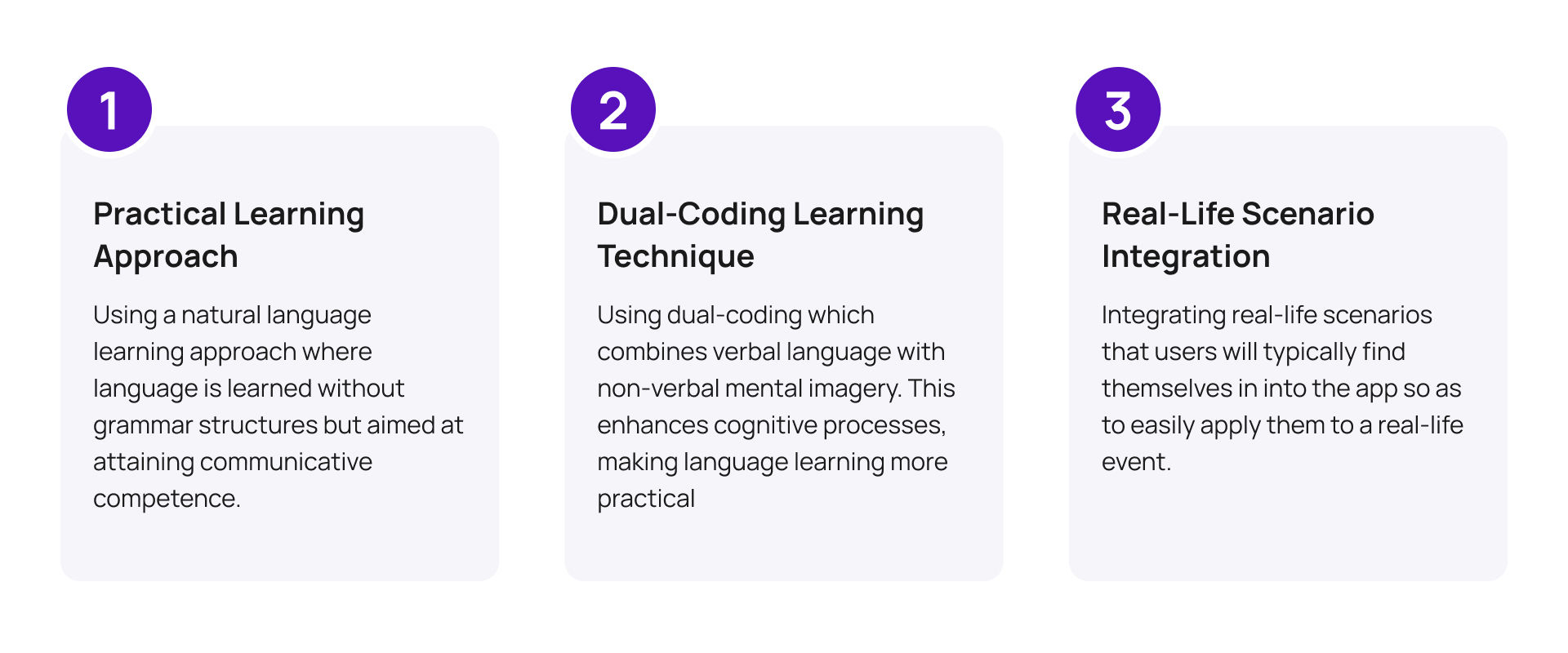
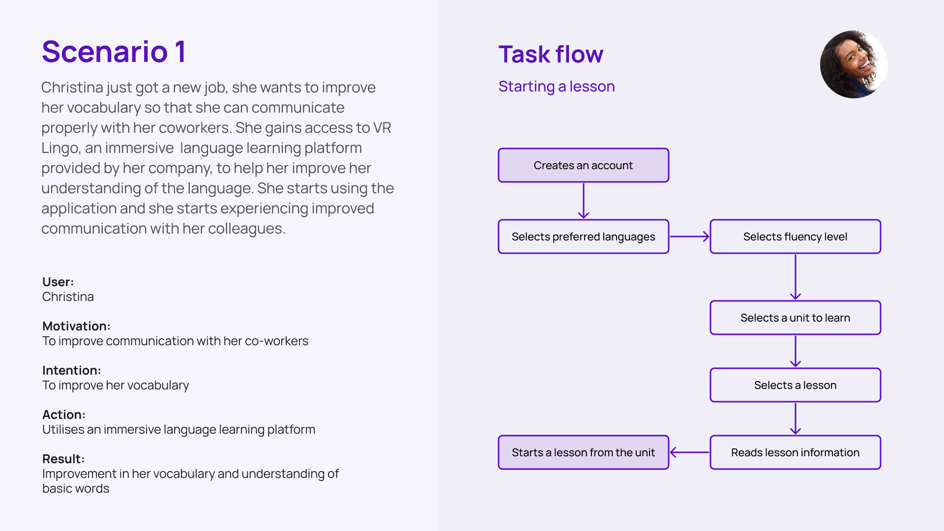
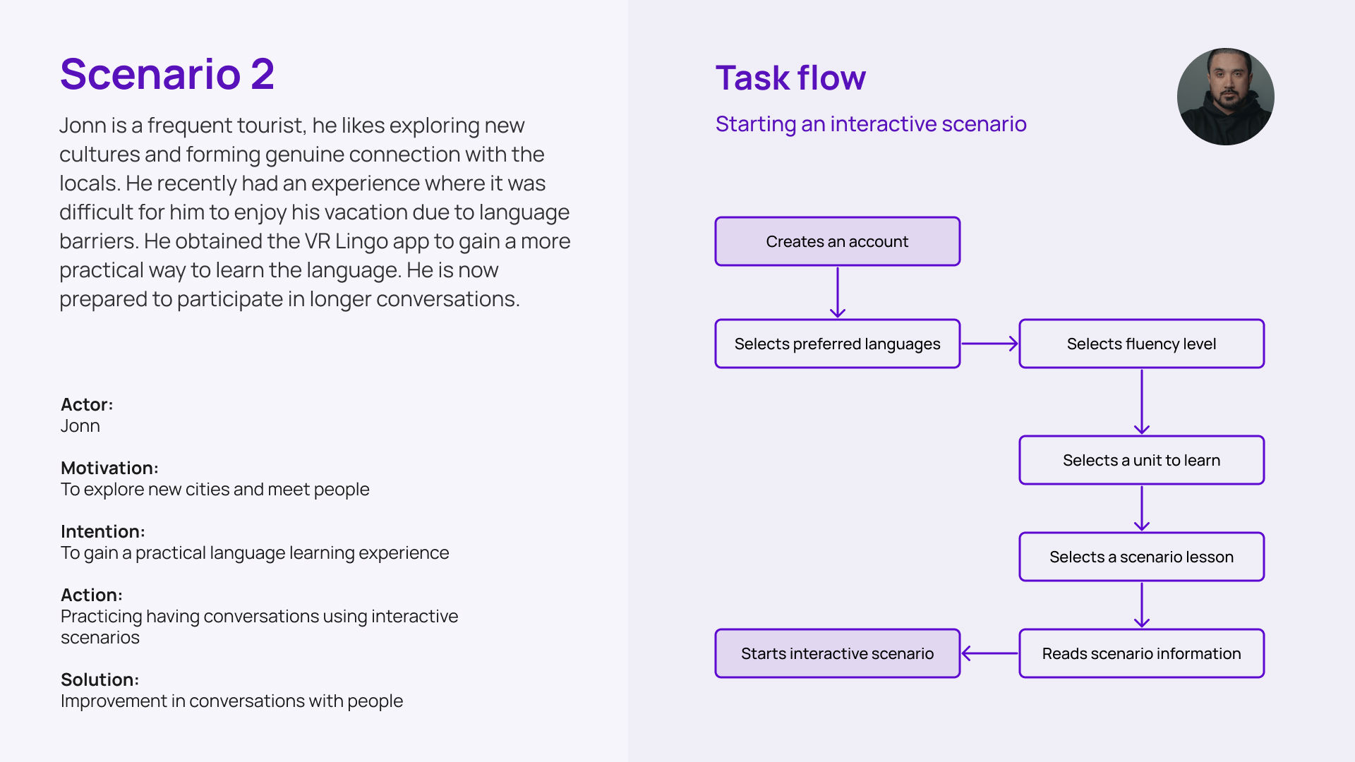
New language learners want to be able to learn languages in a more practical way to enable them to easily apply the knowledge in the real world. VR Lingo is a virtual reality solution that takes a practical approach to language learning by enabling users to easily apply their knowledge in real-world scenarios. The proposed solutions are:
The target audience for the VR Lingo app are language learners who are looking for a more practical and engaging way to learn languages. The target audience includes: Young adults, frequent travelers, college students, self-educators, and career professionals.
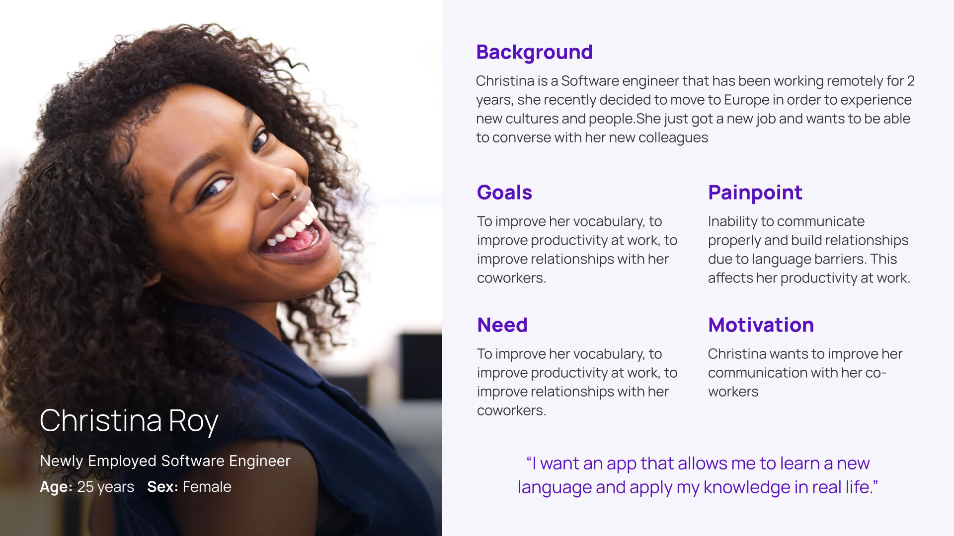
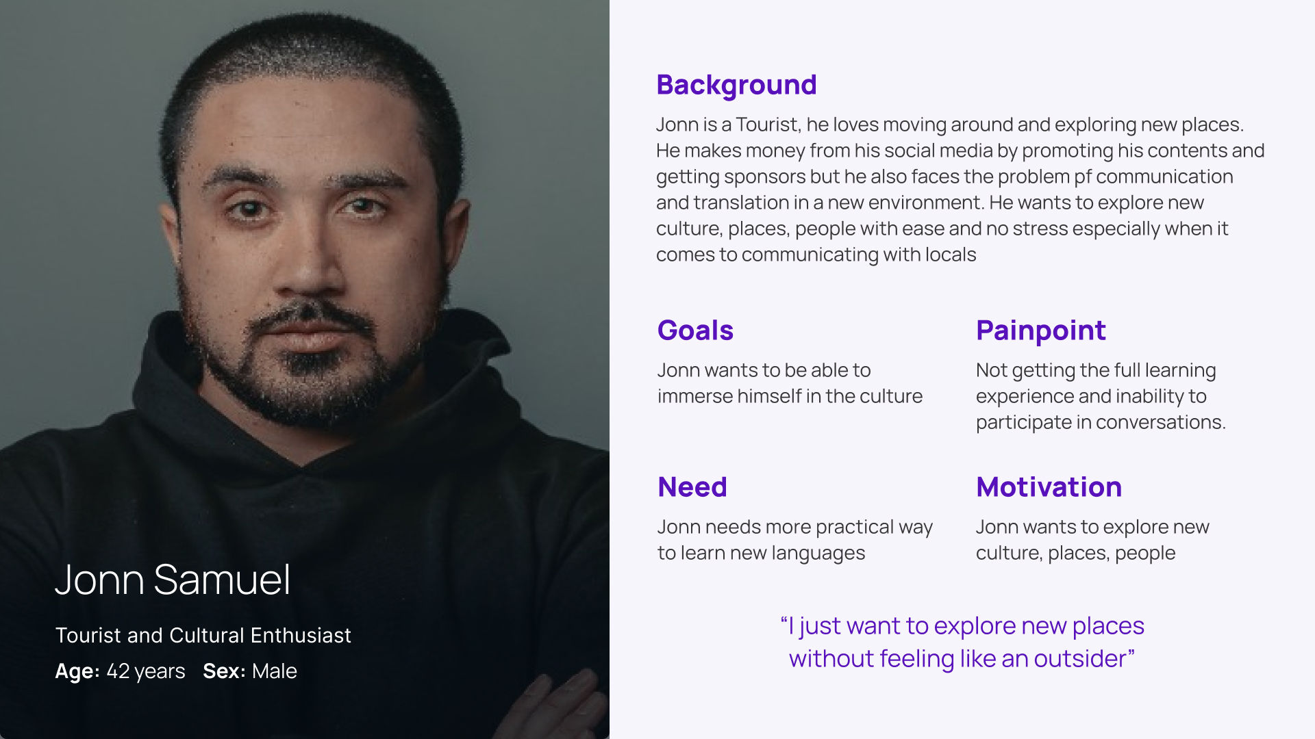
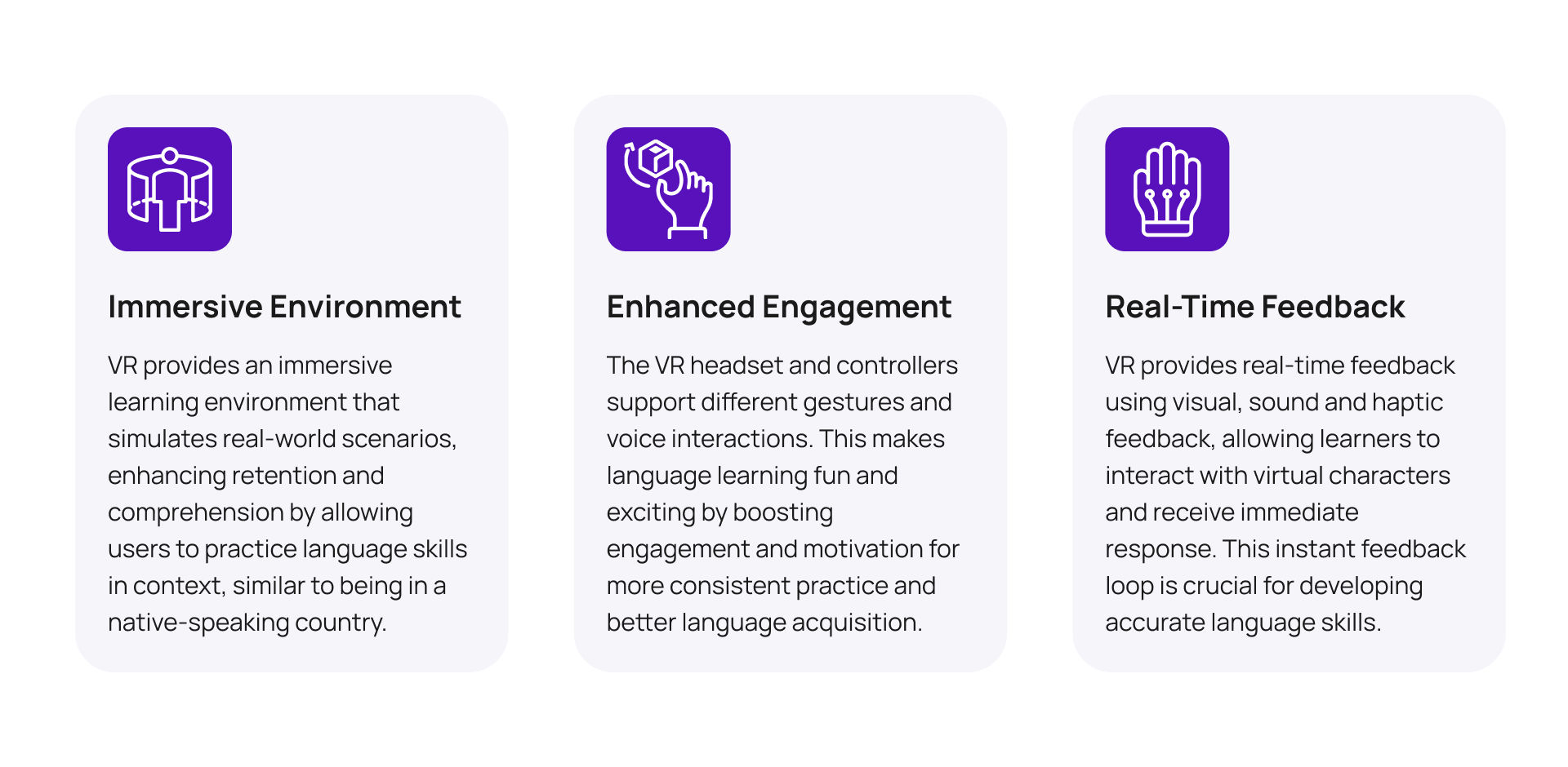
Virtual Reality (VR) technology offers a unique opportunity to create immersive and interactive language learning experiences that simulate real-world scenarios. By leveraging VR technology, the VR Lingo app can provide users with a more engaging and practical language learning experience that enhances their language skills and confidence. The benefits of using VR for language learning include:
The VR Lingo app is built on a client-server architecture, allowing users to experience the solution with their VR headsets. The client-side application runs on the VR headset, handling input and output interactions to provide an immersive language learning experience. Meanwhile, the server-side application manages user data and content delivery.

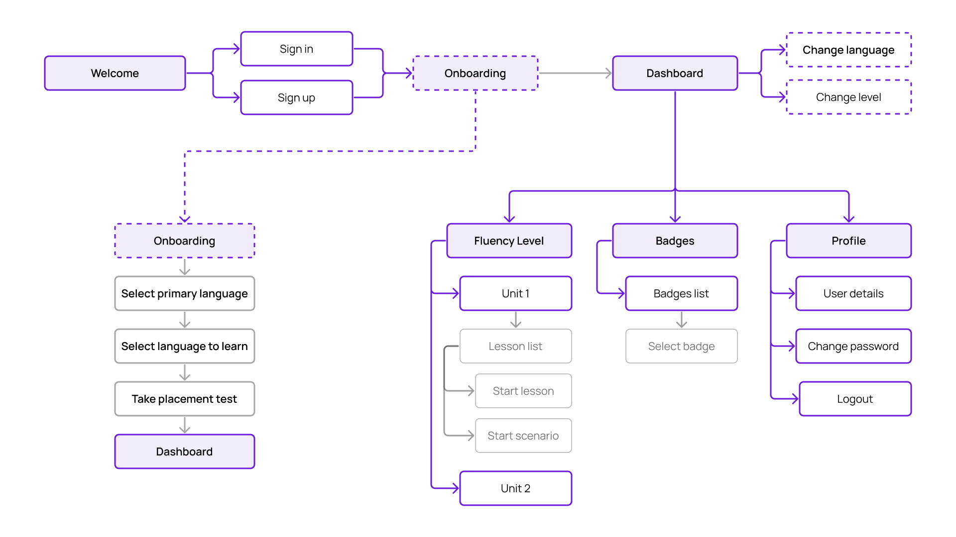
The information architecture was designed to provide a clear and intuitive user experience. The app's content was organized into categories based on language proficiency levels, learning modes, and user preferences.
During the onboarding stage, in order to place users in the appropriate level to start their language learning journey, we included a short language proficiency test. This test was designed to assess users' listening, speaking, reading, and writing skills.
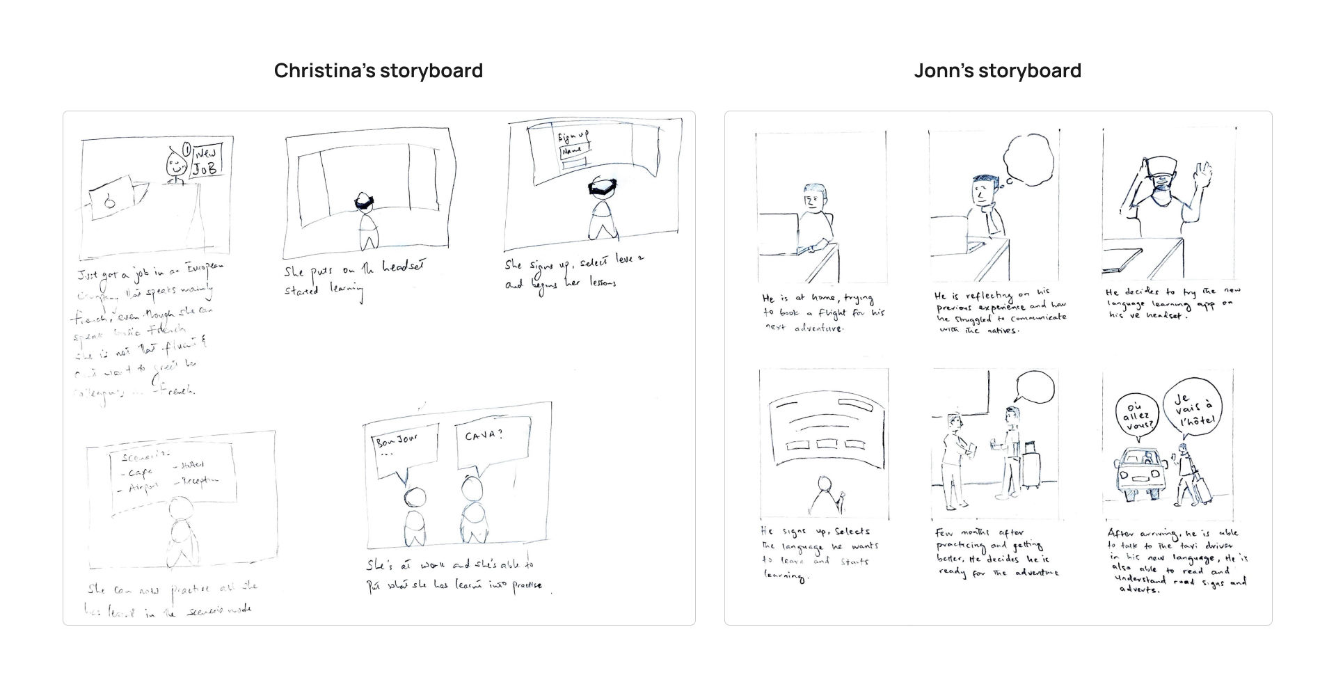
Storyboards were created to visualize the user journey and interactions within the VR Lingo app. The storyboards helped in mapping out the user experience and identifying how their language learning process can be enhanced.
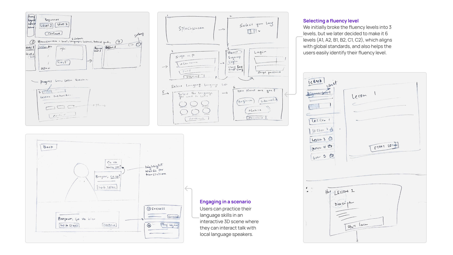
Wireframes were developed to outline the app's layout and functionality. They provided a visual representation of the app's structure and navigation.
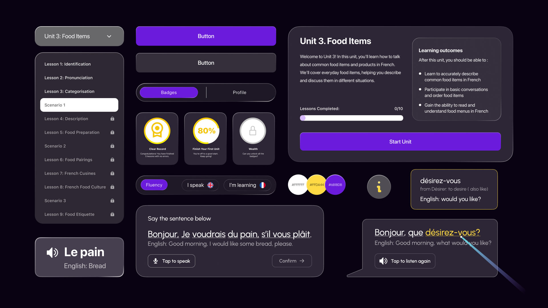
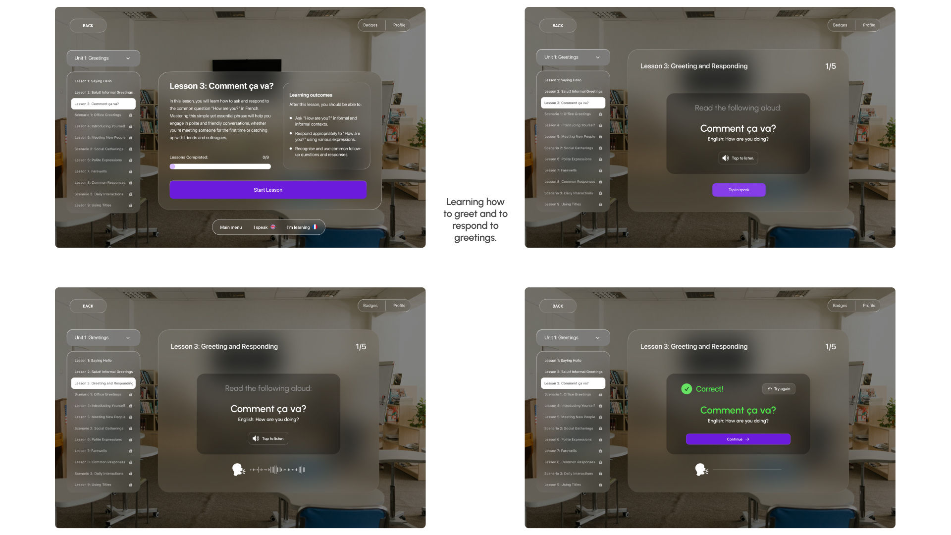
For the visual design of the VR Lingo app, we embraced Apple's Vision Pro design philosophy, aiming for a clean and minimalistic aesthetic that enhances user focus and interaction. This UI components were designed to be intuitive and user-friendly, ensuring a seamless language learning experience.
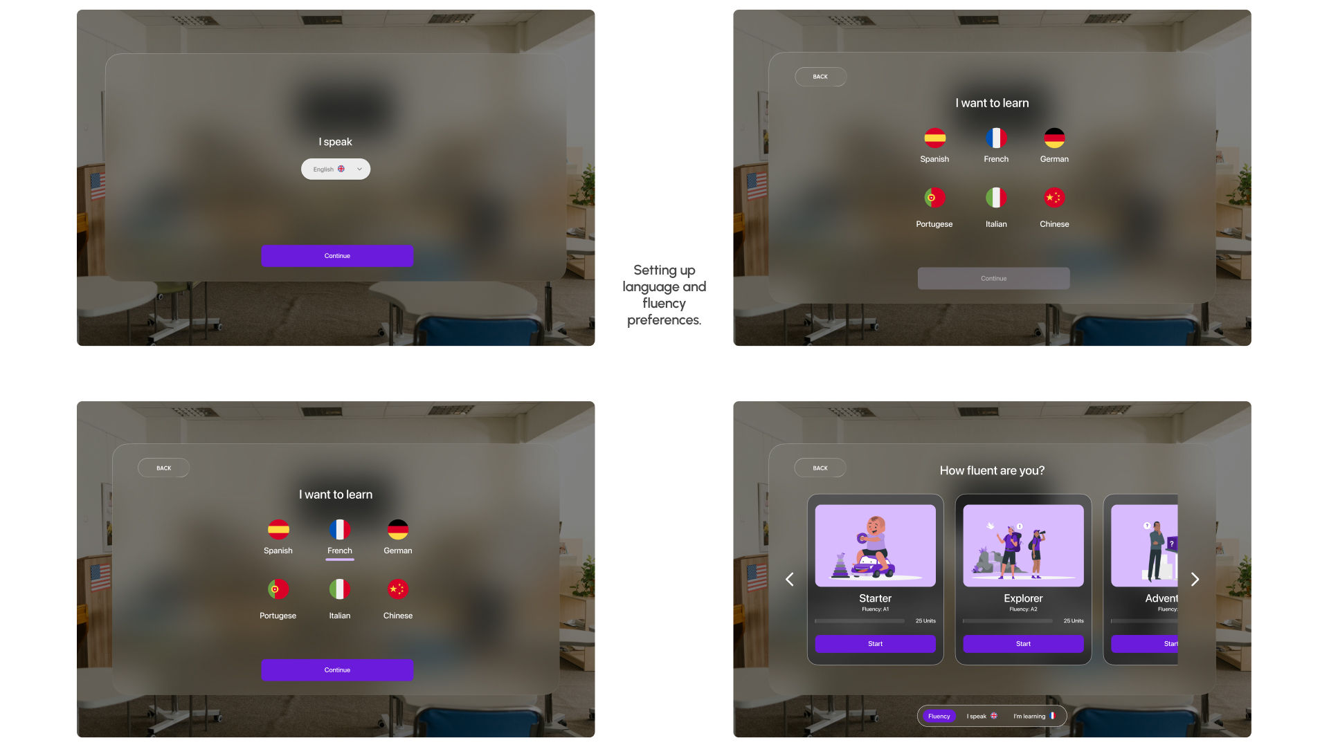
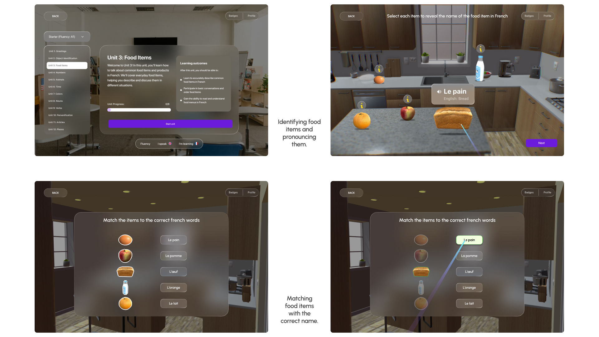
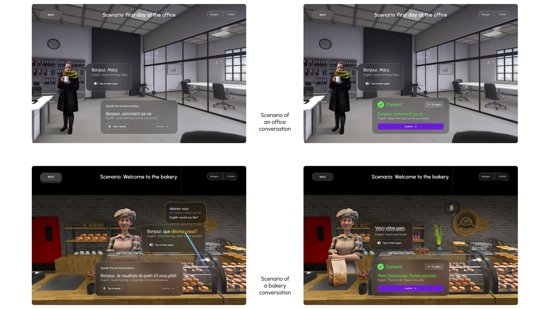
For the high-fidelity designs, we aimed to make the interface and interactions feel intuitive. We wanted to create an immersive and engaging language learning experience that helps users improve their skills. We focused on intuitive navigation, clean layouts, and familiar elements to make the design both effective and enjoyable.
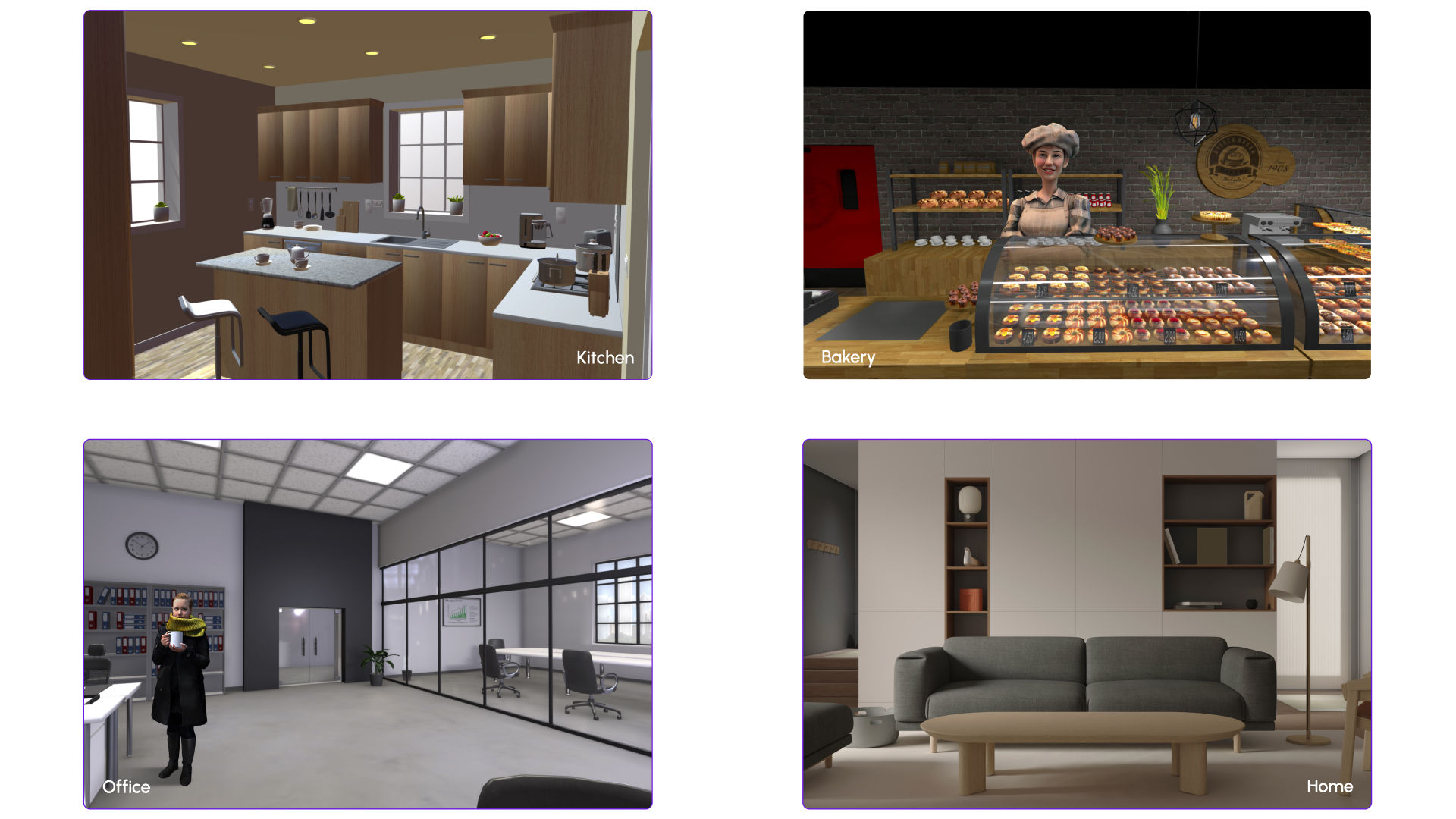
When designing the 3D environments, we focused on making them relaxing and realistic. We wanted to mirror everyday settings to make the learning experience enjoyable and intuitive. By including familiar elements that users interact with daily, we ensured the environments are immersive and support effective learning.
The user testing process involved two rounds of evaluations with 5 participants each conducted in a quiet lab environment. The first round utilised the think-aloud method and post-test interviews to gather qualitative feedback and System Usability Scale (SUS) scores. The second round included an A/B test to evaluate design changes. The main objective was to assess users' perceived usability and overall experience.
“Overall, I like how modern and immersive the app feels, especially the scenarios. The scenarios are a very good way for me to practice what I have learnt, I think it is a great concept.”
“I found the concept of the solution interesting. I think I’ll want to learn a new language with it.”
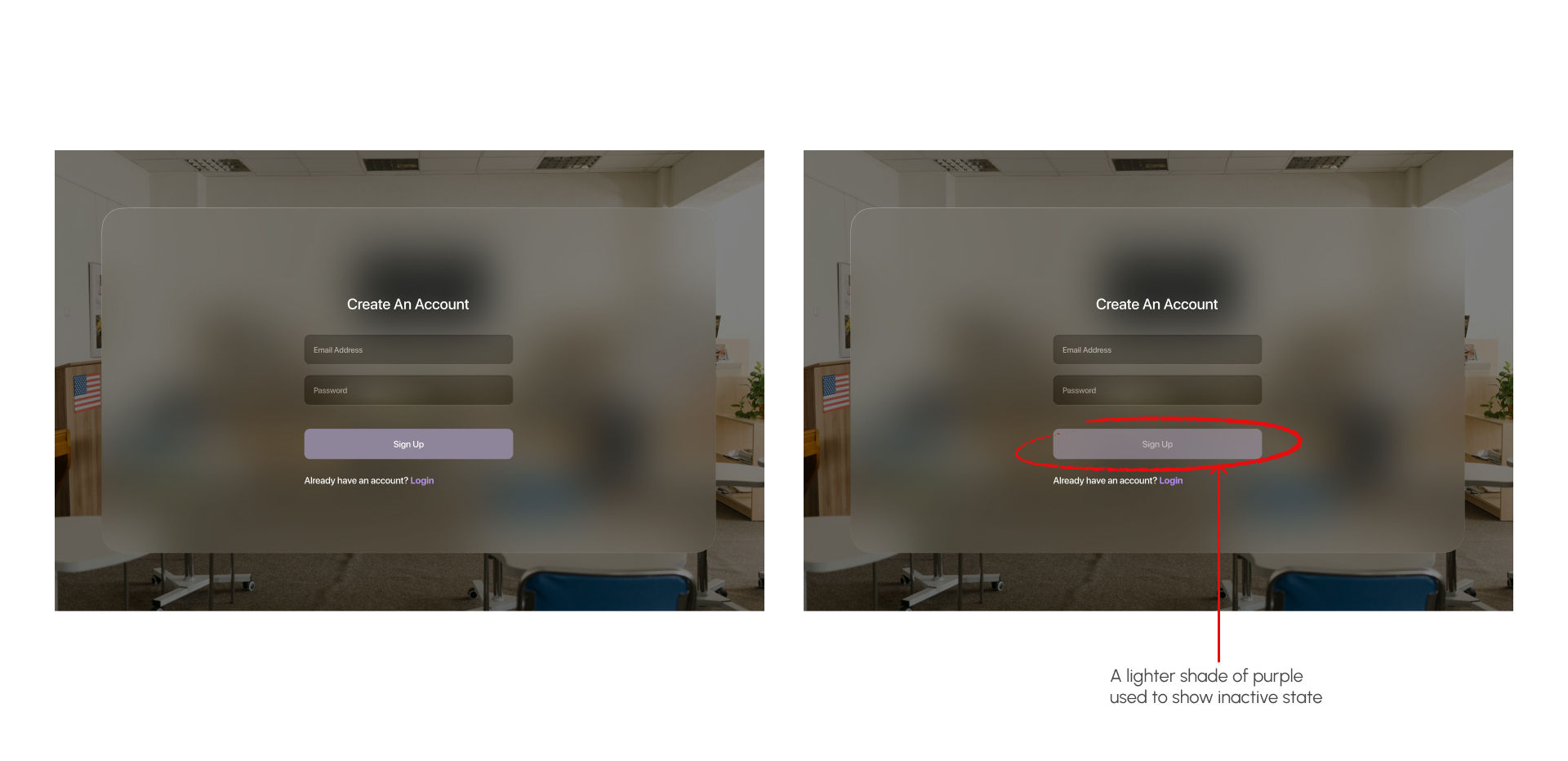
A particular participant mentioned that the inactive button at sign-up was not easily identifiable. Design iterations were made to easily differetiate between the different states of the button.
“I was not sure if the button was active or not, I think it should be more obvious”
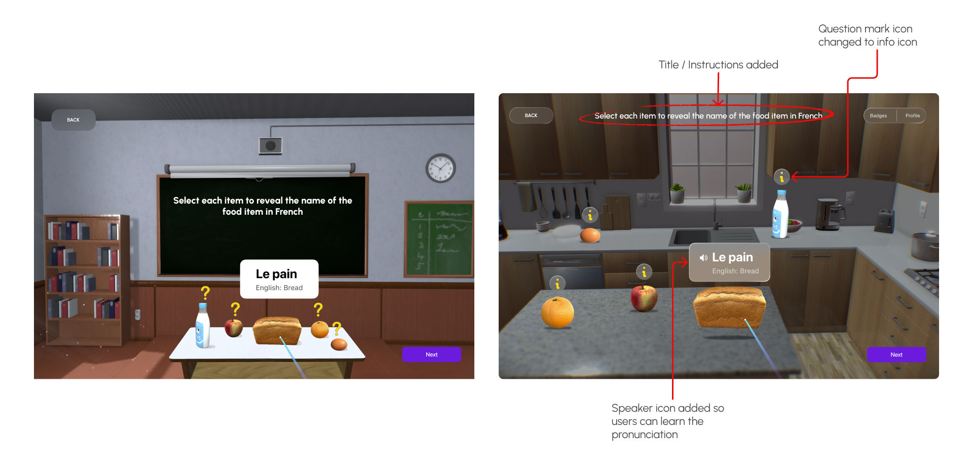
In the first test, 40% of the participants noted the lack of titles and instructions on some screens. After iterating on the designs, the second test showed that all the users were able to easily identify the purpose of the screens.
“I wish I could get more instructions here. The food item lesson screen did not have instructions so I did not know what to do.”
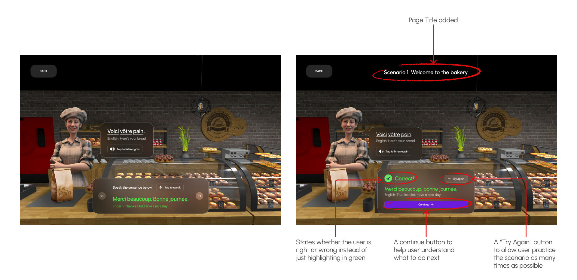
During the first test, 50% of participants expressed frustration when they made errors in speaking exercises and could not retry. After implementing a retry option, the second test showed that 90% of participants found the retry option helpful.
“The scenarios are a very good way to practice what I have learnt, I think it is a great concept.One thing I would like is to be able to retry a speaking exercise when I make an error in scenarios.”
Creating VR Lingo was a rewarding journey that offered significant insights into designing immersive language learning experiences. Incorporating cultural elements within the VR scenarios not only made the experience more authentic but also deepened the users' understanding of the language.
We encountered some limitations, like not being able to test the prototype with the actual VR headset, which limited the immersive experience and feedback we got. Also, due to time constraints, we were not able to design and test multiple lessons and scenarios, reducing the scope of our testing and the app’s overall potential.